Adding Instructions
One of the differences between a professional and an amateur looking form is the quality of instruction that it contains for end-users. The Form Service includes component renderers that are specifically geared toward rendering instructions and may include text, images, or links. For example, the following fragment from the UI-schema will render a paragraph:
{
  "type": "HelpContent",
  "label": "Program Overview",
  "options": {
    "help": "The Alberta Approved Farmers’ Market Program was started in 1973 as a way to provide an opportunity for local Alberta businesses to sell their products. Farmers’ markets are a critical channel for business incubation – entrepreneurs start in markets, test market their products and develop business skills. The Program creates an operational framework, providing direction and guidance to approved farmers’ markets in Alberta through provincial guidelines that outline minimum requirements and best practices."
  }
}
Markdown
Markdown is an industry standard way to add text formatting directives to a document. In this case the document is your form. Its similar to the other help elements, but allows markdown syntax to be added to the text, allowing you to bold or italicize text, and add headings, links, images, bullets, etc. You tell the system to interpret the text as markdown when you add a HelpContent element with the markdown option, like so:
{
  "type": "HelpContent",
  "label": "Program Overview",
  "options": {
    "markdown": true,
    "help": [
      "#### Farmers Market Program",
      "The **Alberta Approved Farmers’ Market Program** was started in 1973 as a way to provide an opportunity for local Alberta businesses to sell their products. [Farmers’ markets](http://google.com) are a critical channel for business incubation – entrepreneurs start in markets, test market their products and develop business skills. The Program creates an operational framework, providing direction and guidance to approved farmers’ markets in Alberta through provincial guidelines that _outline minimum requirements and best practices_.",
      "The end."
    ]
  }
}
The “help” array consists of a set of paragraphs, one per entry, and you add the markdown syntax to each as needed. The above will render as:
Farmers Market Program
The Alberta Approved Farmers’ Market Program was started in 1973 as a way to provide an opportunity for local Alberta businesses to sell their products. Farmers’ markets are a critical channel for business incubation – entrepreneurs start in markets, test market their products and develop business skills. The Program creates an operational framework, providing direction and guidance to approved farmers’ markets in Alberta through provincial guidelines that outline minimum requirements and best practices. The end.
Note: We currently do not support Markdown’s extended syntax.
Deprecated Help Constructs
The following constructs are still available for use, but are not really needed since the introduction of markdown.
Combining elements
By combining several HelpContent types into a list you can create a full page of instructions to help your end-users navigate the form, e.g.
{
  "type": "VerticalLayout",
  "elements": [
    {
      "type": "HelpContent",
      "label": "",
      "options": {
        "help": "1. Must operate on a non-profit basis. This can be achieved in a number of ways:"
      }
    },
    {
      "type": "HelpContent",
      "elements": [
        {
          "type": "HelpContent",
          "label": "Sponsored by:",
          "options": {
            "help": [
              "Registered not-for-profit community group or organization;",
              "Registered Chamber of Commerce;",
              "Municipality; or",
              "Agricultural society formed under the Agricultural Societies Act (Alberta)"
            ]
          }
        }
      ]
    }
  ]
}
will render

Notice that providing an array of text fragments in options/help will render as a bulleted list of points.
Detail Variant
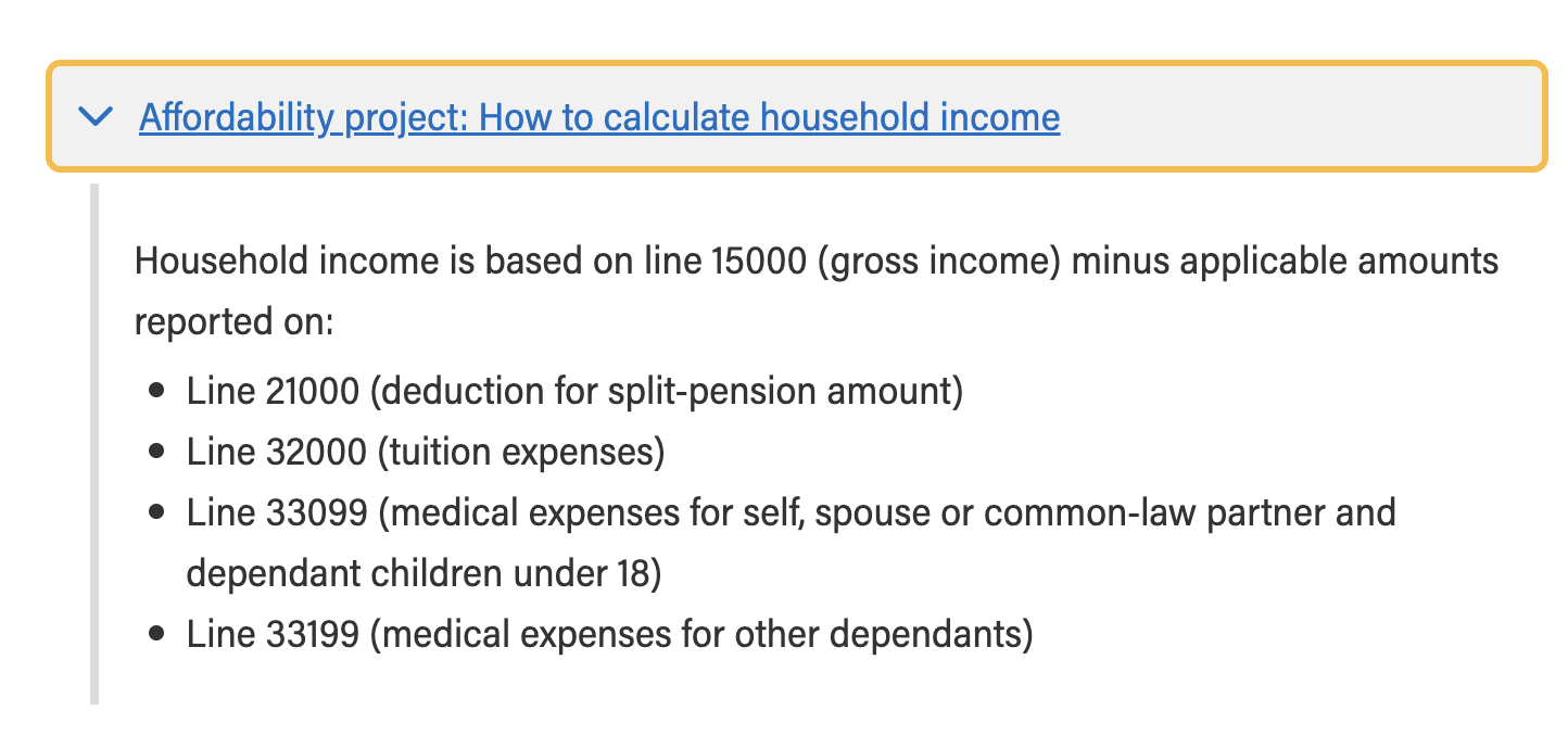
Often a form will look cleaner if the end-user doesn’t have to browse through instructions they are already familiar with, or those that are not directly relevant to the task at hand. One of the Help Content variants will render instructions as a title that, when clicked on, will open up the details of the instruction. The variant looks like this:
{
  "type": "HelpContent",
  "label": "Affordability project: How to calculate household income",
  "elements": [
    {
      "type": "HelpContent",
      "options": {
        "help": "Household income is based on line 15000 (gross income) minus applicable amounts reported on:"
      }
    },
    {
      "type": "HelpContent",
      "options": {
        "help": [
          "Line 21000 (deduction for split-pension amount)",
          "Line 32000 (tuition expenses)",
          "Line 33099 (medical expenses for self, spouse or common-law partner and dependant children under 18)",
          "Line 33199 (medical expenses for other defendants)"
        ]
      }
    }
  ],
  "options": {
    "variant": "details"
  }
}
Which will render as 
In this variant the Help Content contains
- The text displayed in the title (label),
- The details of the instruction (elements) that get exposed when the section is opened,
- the name of the variant (details), in the options section
Image Variant
You can add images to further clarify what is needed, with the img variant
{
  "type": "HelpContent",
  "options": {
    "variant": "img",
    "src": "https://picsum.photos/200/300",
    "width": "300",
    "height": "300",
    "alt": "Workflow diagram"
  }
}
The width, height, and alt properties are optional.
Hyperlink Variant
You can add hypertext links in the instructions to further clarify what is needed, with the link variant
{
  "type": "HelpContent",
  "options": {
    "variant": "hyperlink",
    "link": "https://www.thelink.com",
    "help": "Text to wrap the link in"
  }
}
The help text is optional and will be used as the text of the anchor when present, otherwise the src URL will be rendered directly.