Icon button
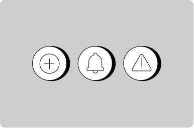
A compact button with an icon and no text.
Props
medium.
outline.
default.
color.
Events
Copy to clipboard
Show a label on an icon only button
Show multiple actions in a compact table
States
Only use disabled buttons if research shows it makes the user interface easier to understand.
Consider removing options that are unavailable or not applicable. Show actions that are only relevant and useful to the user at a given time.
When you must disable a button or input:
- Provide nearby text explaining what needs to happen first
- Consider showing the element enabled with validation on submit instead
- Use aria-describedby to link the disabled element to explanatory text
Types
Positioning
Usage
Feedback
Screen Readers
Icon-only interactive elements must have an accessible label so screen reader users understand their purpose.
For IconButton: The ariaLabel prop is required.
// Good - describes the action
<GoabIconButton icon="trash" ariaLabel="Delete item" />

// Bad - no label for screen readers
<GoabIconButton icon="trash" />
For Badge with icon only: Provide ariaLabel when there’s no visible text.
<GoabBadge icon="warning" ariaLabel="Warning" type="important" />For Icon: Use ariaLabel when the icon conveys meaning, not just decoration.
The label should describe:
- What action happens (for buttons): “Delete”, “Edit”, “Close”
- What the icon represents (for informational icons): “Warning”, “Success”
For decorative icons: Set ariaHidden to true when nearby text or the parent control already communicates the same meaning. This prevents screen readers from announcing duplicate information.
<GoabIcon type="checkmark-circle" ariaHidden />
<span>Application saved</span>
Do not use ariaHidden to replace a missing accessible label. If the icon provides information that is not available elsewhere, use ariaLabel instead.