Button

Carry out an important action or navigate to another page.

Props

action
string
Action identifier passed in click events for event delegation patterns.
actionArg
string
Single argument value passed with the action in click events.
actionArgs
Record<string, unknown>
Multiple argument values passed with the action in click events.
disabled
boolean
When true, prevents user interaction and applies disabled styling.
leadingIcon
GoabIconType
Icon displayed before the button text.
size
GoabButtonSize
Controls the size of the button. Use "compact" for inline actions or space-constrained layouts.
Defaults to normal.
testId
string
Sets a data-testid attribute for automated testing.
trailingIcon
GoabIconType
Icon displayed after the button text.
type
GoabButtonType
Sets the visual style of the button. Use "primary" for main actions, "secondary" for alternative actions, "tertiary" for low-emphasis actions, "start" for prominent call-to-action buttons, and "text" for text-only buttons.
Defaults to primary.
variant
GoabButtonVariant
Sets the color variant for semantic meaning. Use "destructive" for delete or irreversible actions, "inverse" for light-colored text on dark backgrounds, and "dark" for dark text color on text buttons only. Note: "dark" has no effect on non-text button types.
Defaults to normal.
width
string
Sets a custom width for the button (e.g., "200px" or "100%").
mt, mr, mb, ml
Spacing
Apply margin to the top, right, bottom, and/or left of the component.
action
string
Action identifier passed in click events for event delegation patterns.
actionArg
string
Single argument value passed with the action in click events.
actionArgs
Record<string, unknown>
Multiple argument values passed with the action in click events.
disabled
boolean
Sets the disabled state. When true, prevents user interaction and applies disabled styling.
leadingIcon
GoabIconType
Sets the icon displayed before the button text.
size
GoabButtonSize
Sets the size of the button. Use "compact" for inline actions or space-constrained layouts.
Defaults to normal.
testId
string
Sets the data-testid attribute for automated testing.
trailingIcon
GoabIconType
Icon displayed after the button text.
type
GoabButtonType
Sets the visual style of the button. Use "primary" for main actions, "secondary" for alternative actions, "tertiary" for low-emphasis actions, "start" for prominent call-to-action buttons, and "text" for text-only buttons.
Defaults to primary.
variant
GoabButtonVariant
Sets the color variant for semantic meaning. Use "destructive" for delete or irreversible actions, "inverse" for light-colored text on dark backgrounds, and "dark" for dark text color on text buttons only. Note: "dark" has no effect on non-text button types.
Defaults to normal.
width
string
Sets a custom width for the button (e.g., "200px" or "100%").
mt, mr, mb, ml
Spacing
Apply margin to the top, right, bottom, and/or left of the component.
action
string
Action identifier passed in click events for event delegation patterns.
action-arg
string
Single argument value passed with the action in click events.
action-args
Record<string, unknown>
Multiple argument values passed with the action in click events.
Defaults to {}.
disabled
boolean true | false
When true, prevents user interaction and applies disabled styling.
Defaults to false.
leadingicon
GoabIconType
Icon displayed before the button text.
size
GoabButtonSize normal | compact
Controls the size of the button. Use "compact" for inline actions or space-constrained layouts.
Defaults to normal.
testid
string
Sets a data-testid attribute for automated testing.
trailingicon
GoabIconType
Icon displayed after the button text.
type
GoabButtonType primary | submit | secondary | tertiary | start | text
Sets the visual style of the button. Use "primary" for main actions, "secondary" for alternative actions, "tertiary" for low-emphasis actions, "start" for prominent call-to-action buttons, and "text" for text-only buttons.
Defaults to primary.
variant
GoabButtonVariant normal | destructive | inverse | dark
Sets the color variant for semantic meaning. Use "destructive" for delete or irreversible actions, "inverse" for light-colored text on dark backgrounds, and "dark" for dark text color on text buttons only. Note: "dark" has no effect on non-text button types.
Defaults to normal.
version
GoabButtonVersion 1 | 2
Design system version for styling.
Defaults to 1.
width
string
Sets a custom width for the button (e.g., "200px" or "100%").
mt, mr, mb, ml
Spacing
Apply margin to the top, right, bottom, and/or left of the component.

Events

onClick
() => void
Callback fired when the button is clicked.
onClick
() => void
Emits when the button is clicked.
_click
CustomEvent
Examples

Activate a specific tab with a button

Add a filter chip

Add a record using a drawer

Add and edit lots of filters

Add another item in a modal

Ask a user for an address

Button with Icon

When using icons in buttons, the button text provides the accessible name. The icon is decorative and should be hidden from screen readers with aria-hidden.

Card view of case files

Confirm a change

Confirm a destructive action

Confirm before navigating away

Disabled button with a required field

Display user information

Dynamically add an item to a dropdown list

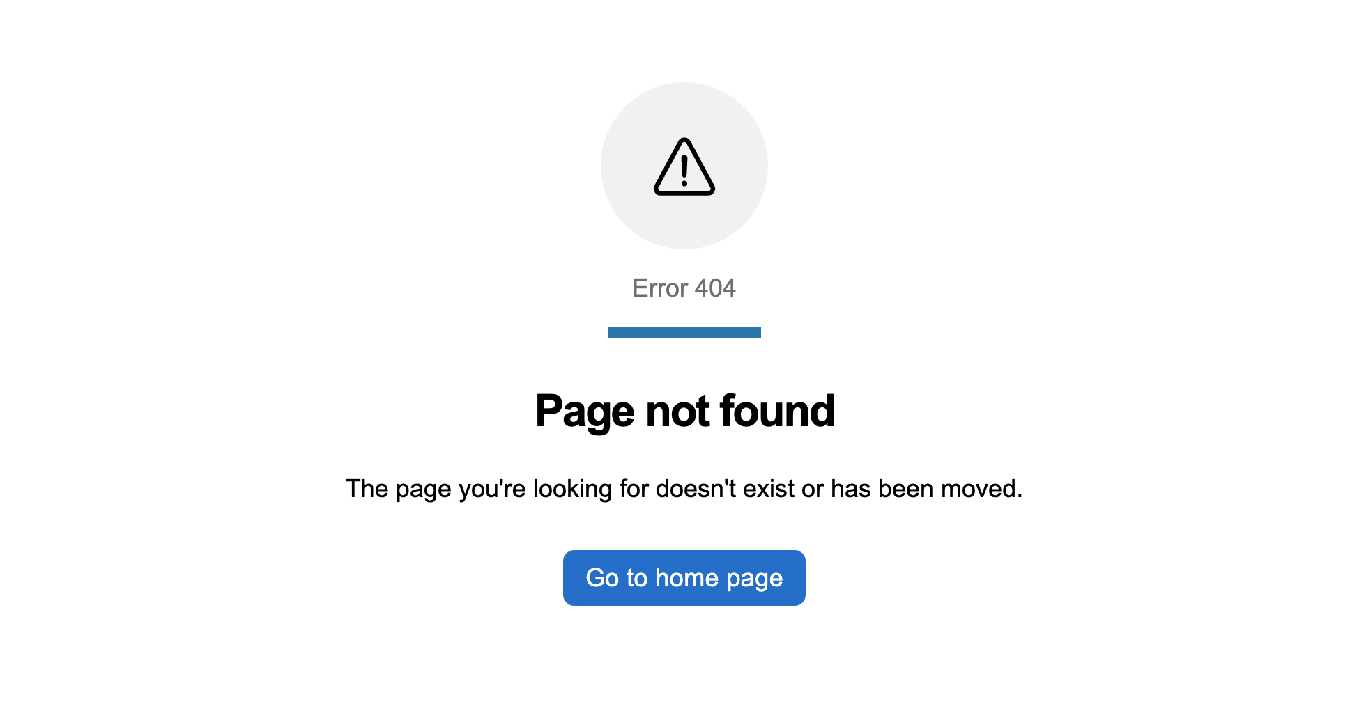
Error pages

Error pages preview
More info

Filter a list using a push drawer

Filter data in a table

Hero banner with actions

Hide and show many sections of information

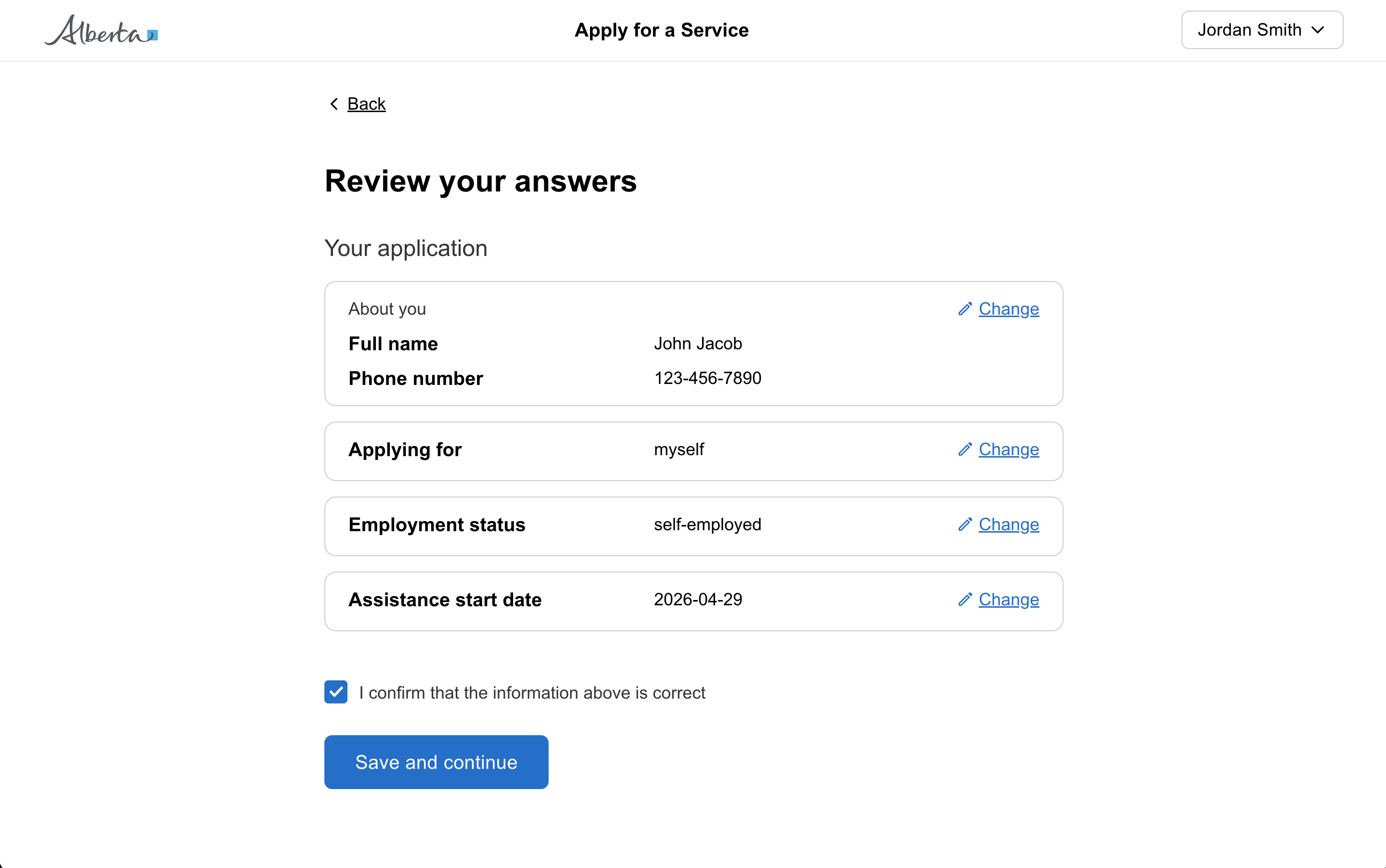
Question page

Question page preview
More info

Require user action before continuing

Reset date picker field

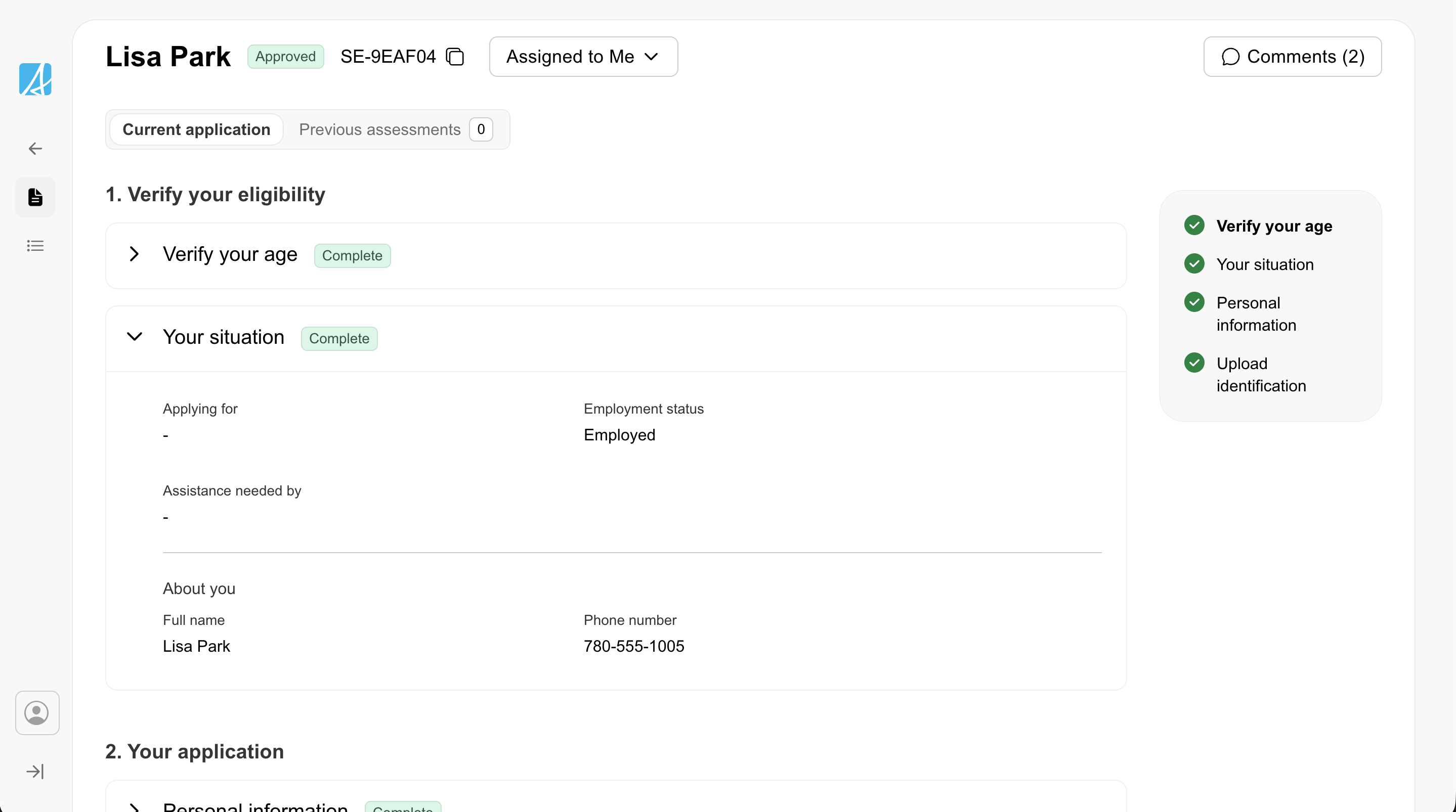
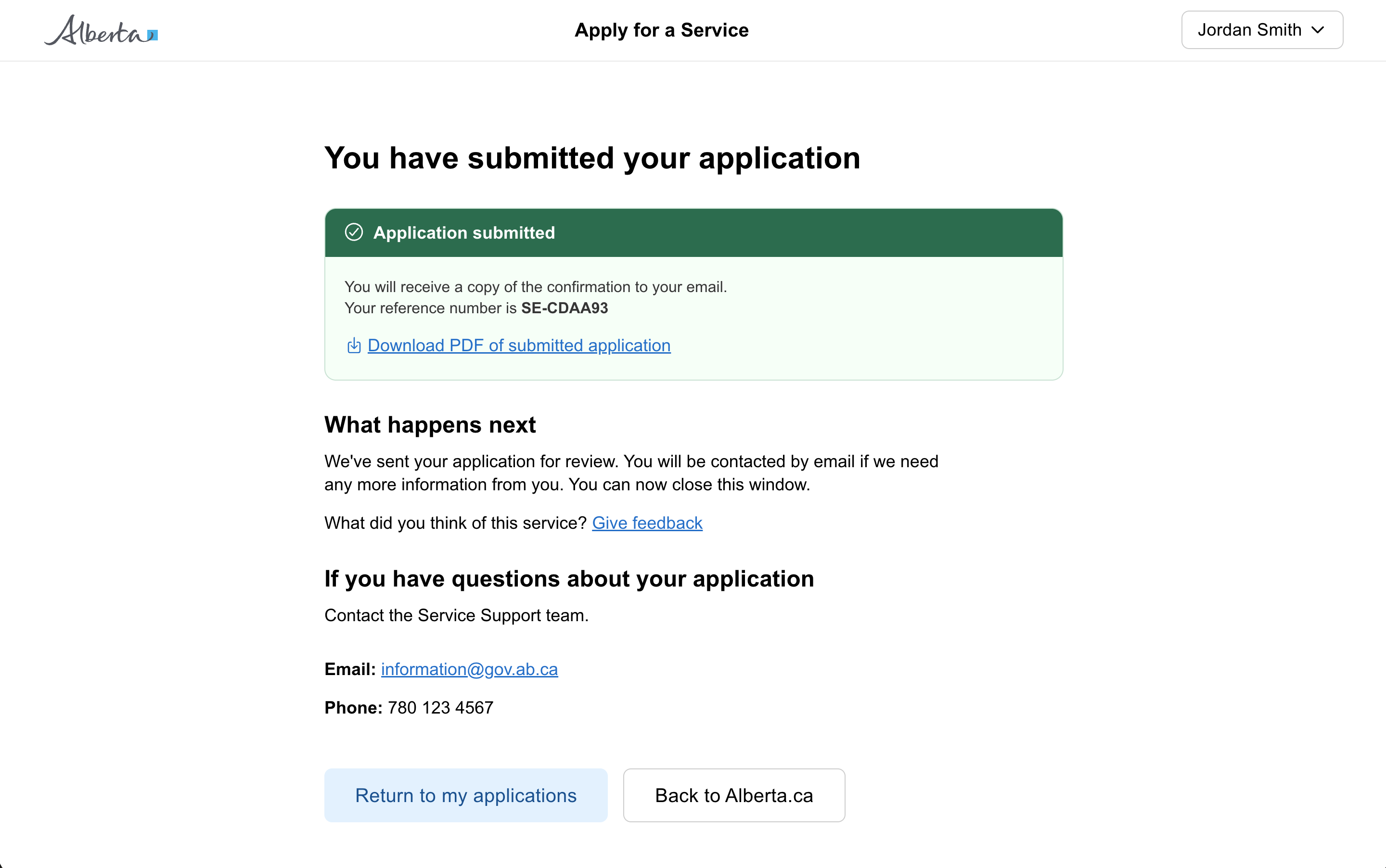
Review and action

Set a specific tab to be active

Show a notification

Show a notification with an action

Show a user progress

Show a user progress when the time is unknown

Show different views of data in a table

Show status in a table

Warn a user of a deadline

States

Submit

Only use disabled buttons if research shows it makes the user interface easier to understand.

Consider removing options that are unavailable or not applicable. Show actions that are only relevant and useful to the user at a given time.

Avoid using disabled buttons. They have poor contrast and can confuse users.

Instead of disabling a submit button, keep it enabled and provide clear feedback about any missed fields or input errors when the user tries to submit the form.

Keep buttons enabled and use error handling to provide clear feedback when the user submits.
Submit

When you must disable a button or input:

  • Provide nearby text explaining what needs to happen first
  • Consider showing the element enabled with validation on submit instead
  • Use aria-describedby to link the disabled element to explanatory text
Don't disable buttons or inputs without explaining why. Disabled controls can be confusing and users may not understand why they can't interact with an element.

Sizing

Edit
Use compact buttons in dense spaces like tables or container title bars.
SaveCancel
Don't use different button sizes in the same area to emphasize hierarchy.
CancelSave
Don't stack standard and full width buttons.
SaveCancel
Use full width buttons on mobile.

Content

SubmitCancel
Use one word to explain the function whenever possible, such as "Save", "Submit", or "Search".
Cancel application
Use descriptive language in both modal content and button text to inform users of the resulting destructive action.
SUBMITcancel
Don't use all uppercase or all lowercase to label buttons.
Submit applicationSave draftCancel
Button labels should clearly describe what happens when clicked. Use specific verbs like "Submit application" or "Save draft" instead of generic labels like "OK" or "Click here".

Types

Button types
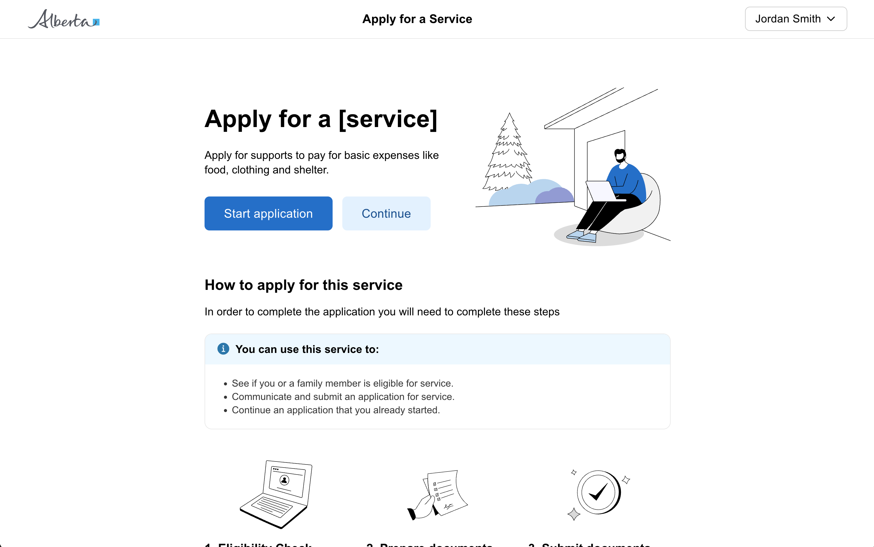
  • Primary - If there is only one button on a page, it should be a primary button. For citizen facing applications, generally there should only be one primary button on a page.
  • Secondary - Use secondary buttons for less important actions on a page. Often paired with a primary action as a secondary action.
  • Tertiary - Use tertiary buttons for links that should function like a button, such as “edit” or “cancel” in applications. It’s okay to use more than one tertiary button on a page.
Delete account
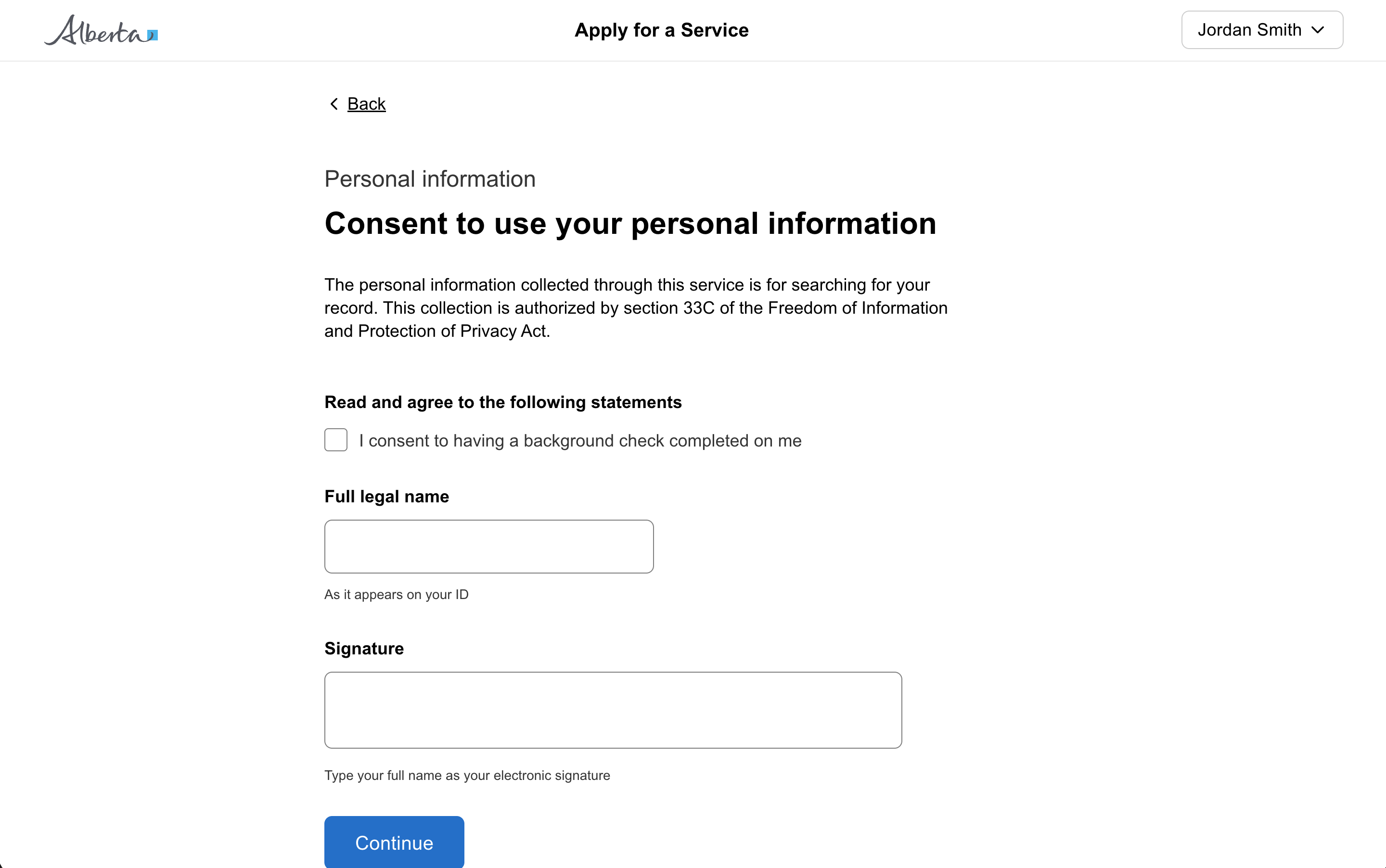
Use the destructive button variant for actions that cannot be easily undone, like permanently deleting data or removing a user from a system.
Delete record
Don't use a destructive button to trigger a confirmation. Reserve destructive styling for the final action inside the modal.
SaveSubmitContinue
Avoid using more than one primary button per page. Multiple primary buttons create visual competition and make it unclear which action is most important.
SaveCancel
Use a primary button for main actions and a secondary button for less important actions.
Submit form

This distinction matters for screen reader users who expect different behaviors, keyboard navigation patterns, and browser history.

Use a button for actions that trigger functionality (submit, save, cancel). Use a link for navigation to different pages or external websites.
Go to homepage
Don't use Button for simple navigation (use Link), toggling state (use Toggle or Checkbox), or minor utility functions (use Icon Button).
Submit application
Use a button when you need users to take a specific action, such as submitting a form, starting a process, or confirming a decision.

Icons

Add item
Use icons with a clear visual association to the action.
Confirm
Don't use icons that don't have a clear visual association to the intended outcome.
Add new
Use a text label with an icon, especially for public-facing applications and novice users.

Positioning

SubmitEditSaveCopyDraft
Don't group more than 3 actions together. Consider using an overflow menu for additional options.
SubmitCancel
Use a button group when putting multiple buttons together.

Other

Use Link for navigation to other pages. Use Button for actions that change state or trigger functionality.
All GoA Design System components are built to meet WCAG 2.2 AA standards. The following guidelines provide additional context for accessible implementation.

Screen Readers

For icon buttons with both a label and icon, hide the icon from the screen reader so it announces “Button, add row” not “Button, cross icon, add row”.
Don't read the icon class or description for icon buttons with labels. Screen readers should read the button label only.
Icon-only buttons must include a descriptive label for screen readers.

Focus

Don't focus on just the icon within a button. Focus the button as a whole.
View old component docs