Container
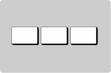
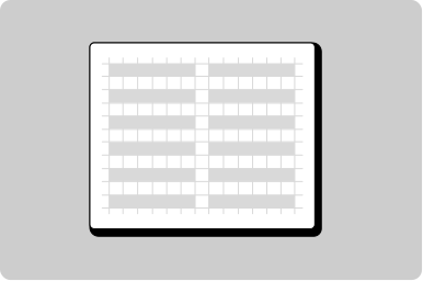
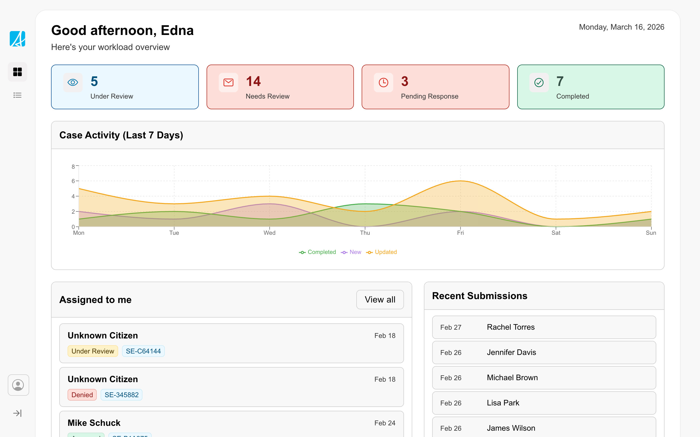
Group information, create hierarchy, and show related information.
Props
accent
GoabContainerAccent
Sets the style of accent on the container.
Defaults to
filled.
maxHeight
string
Sets the maximum height of the container.
maxWidth
string
Sets the maximum width of the container.
minHeight
string
Sets the minimum height of the container.
padding
GoabContainerPadding
Sets the amount of white space in the container.
Defaults to
relaxed.
testId
string
Sets a data-testid attribute for automated testing.
type
GoabContainerType
Sets the container and accent bar styling.
Defaults to
interactive.
width
GoabContainerWidth
Sets the width of the container.
Defaults to
full.
mt, mr, mb, ml
Spacing
Apply margin to the top, right, bottom, and/or left of the component.
ReactNode
actions
ReactNode
Content rendered in the container's actions area, typically buttons or controls.
title
ReactNode
Content rendered in the container's title/heading area.
Types
Tip
Use accent='thick' when you need a header area with a title or actions on a container.
Other
Header section
Main content area
Footer section
Don't
Don't use a container for general page layout. Containers are for visual emphasis and grouping content.