Block
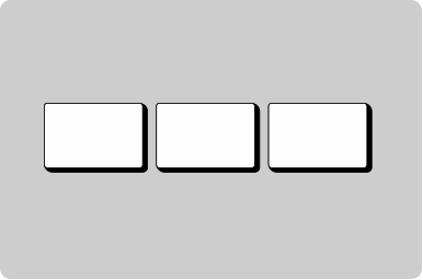
Group components into a block with consistent space between.
Props
alignment
GoabBlockAlignment
Primary axis alignment of child components.
Defaults to
normal.
direction
GoabBlockDirection
Stacking direction of child components.
Defaults to
row.
gap
Spacing
Spacing between items. Uses design system spacing tokens.
Defaults to
m.
maxWidth
string
Sets the maximum width of the block container.
minWidth
string
Sets the minimum width of the block container.
stretch
boolean
When true, children fill the cross-axis (e.g. width in a column block) regardless of alignment.
Defaults to
false.
testId
string
Sets a data-testid attribute for automated testing.
width
string
Sets the width of the block container.
mt, mr, mb, ml
Spacing
Apply margin to the top, right, bottom, and/or left of the component.
Card view of case files
Copy to clipboard
Display user information
Filter data in a table
Question page

Review and action
Show multiple actions in a compact table
Show multiple tags together
Show number of results per page
Other
Tip
Use Block for general layout and spacing. Use ButtonGroup for semantically related action buttons.
Header section
Main content area
Footer section
Don't
Don't use a container for general page layout. Containers are for visual emphasis and grouping content.