Table
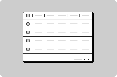
A set of structured data that is easy for a user to scan, examine, and compare.
Props
sortMode
GoabTableSortMode
Sort mode: "single" allows one column, "multi" allows up to 2 columns.
Defaults to
single.
striped
boolean
When true, alternates row background colors for improved readability.
testId
string
Sets a data-testid attribute for automated testing.
variant
GoabTableVariant
A relaxed variant of the table with more vertical padding for the cells.
Defaults to
normal.
width
string
Width of the table. By default it will fit the enclosed content.
mt, mr, mb, ml
Spacing
Apply margin to the top, right, bottom, and/or left of the component.
Events
onMultiSort
(detail: GoabTableOnMultiSortDetail) => void
Callback fired when multi-column sorting changes.
onSort
(detail: GoabTableOnSortDetail) => void
Callback fired when a single-column sort header is clicked.
Table Sort Header Props
direction
GoabTableSortDirection
Sets the sort direction indicator.
Defaults to
none.
name
string
Column name identifier for sorting.
sortOrder
GoabTableSortOrder
Sort order number for multi-column sort display. Used for displaying priority numbers when multiple columns are sorted.
Display numbers in a table so they can be scanned easily
Display user information
Filter a list using a push drawer
Filter data in a table
Set a specific tab to be active
Show different views of data in a table
Show multiple actions in a compact table
Show number of results per page
Show status in a table
Sort data in a table
Types
Tip
Use variant='relaxed' for tables with longer content that needs more breathing room between rows.
Screen Readers
Do
Use proper semantic HTML table structure (thead, tbody, tr, th, td) for accessibility.