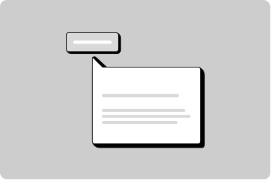
Tooltip
A small popover that displays more information about an item.
Props
content
string | ReactNode
The content of the tooltip. Accepts plain text or rich content.
hAlign
GoabTooltipHorizontalAlignment
Horizontal alignment of the tooltip relative to the child element.
Defaults to
center.
maxWidth
string
Sets the maximum width of the tooltip. Must use 'px' unit.
position
GoabTooltipPosition
Position of the tooltip with respect to the child element.
Defaults to
top.
testId
string
Sets a data-testid attribute for automated testing.
mt, mr, mb, ml
Spacing
Apply margin to the top, right, bottom, and/or left of the component.
ReactNode
content
ReactNode
The content of the tooltip. Accepts plain text or rich content.
Copy to clipboard
Show a label on an icon only button
Show full date in a tooltip
Other
Don't
Don't use tooltips to communicate essential information such as required field indicators, error messages, critical instructions, or information needed to complete a task.
Do
Use tooltips for additional context that enhances understanding, definitions of terms, or keyboard shortcuts.
Feedback
Do
Use tooltips to describe an icon button and provide clarity on what the icon button will do.
Don't
Don't position a tooltip in a way that forces the user to scroll to view the tooltip content.
Don't
Don't use tooltips inconsistently; if one icon button has a tooltip, the rest of the icon buttons must also have tooltips.
Don't
Don't add more than 140 characters to a tooltip; for lengthy information use the details component.
Tooltip
Don't
Don't position a tooltip too far from the element.
Don't
Don't use tooltips for information that is vital to task completion.