Checkbox

Let the user select one or more options.

Props

name
string
Unique name to identify the checkbox.
ariaLabel
string
Defines how the text will be translated for the screen reader. If not specified it will fall back to the name.
checked
boolean
Marks the checkbox item as selected.
description
string | React.ReactNode
Additional description text displayed below the checkbox label.
disabled
boolean
Disable this control. It will not receive focus or events.
error
boolean
Shows an error on the checkbox item.
id
string
Sets a unique id for the checkbox element.
indeterminate
boolean
Shows a mixed/partial selection state. Used for 'Select All' checkboxes when some items are selected.
maxWidth
string
Sets the maximum width of the checkbox.
revealAriaLabel
string
Text announced by screen readers when the reveal slot content is displayed.
size
GoabCheckboxSize
Sets the size of the checkbox. 'compact' reduces spacing for dense layouts.
Defaults to default.
testId
string
Sets a data-testid attribute for automated testing.
text
string
Label shown beside the checkbox.
value
string | number | boolean
The value binding.
mt, mr, mb, ml
Spacing
Apply margin to the top, right, bottom, and/or left of the component.
ariaLabel
string
Defines how the text will be translated for the screen reader. If not specified it will fall back to the name.
checked
boolean
Marks the checkbox item as selected.
description
string | TemplateRef<any>
Sets additional description content displayed below the checkbox label. Accepts plain text or a template.
disabled
boolean
Sets the disabled state for the control.
error
boolean
Sets the error state for the control.
id
string
Sets the id attribute of the underlying web component.
indeterminate
boolean
Shows a mixed/partial selection state. Used for 'Select All' checkboxes when some items are selected.
maxWidth
string
Sets the maximum width of the checkbox.
name
string
Sets the name of the checkbox input for form submission.
revealArialLabel
string
Text announced by screen readers when the reveal slot content is displayed.
size
GoabCheckboxSize
Sets the size of the checkbox. 'compact' reduces spacing for dense layouts.
Defaults to default.
testId
string
Sets the data-testid attribute for automated testing.
text
string
Label shown beside the checkbox.
value
string | number | boolean | null
The value binding.
mt, mr, mb, ml
Spacing
Apply margin to the top, right, bottom, and/or left of the component.
name
string
Unique name to identify the checkbox.
arialabel
string
Defines how the text will be translated for the screen reader. If not specified it will fall back to the name.
checked
boolean true | false
Marks the checkbox item as selected.
Defaults to false.
description
string
Additional description text displayed below the checkbox label.
disabled
boolean true | false
Disable this control. It will not receive focus or events.
Defaults to false.
error
boolean true | false
Shows an error on the checkbox item.
Defaults to false.
indeterminate
boolean true | false
Shows a mixed/partial selection state. Used for 'Select All' checkboxes when some items are selected.
Defaults to false.
maxwidth
string
Sets the maximum width of the checkbox.
Defaults to none.
revealarialabel
string
Text announced by screen readers when the reveal slot content is displayed.
size
"default" | "compact"
Sets the size of the checkbox. 'compact' reduces spacing for dense layouts.
Defaults to default.
testid
string
Sets a data-testid attribute for automated testing.
text
string
Label shown beside the checkbox.
value
string
The value binding.
version
"1" | "2"
Design system version for styling.
Defaults to 1.
mt, mr, mb, ml
Spacing
Apply margin to the top, right, bottom, and/or left of the component.

Events

onBlur
(detail: GoabCheckboxOnBlurDetail) => void
Callback fired when the checkbox loses focus.
onChange
(detail: GoabCheckboxOnChangeDetail) => void
Callback fired when the checkbox selection changes.
onFocus
(detail: GoabCheckboxOnFocusDetail) => void
Callback fired when the checkbox receives focus.
onBlur
(event: GoabCheckboxOnBlurDetail) => void
Emits when the checkbox loses focus.
onChange
(event: GoabCheckboxOnChangeDetail) => void
Emits when the checkbox value changes. Emits the new checkbox state as a GoabCheckboxOnChangeDetail object.
onFocus
(event: GoabCheckboxOnFocusDetail) => void
Emits when the checkbox receives focus.
_blur
CustomEvent<{ name: string; value: string; checked: boolean }>
_change
CustomEvent<{ name: string; checked: boolean; value: string }>
_focus
CustomEvent<{ name: string; value: string; checked: boolean }>

ReactNode

description
ReactNode
Additional description text displayed below the checkbox label.
reveal
ReactNode
Content revealed when the checkbox is checked.
description
TemplateRef
Additional description text displayed below the checkbox label.
reveal
TemplateRef
Content revealed when the checkbox is checked.
description
slot
Additional description text displayed below the checkbox label.
reveal
slot
Content revealed when the checkbox is checked.
Examples

Add and edit lots of filters

Filter a list using a push drawer

Reveal input based on a selection

Select one or more from a list of options

Types

Go to homepage
Don't use Button for simple navigation (use Link), toggling state (use Toggle or Checkbox), or minor utility functions (use Icon Button).

Content

Start all checkbox labels with a capital letter.
Use the description prop to add context on complex options where the label alone isn't enough.
Don't include punctuation after checkbox labels.

Other

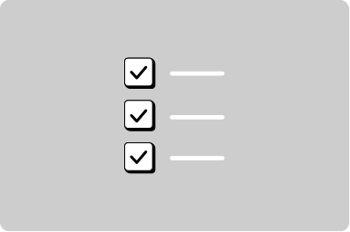
Use checkboxes when the user can select more than one option.

The form item automatically associates the label with the input for screen readers, ensuring your form is accessible.

Use a form item wrapper on all inputs to add a label, helper text, error message, and more.

Positioning

Put the checkbox input to the left of the label.
List checkbox options vertically.
Don't list options horizontally when showing more than two options.

States

Submit

When you must disable a button or input:

  • Provide nearby text explaining what needs to happen first
  • Consider showing the element enabled with validation on submit instead
  • Use aria-describedby to link the disabled element to explanatory text
Don't disable buttons or inputs without explaining why. Disabled controls can be confusing and users may not understand why they can't interact with an element.
All GoA Design System components are built to meet WCAG 2.2 AA standards. The following guidelines provide additional context for accessible implementation.

No accessibility-specific guidelines have been documented for this component yet.

View old component docs