Tabs
Let users navigate between related sections of content, displaying one section at a time.
Props
initialTab
number
The initially active tab (1-based index). If not set, the first tab is active.
navigation
GoabTabsNavigation
Controls URL navigation mode on tab change.
Defaults to
hash.
orientation
GoabTabsOrientation
Tab layout orientation. "auto" stacks vertically on mobile, "horizontal" keeps horizontal on all screen sizes.
Defaults to
auto.
testId
string
Sets a data-testid attribute for automated testing.
variant
GoabTabsVariant
Visual style variant. "segmented" shows pill-style tabs with animation.
Defaults to
default.
Events
onChange
(detail: GoabTabsOnChangeDetail) => void
Callback fired when the active tab changes.
Tab Props
disabled
boolean
When true, disables the tab so it cannot be selected.
heading
string | React.ReactNode
The text label for this tab. Can also pass React nodes for custom heading content.
slug
string
URL-friendly identifier for the tab, used for hash-based navigation.
Tab ReactNode
heading
ReactNode
The text label for this tab. Can also pass React nodes for custom heading content.
Activate a specific tab with a button
Set a specific tab to be active
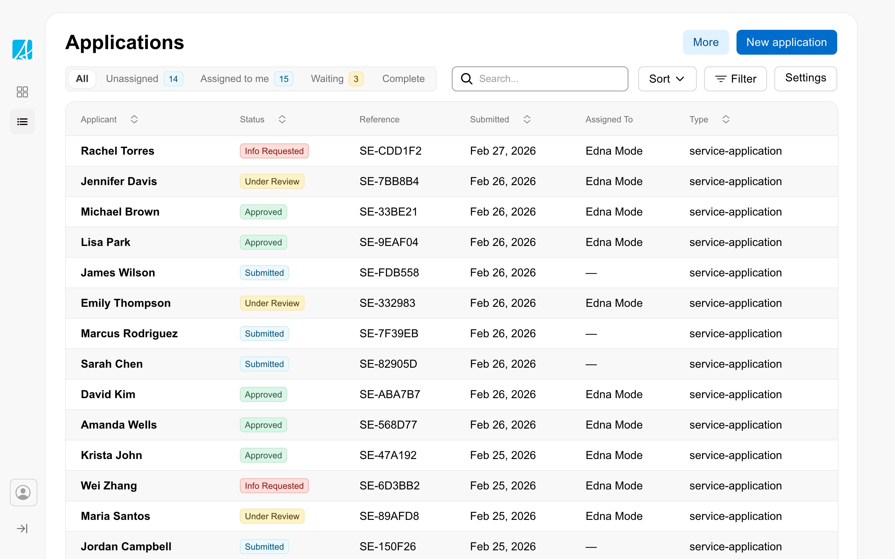
Show different views of data in a table
Usage
Don't
Don't use tabs to indicate progress.
Don't
Don't use tabs if users need to see content from multiple tabs simultaneously.
Don't
Avoid nesting tabs inside other tabs.
Content
Don't
Don't truncate tab labels - use short labels instead.
Interaction
Do
Always have one of the tabs pre-selected on page load.