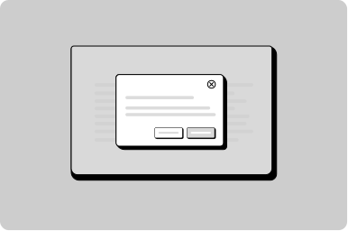
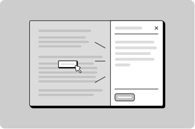
Drawer
A panel that slides in from the side of the screen to display additional content or actions without navigating away from the current view.
Props
position
GoabDrawerPosition
The position of the drawer.
heading
string | ReactNode
The heading text displayed at the top of the drawer. Accepts a string or a ReactNode for custom heading content.
maxSize
GoabDrawerSize
Sets max height on bottom position, sets width on left and right position.
open
boolean
Whether the drawer is open.
testId
string
Sets a data-testid attribute for automated testing.
Events
onClose
() => void
Callback fired when the drawer requests to be closed.
ReactNode
actions
ReactNode
Action elements rendered in the drawer footer slot.
heading
ReactNode
The heading text displayed at the top of the drawer. Accepts a string or a ReactNode for custom heading content.
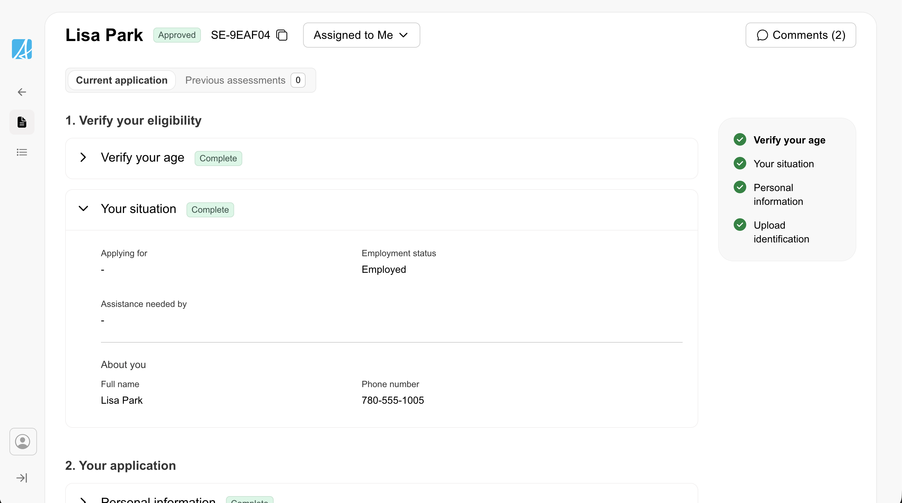
Types
Tip
Use position='right' for forms and detail panels. Use position='bottom' for mobile-friendly bottom sheets.
Other
Don't
Don't use a push drawer for tasks that require the user's full attention. Use a regular drawer instead — it blocks interaction with the background and focuses the user on the task.