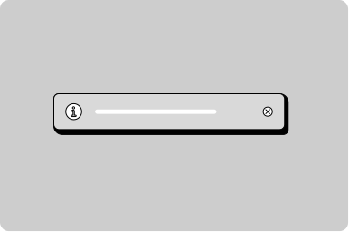
Temporary notification
A notification that appears at the bottom of the screen.
Props
horizontalPosition
SnackbarHorizontalPosition
Horizontal position of the notification container.
Defaults to
center.
testId
string
Sets a data-testid attribute for automated testing.
verticalPosition
SnackbarVerticalPosition
Vertical position of the notification container.
Defaults to
bottom.
show()
Displays a temporary notification from your component. Returns the notification's UUID, which you can use to dismiss it or update its progress.
TemporaryNotification.show(message, options): stringmessage
string
The message to display in the notification.
options.type
GoabTemporaryNotificationTypebasic | success | failure | indeterminate | progress
The type of notification, which determines its styling and icon. Use "indeterminate" to show an animated progress bar while work of unknown length runs, or "progress" to show a progress bar you update with setProgress(). Defaults to "basic".
options.duration
"long" | "medium" | "short" | number
How long the notification stays before it auto-dismisses: "short" (about 3 seconds), "medium" (about 4 seconds), "long" (about 6 seconds), or a number of milliseconds. Only "basic", "success", and "failure" notifications auto-dismiss (default "short"). "indeterminate" and "progress" notifications have no default duration and stay until you dismiss them.
options.actionText
string
Text for an action button. When set, the notification shows a button the user can select.
options.action
() => void
Function to run when the action button is selected.
options.cancelUUID
string
UUID of an existing notification to cancel when this one is shown.
dismiss()
Hides a notification, using the UUID that show() returns.
TemporaryNotification.dismiss(uuid): voiduuid
string
The UUID of the notification to dismiss. This is the value that show() returns.
setProgress()
Updates the progress shown on a progress notification, using the UUID that show() returns.
TemporaryNotification.setProgress(uuid, progress): voiduuid
string
The UUID of the progress notification to update. This is the value that show() returns.
progress
number
The progress to display, from 0 to 100.
Show a notification
Show a notification with an action
Show a user progress
Show a user progress when the time is unknown
Types
Tip
For temporary toast-style messages, use TemporaryNotification instead of Notification. Notification stays on screen until dismissed.
Don't
Don't show critical errors that require user action in a temporary notification. They auto-dismiss and can be missed. Use Callout or Notification instead.