Badge

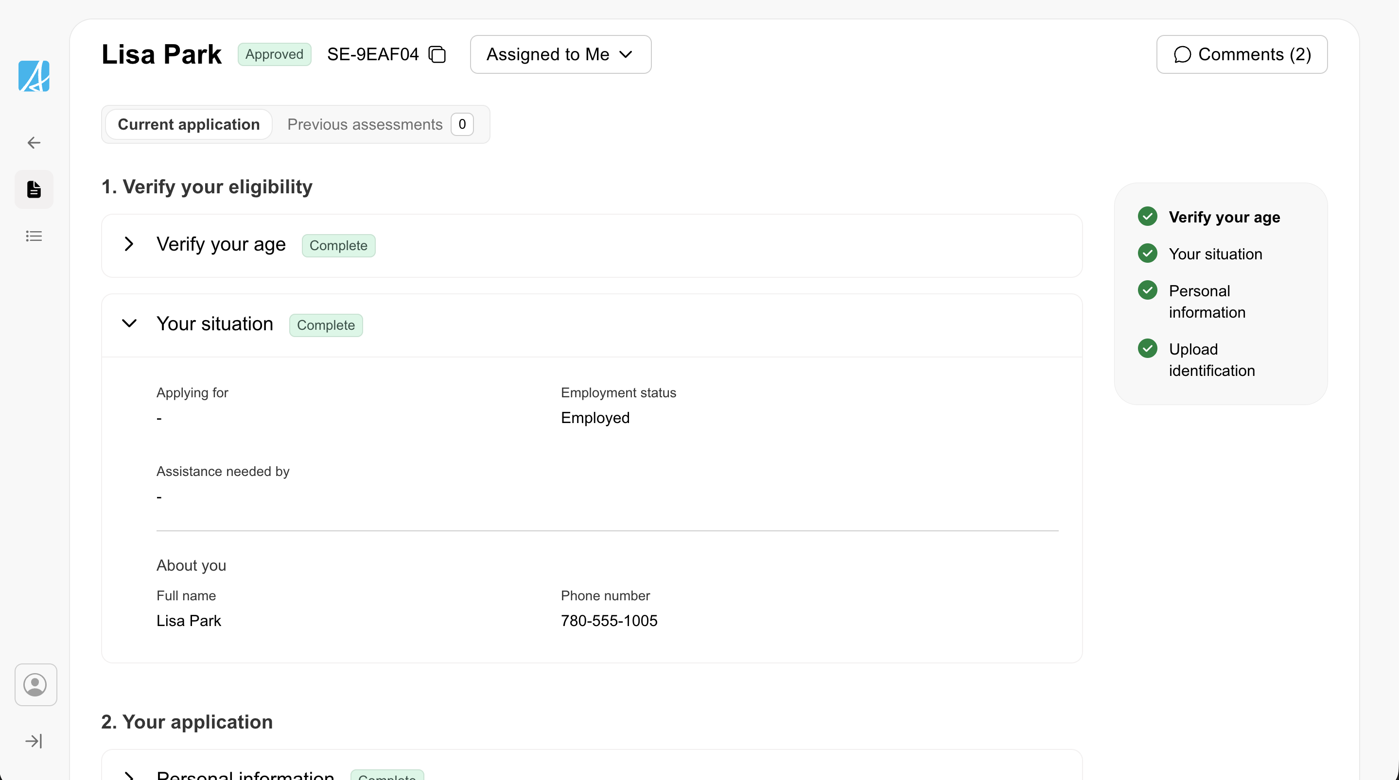
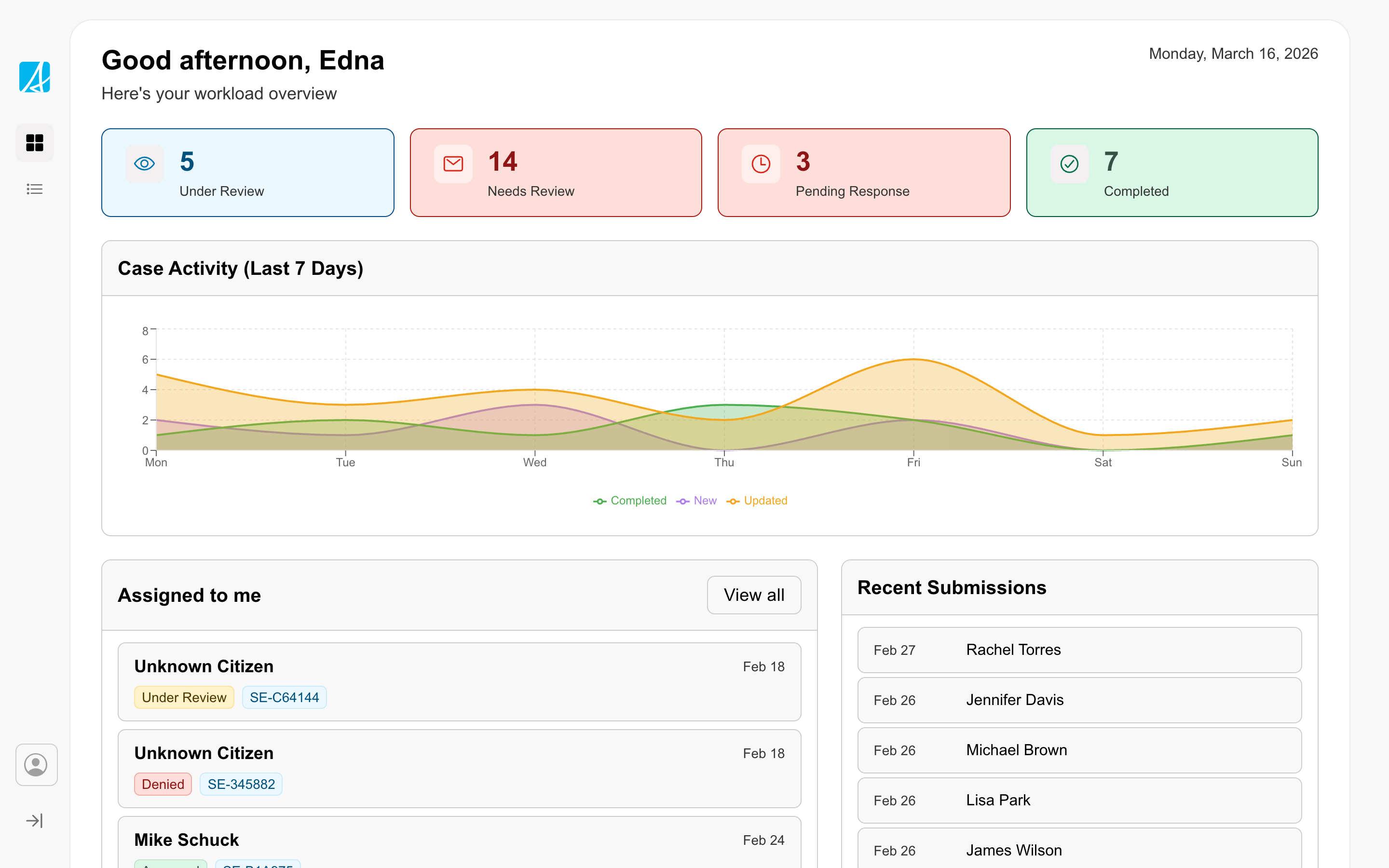
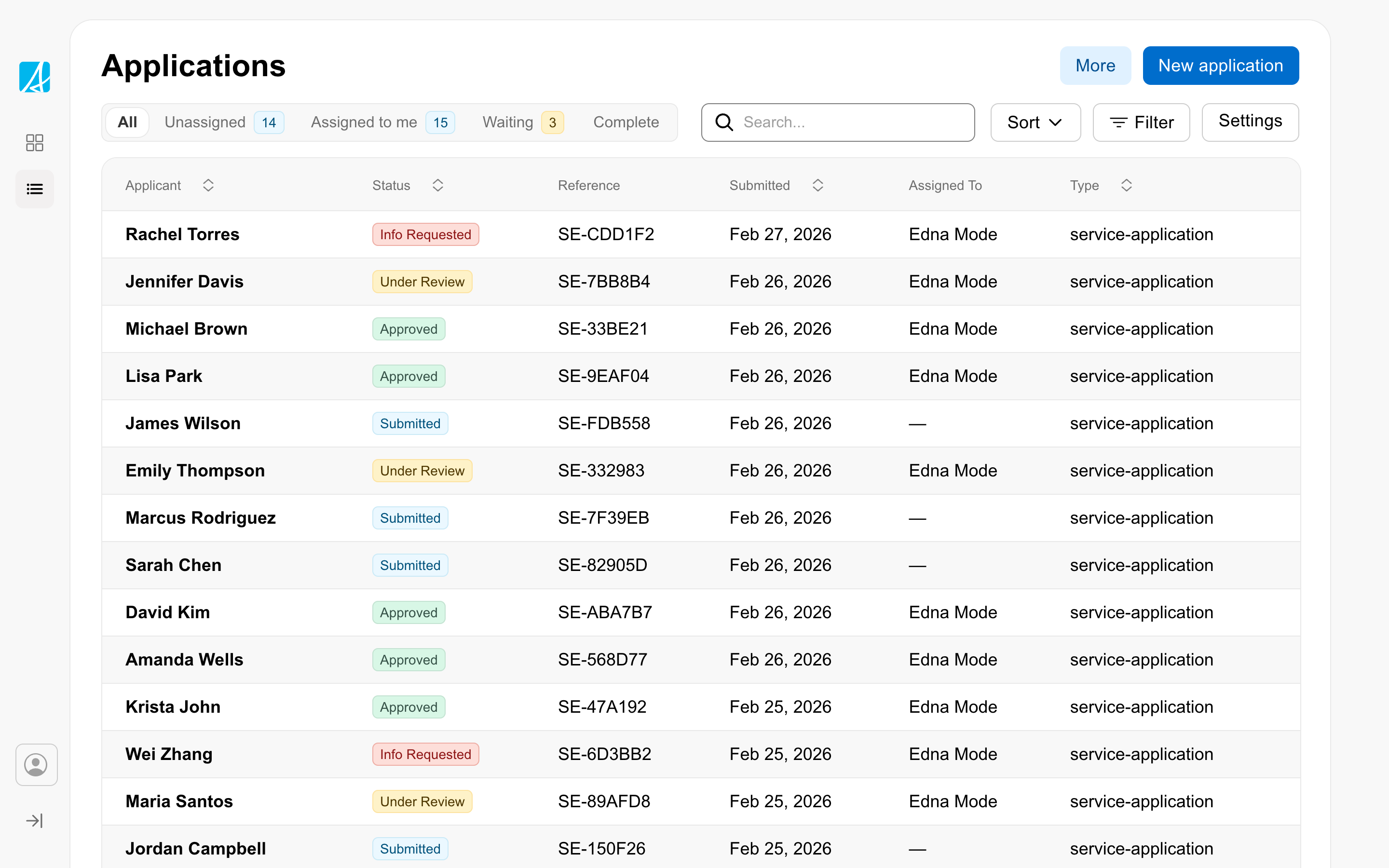
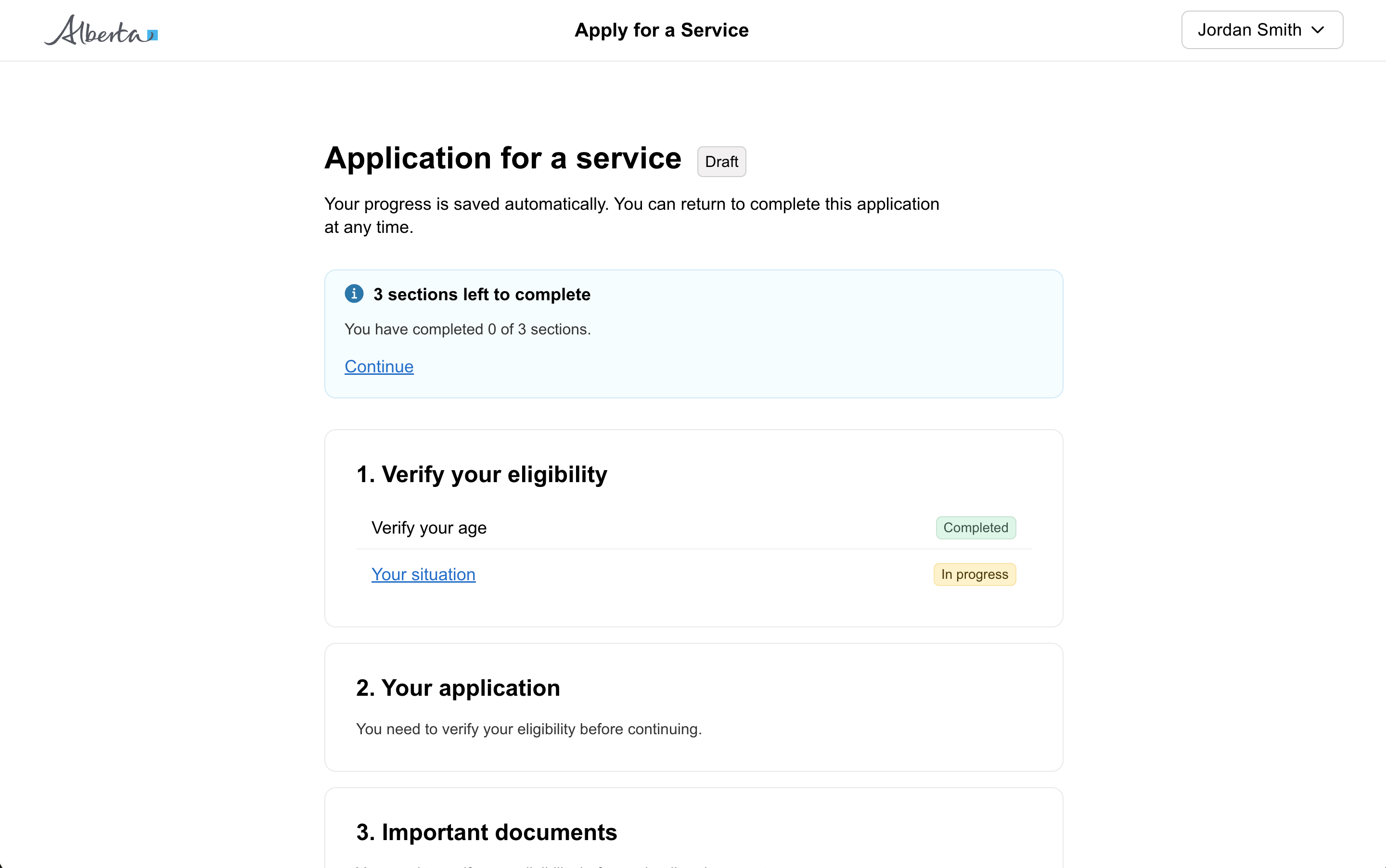
Small labels which hold small amounts of information, system feedback, or states.

Props

type
GoabBadgeType
Sets the context and colour of the badge.
ariaLabel
string
Accessible label for screen readers.
emphasis
GoabBadgeEmphasis
Sets the visual emphasis. 'subtle' for less prominent, 'strong' for more emphasis.
Defaults to strong.
iconType
GoabIconType
Icon type to display in the badge.
size
GoabBadgeSize
Sets the size of the badge.
Defaults to medium.
testId
string
Sets a data-testid attribute for automated testing.
mt, mr, mb, ml
Spacing
Apply margin to the top, right, bottom, and/or left of the component.
ariaLabel
string
Sets the accessible label for screen readers.
content
string | TemplateRef<unknown>
Sets the content displayed in the badge. Accepts a string or template for custom content.
emphasis
GoabBadgeEmphasis
Sets the visual emphasis. 'subtle' for less prominent, 'strong' for more emphasis.
Defaults to strong.
iconType
GoabIconType
Sets the icon type to display in the badge.
size
GoabBadgeSize
Sets the size of the badge.
Defaults to medium.
testId
string
Sets the data-testid attribute for automated testing.
type
GoabBadgeType
Sets the context and colour of the badge.
mt, mr, mb, ml
Spacing
Apply margin to the top, right, bottom, and/or left of the component.
type
GoabBadgeType information | important | emergency | success | dark | midtone | light | archived | aqua | black | blue | green | orange | pink | red | violet | white | yellow | aqua-light | black-light | blue-light | green-light | orange-light | pink-light | red-light | violet-light | yellow-light | sky | prairie | lilac | pasture | sunset | dawn | default
Defines the context and colour of the badge.
arialabel
string
Accessible label for screen readers.
content
string
Content displayed in the badge. Use the content slot for custom HTML in version 2.
emphasis
Sets the visual emphasis. 'subtle' for less prominent, 'strong' for more emphasis.
Defaults to strong.
icontype
GoabIconType
Icon type to display in the badge.
justify-content
"center" | "flex-start" | "flex-end" | "space-between" | ""
justify-content value for the badge container.
min-width
string
min-width value for the badge container (e.g. "20px", "var(--goa-space-m)").
size
GoabBadgeSize medium | large
Sets the size of the badge.
Defaults to medium.
testid
string
Sets a data-testid attribute for automated testing.
version
GoabBadgeVersion 1 | 2
Design system version for styling.
Defaults to 1.
mt, mr, mb, ml
Spacing
Apply margin to the top, right, bottom, and/or left of the component.

ReactNode

content
ReactNode
Content displayed in the badge. Accepts a string or ReactNode for custom content.
content
TemplateRef
Content displayed in the badge. Accepts a string or ngTemplate for custom content.
content
slot
Content displayed in the badge. Accepts a string or ReactNode for custom content.
Examples

Card view of case files

Expand or collapse part of a form

Filter a list using a push drawer

Filter data in a table

Set a specific tab to be active

Show different views of data in a table

Show multiple actions in a compact table

Show multiple tags together

Show status in a table

Show status on a card
Other

Edit
Don't use a primary button to edit a badge.
Use badges for information and organization, not interactivity.
Edit
Use a tertiary button next to a badge if it needs to be manually updated.

Types

Don't style badges to look like buttons.
Don't use interactive colours. These are reserved for links, buttons, and other interactive elements.
Match badge type to the status it represents
FilterChip is for removable filters that users can dismiss. For static labels or status indicators, use Badge instead.

Content

Use sentence case for badge text. Capitalize the first word only.
Use short, concise text in badges.
All GoA Design System components are built to meet WCAG 2.2 AA standards. The following guidelines provide additional context for accessible implementation.

Screen Readers

Icon-only interactive elements must have an accessible label so screen reader users understand their purpose.

For IconButton: The ariaLabel prop is required.

// Good - describes the action
<GoabIconButton icon="trash" ariaLabel="Delete item" />

// Bad - no label for screen readers
<GoabIconButton icon="trash" />

For Badge with icon only: Provide ariaLabel when there’s no visible text.

<GoabBadge icon="warning" ariaLabel="Warning" type="important" />

For Icon: Use ariaLabel when the icon conveys meaning, not just decoration.

The label should describe:

  • What action happens (for buttons): “Delete”, “Edit”, “Close”
  • What the icon represents (for informational icons): “Warning”, “Success”

For decorative icons: Set ariaHidden to true when nearby text or the parent control already communicates the same meaning. This prevents screen readers from announcing duplicate information.

<GoabIcon type="checkmark-circle" ariaHidden />
<span>Application saved</span>

Do not use ariaHidden to replace a missing accessible label. If the icon provides information that is not available elsewhere, use ariaLabel instead.
Don't use icon-only elements without an accessible label
When using an icon-only badge, ariaLabel is required so screen readers can identify it.
View old component docs