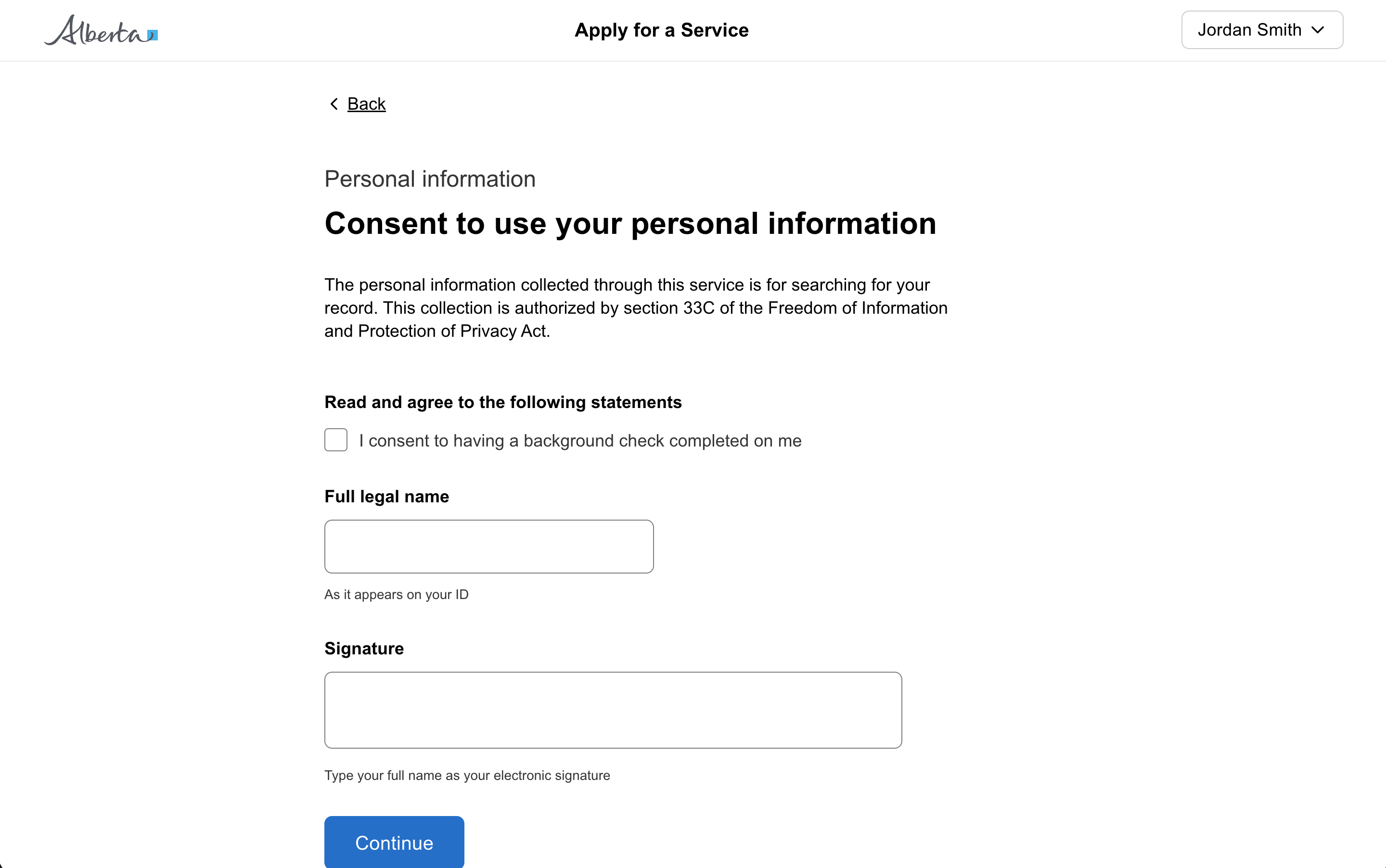
Dropdown

Present a list of options to the user to select from.

Props

ariaLabel
string
Defines how the selected value will be translated for the screen reader. If not specified it will fall back to the name.
ariaLabelledBy
string
The aria-labelledby attribute identifies the element that labels the dropdown. Normally it is the id of the label.
autoComplete
string
Specifies the autocomplete attribute for the dropdown input. Native only.
disabled
boolean
Disables the dropdown control.
error
boolean
Shows an error state on the dropdown.
filterable
boolean
When true, allows filtering options by typing into the input field.
id
string
The id attribute for the dropdown element.
leadingIcon
GoabIconType
Icon shown to the left of the dropdown input.
maxHeight
string
Maximum height of the dropdown menu. Non-native only.
Defaults to 276px.
maxWidth
string
Sets the maximum width of the dropdown. Use a CSS unit (px, %, ch, rem, em).
name
string
Identifier for the dropdown. Should be unique.
native
boolean
When true, renders the native select HTML element.
noResults
string
Sets the text displayed when filtering returns no results.
Defaults to No matches found.
placeholder
string
The text displayed in the dropdown before a selection is made. Non-native only.
size
GoabDropdownSize
Sets the size of the dropdown. Compact reduces height for dense layouts.
testId
string
Sets a data-testid attribute for automated testing.
value
string[] | string
The currently selected value(s) of the dropdown.
width
string
Overrides the autosized menu width. Non-native only.
mt, mr, mb, ml
Spacing
Apply margin to the top, right, bottom, and/or left of the component.
ariaLabel
string
Defines how the selected value will be translated for the screen reader. If not specified it will fall back to the name.
ariaLabelledBy
string
The aria-labelledby attribute identifies the element(or elements) that labels the dropdown it is applied to. Normally it is the id of the label.
autoComplete
string
Specifies the autocomplete attribute for the dropdown input. Native only.
disabled
boolean
Sets the disabled state for the control.
error
boolean
Sets the error state for the control.
filterable
boolean
When true the dropdown will have the ability to filter options by typing into the input field.
id
string
Sets the id attribute of the underlying web component.
leadingIcon
GoabIconType
Icon shown to the left of the dropdown input.
maxHeight
string
Maximum height of the dropdown menu. Non-native only.
maxWidth
string
Sets the maximum width of the dropdown. Use a CSS unit (px, %, ch, rem, em).
name
string
Identifier for the dropdown. Should be unique.
native
boolean
When true will render the native select HTML element.
noResults
string
Sets the text displayed when filtering returns no results.
Defaults to No matches found.
placeholder
string
The text displayed for the dropdown before a selection is made. Non-native only.
size
GoabDropdownSize
Sets the size of the dropdown. Compact reduces height for dense layouts.
Defaults to default.
testId
string
Sets the data-testid attribute for automated testing.
value
string[] | string
Sets the control value used by Angular forms and one-way binding.
width
string
Overrides the autosized menu width. Non-native only.
mt, mr, mb, ml
Spacing
Apply margin to the top, right, bottom, and/or left of the component.
name
string
Identifier for the dropdown. Should be unique.
arialabel
string
Defines how the selected value will be translated for the screen reader. If not specified it will fall back to the name.
arialabelledby
string
The aria-labelledby attribute identifies the element(or elements) that labels the dropdown it is applied to. Normally it is the id of the label.
autocomplete
string
Specifies the autocomplete attribute for the dropdown input. Native only.
disabled
boolean true | false
Disable this control.
Defaults to false.
error
boolean true | false
Show an error state.
Defaults to false.
filterable
boolean true | false
When true the dropdown will have the ability to filter options by typing into the input field.
Defaults to false.
leadingicon
GoabIconType
Icon shown to the left of the dropdown input.
maxheight
string
Maximum height of the dropdown menu. Non-native only.
Defaults to 276px.
maxwidth
string
Sets the maximum width of the dropdown. Use a CSS unit (px, %, ch, rem, em).
native
boolean true | false
When true will render the native select HTML element.
Defaults to false.
noresults
string
Sets the text displayed when filtering returns no results.
Defaults to No matches found.
placeholder
string
The text displayed for the dropdown before a selection is made. Non-native only.
size
"default" | "compact"
Sets the size of the dropdown. Compact reduces height for dense layouts.
Defaults to default.
testid
string
Sets a data-testid attribute for automated testing.
value
string
Stores the value of the item selected from the dropdown.
version
"1" | "2"
Design system version for styling.
Defaults to 1.
width
string
Overrides the autosized menu width. Non-native only.
mt, mr, mb, ml
Spacing
Apply margin to the top, right, bottom, and/or left of the component.

Events

onBlur
(detail: GoabDropdownOnBlurDetail) => void
Callback fired when the dropdown loses focus.
onChange
(detail: GoabDropdownOnChangeDetail) => void
Callback fired when the selected value changes.
onFocus
(detail: GoabDropdownOnFocusDetail) => void
Callback fired when the dropdown receives focus.
onBlur
(event: GoabDropdownOnBlurDetail) => void
Emits when the dropdown loses focus.
onChange
(event: GoabDropdownOnChangeDetail) => void
Emits when the user selects a value from the dropdown. Emits a GoabDropdownOnChangeDetail object with the new value.
onFocus
(event: GoabDropdownOnFocusDetail) => void
Emits when the dropdown receives focus.
_blur
CustomEvent<{ name: string }>
_change
CustomEvent<{ name?: string; value?: string; event: Event }>
_focus
CustomEvent<{ name: string }>
value
string
The value submitted when this item is selected.
filter
string
Rich item content. On selection, `label` is shown and `filter` defaults to the content's text.
label
string
Display label for the dropdown item.
mountType
GoabDropdownItemMountType
Controls how the item is registered with the parent dropdown.
testId
string
Sets a data-testid attribute for automated testing.
filter
string
Rich item content. On selection, `label` is shown and `filter` defaults to the content's text.
label
string
Display label for the dropdown item.
mountType
GoabDropdownItemMountType
Controls how the item is registered with the parent dropdown.
name
string
Sets the name attribute of the dropdown item.
value
string
The value submitted when this item is selected.
filter
string
Additional text used to match this item in typeahead search, alongside the label. Defaults to the slotted content's text.
label
string
Display label for the dropdown item.
mount
"append" | "prepend" | "reset"
Controls how the item is registered with the parent dropdown.
Defaults to reset.
value
string
The value submitted when this item is selected.
Examples

Add a record using a drawer

Add and edit lots of filters

Add another item in a modal

Ask a user for an address

Dynamically add an item to a dropdown list

Dynamically change items in a dropdown list

Filter a list using a push drawer

Question page

Question page preview
More info

Review and action

Show number of results per page

States

Submit

When you must disable a button or input:

  • Provide nearby text explaining what needs to happen first
  • Consider showing the element enabled with validation on submit instead
  • Use aria-describedby to link the disabled element to explanatory text
Don't disable buttons or inputs without explaining why. Disabled controls can be confusing and users may not understand why they can't interact with an element.

Sizing

Define dropdown widths based on the widest dropdown in the form.
Use the default width for dropdowns. The dropdown automatically sets its width based on the length of the options.

Positioning

Don't allow the dropdown menu to hide below the viewport.

Content

Don't truncate labels. Longer labels should wrap to the next line.

Placeholder text disappears when users start typing, leaving them without context for what the field is asking for.

Always use a visible label above or beside the input field. Placeholder text can provide an example of the expected format, but should never be the only indication of what information is needed.

Don't use placeholder text as a label

Interaction

A filterable dropdown searches an item's label and the text of its content, but not text rendered inside a nested component such as a Badge. Use the filter property to add those terms to the search.

Types

The native dropdown renders a native select element, which cannot contain HTML. Items with rich content fall back to their label, so set a label on every item that you also give content to.

Other

The form item automatically associates the label with the input for screen readers, ensuring your form is accessible.
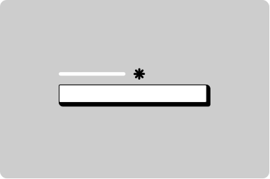
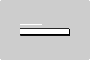
Use a form item wrapper on all inputs to add a label, helper text, error message, and more.
All GoA Design System components are built to meet WCAG 2.2 AA standards. The following guidelines provide additional context for accessible implementation.

Screen Readers

When a Dropdown is not wrapped in a FormItem, set ariaLabel to provide an accessible name. Without it, screen readers won't be able to identify the dropdown.

Accessibility

Don't put buttons, links, inputs, or other interactive elements in an item's content. Each item is a listbox option, so nested controls are not in the tab order and cannot be reached by keyboard, and clicking one selects the item instead of activating the control. Use text, icons, and badges instead.
View old component docs