Button
Carry out an important action or navigate to another page.
Props
normal.
primary.
normal.
Events
Activate a specific tab with a button
Add a filter chip
Button with Icon
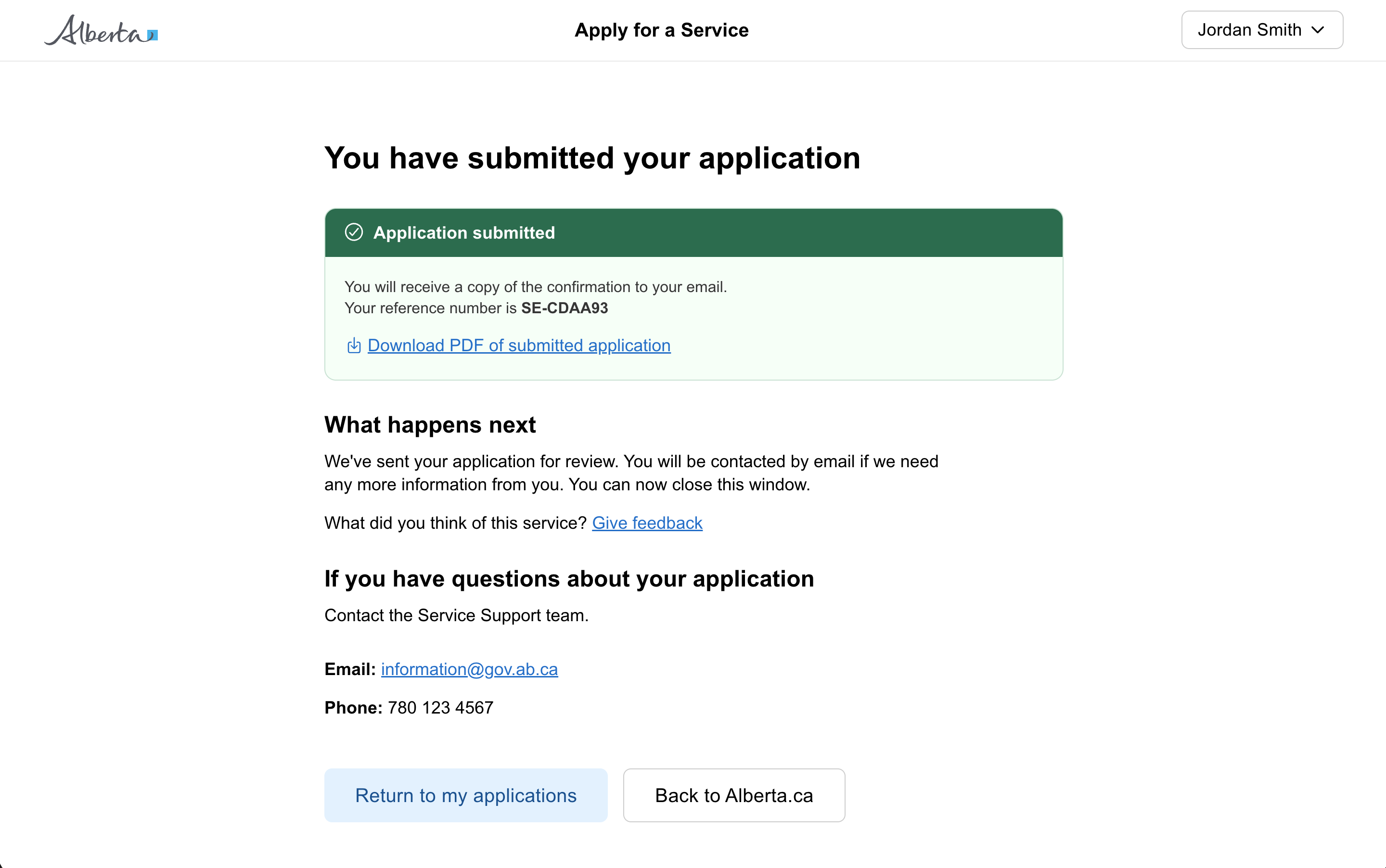
Card view of case files
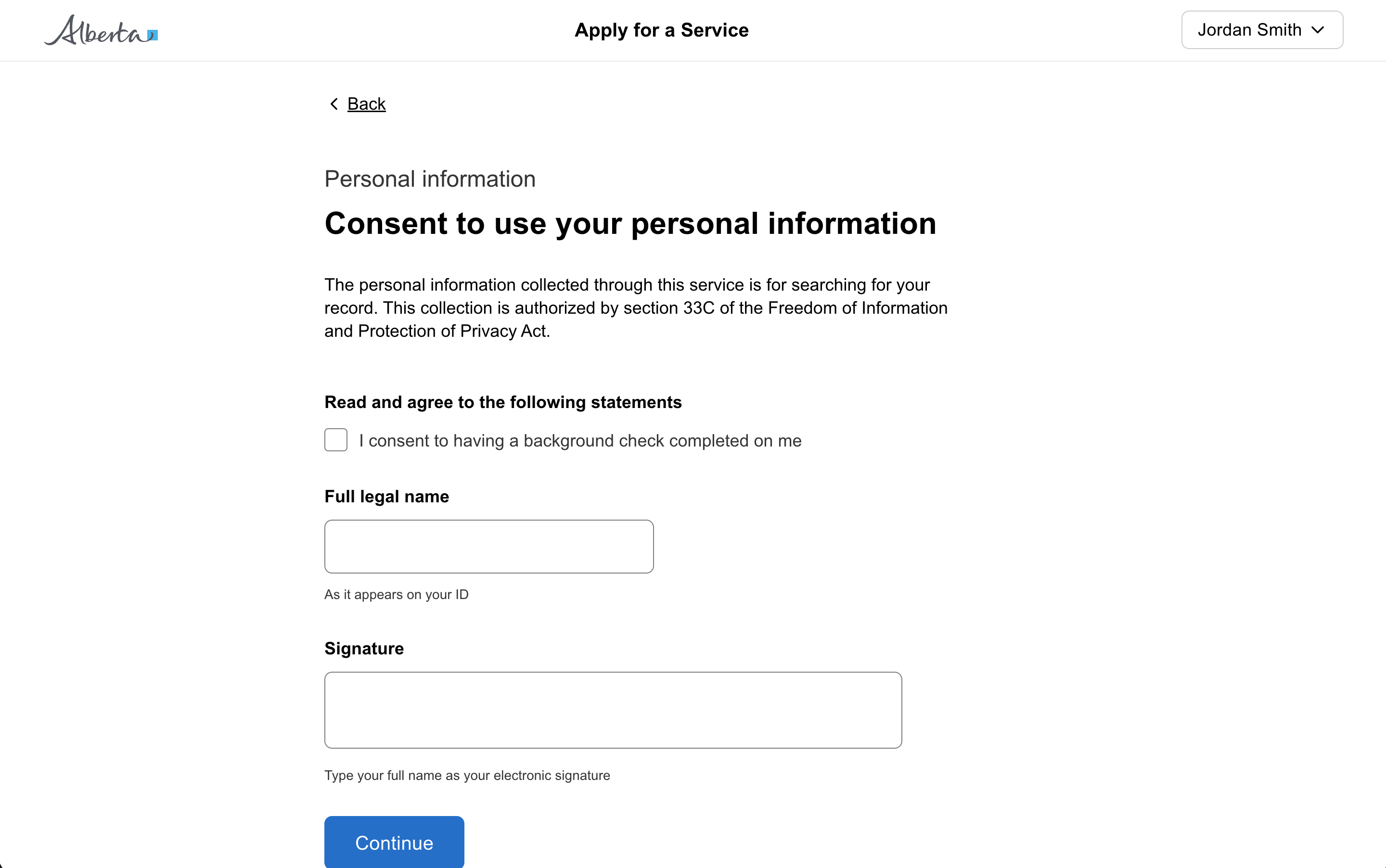
Disabled button with a required field
Display user information
Dynamically add an item to a dropdown list
Filter a list using a push drawer
Filter data in a table
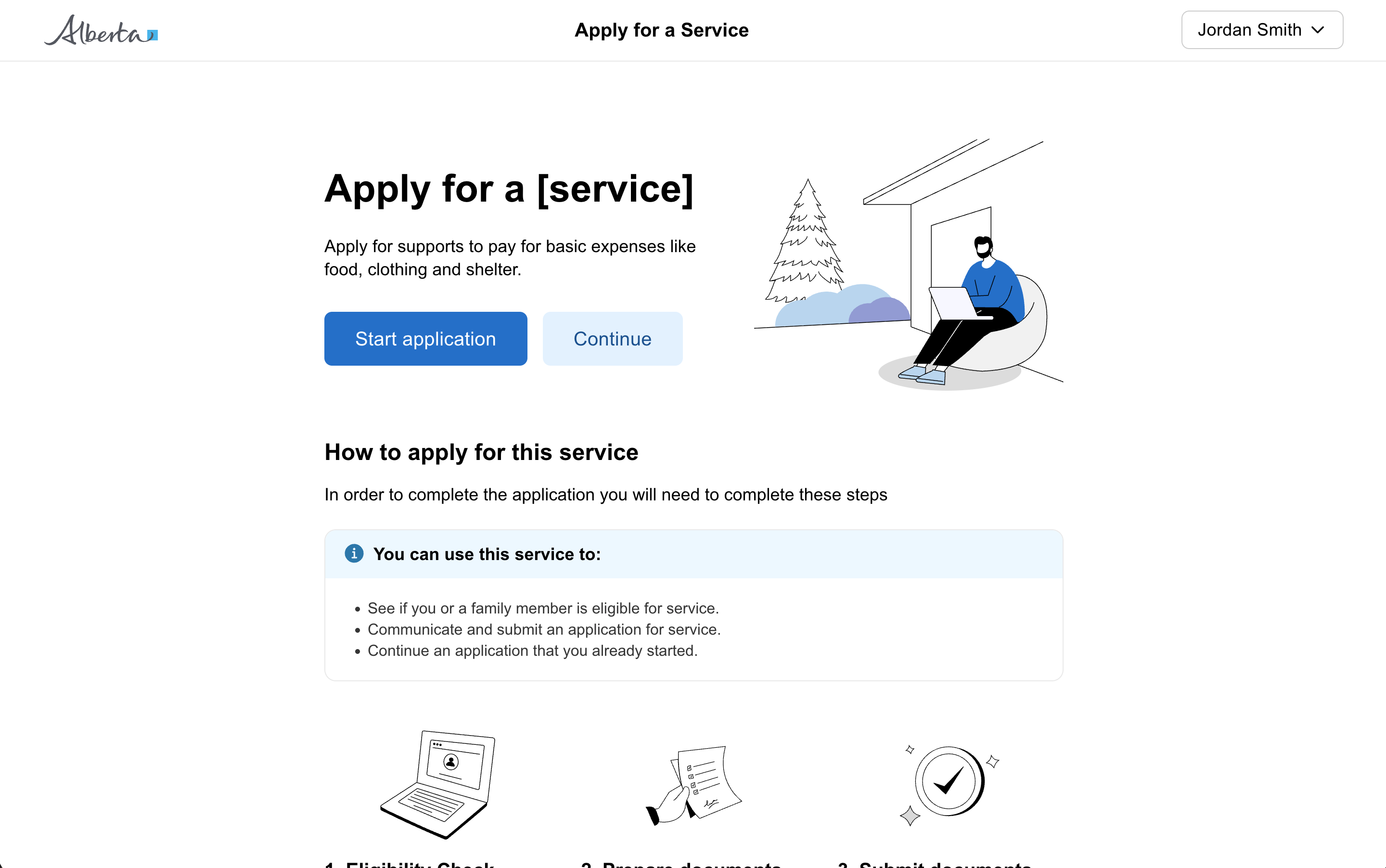
Hero banner with actions
Question page

Reset date picker field
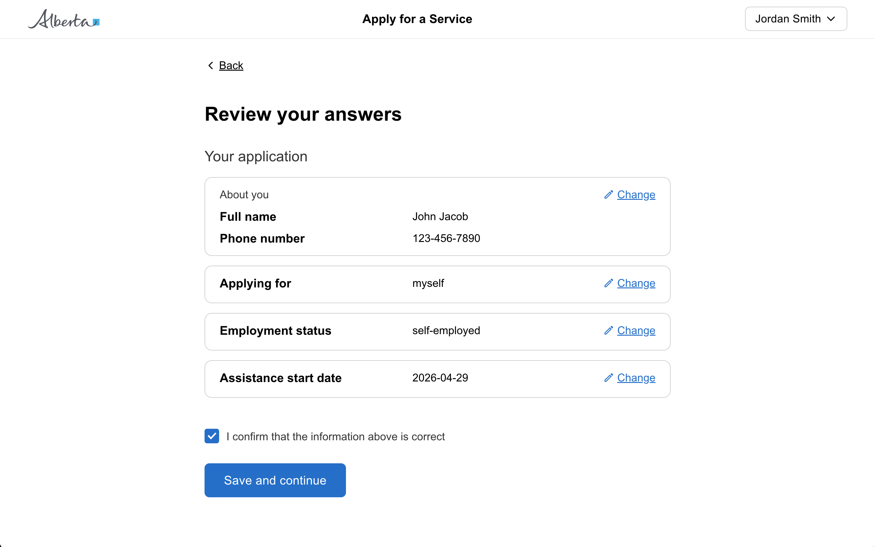
Review and action
Set a specific tab to be active
Show a notification
Show a notification with an action
Show a user progress
Show a user progress when the time is unknown
Show different views of data in a table
Show status in a table
States
Only use disabled buttons if research shows it makes the user interface easier to understand.
Consider removing options that are unavailable or not applicable. Show actions that are only relevant and useful to the user at a given time.
Instead of disabling a submit button, keep it enabled and provide clear feedback about any missed fields or input errors when the user tries to submit the form.
When you must disable a button or input:
- Provide nearby text explaining what needs to happen first
- Consider showing the element enabled with validation on submit instead
- Use aria-describedby to link the disabled element to explanatory text
Sizing
Content
Types
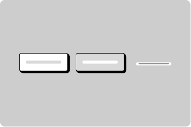
- Primary - If there is only one button on a page, it should be a primary button. For citizen facing applications, generally there should only be one primary button on a page.
- Secondary - Use secondary buttons for less important actions on a page. Often paired with a primary action as a secondary action.
- Tertiary - Use tertiary buttons for links that should function like a button, such as “edit” or “cancel” in applications. It’s okay to use more than one tertiary button on a page.
This distinction matters for screen reader users who expect different behaviors, keyboard navigation patterns, and browser history.
Icons
Positioning
Other
Screen Readers
For icon buttons with both a label and icon, hide the icon from the screen reader so it announces “Button, add row” not “Button, cross icon, add row”.