Badge
Small labels which hold small amounts of information, system feedback, or states.
Props
strong.
medium.
ReactNode
Card view of case files
Filter a list using a push drawer
Filter data in a table
Set a specific tab to be active
Show different views of data in a table
Show multiple actions in a compact table
Show multiple tags together
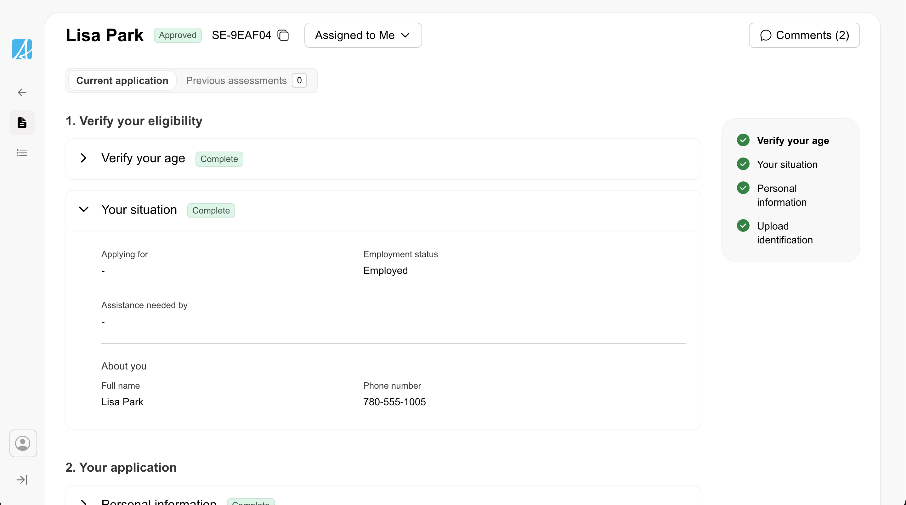
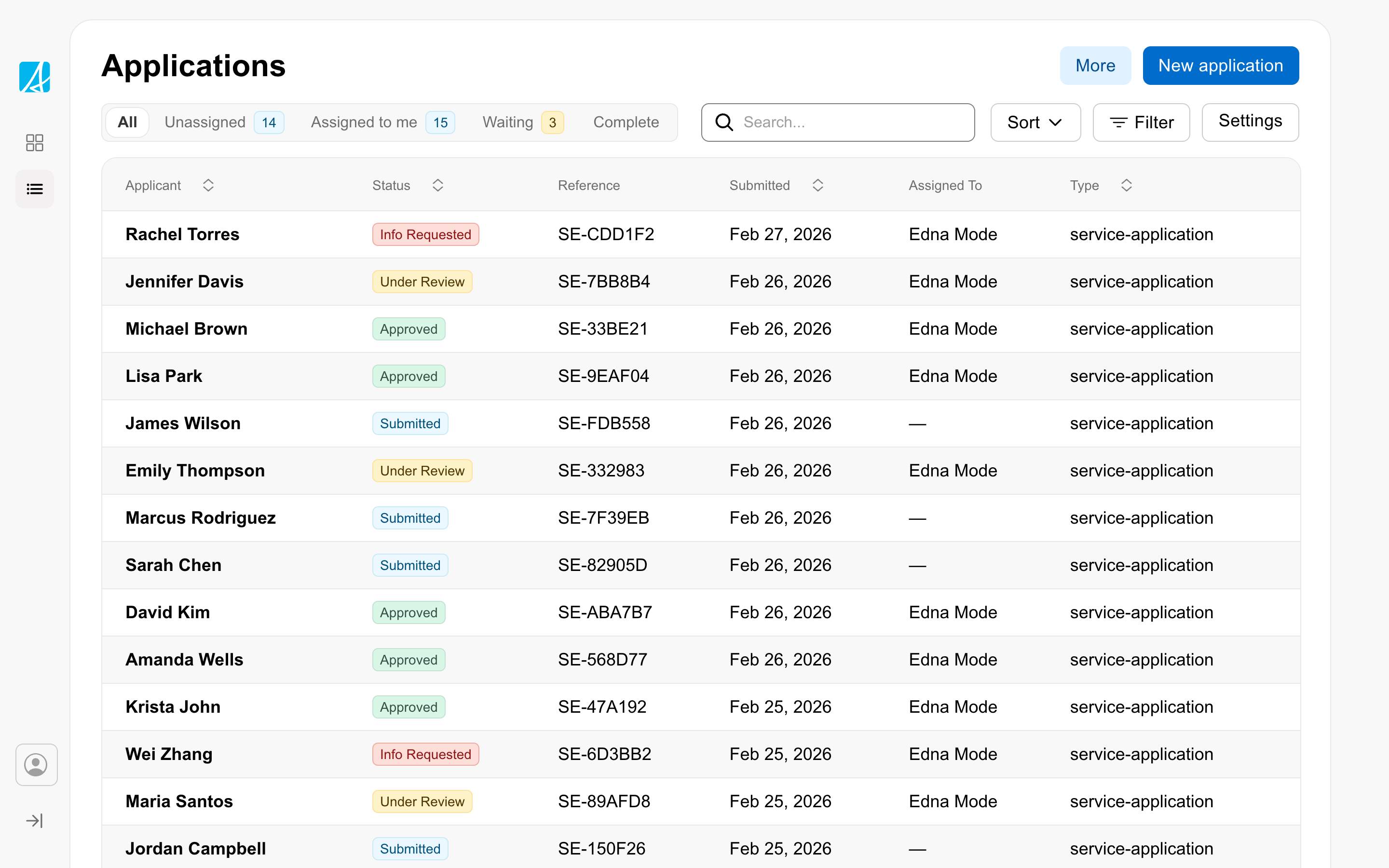
Show status in a table
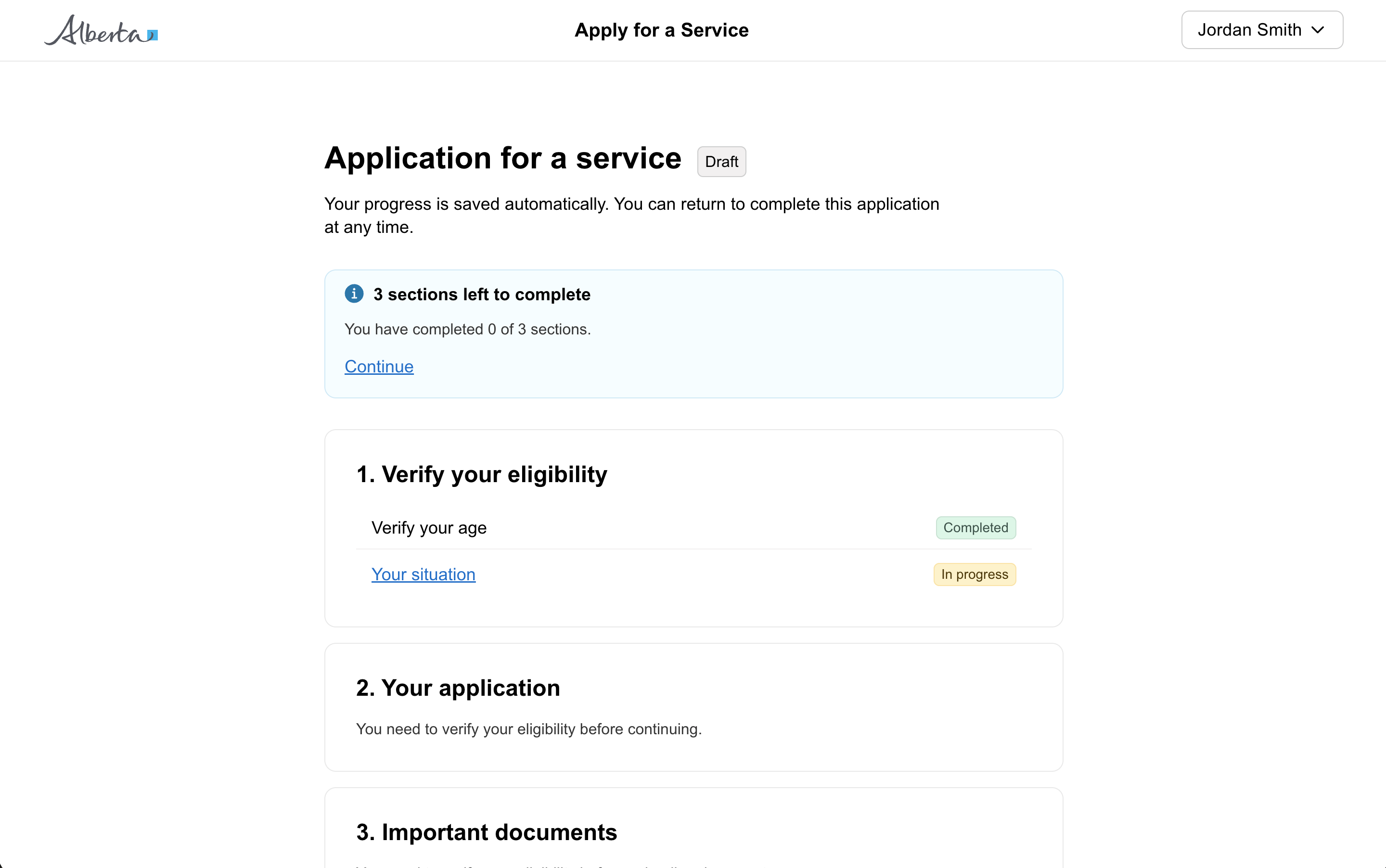
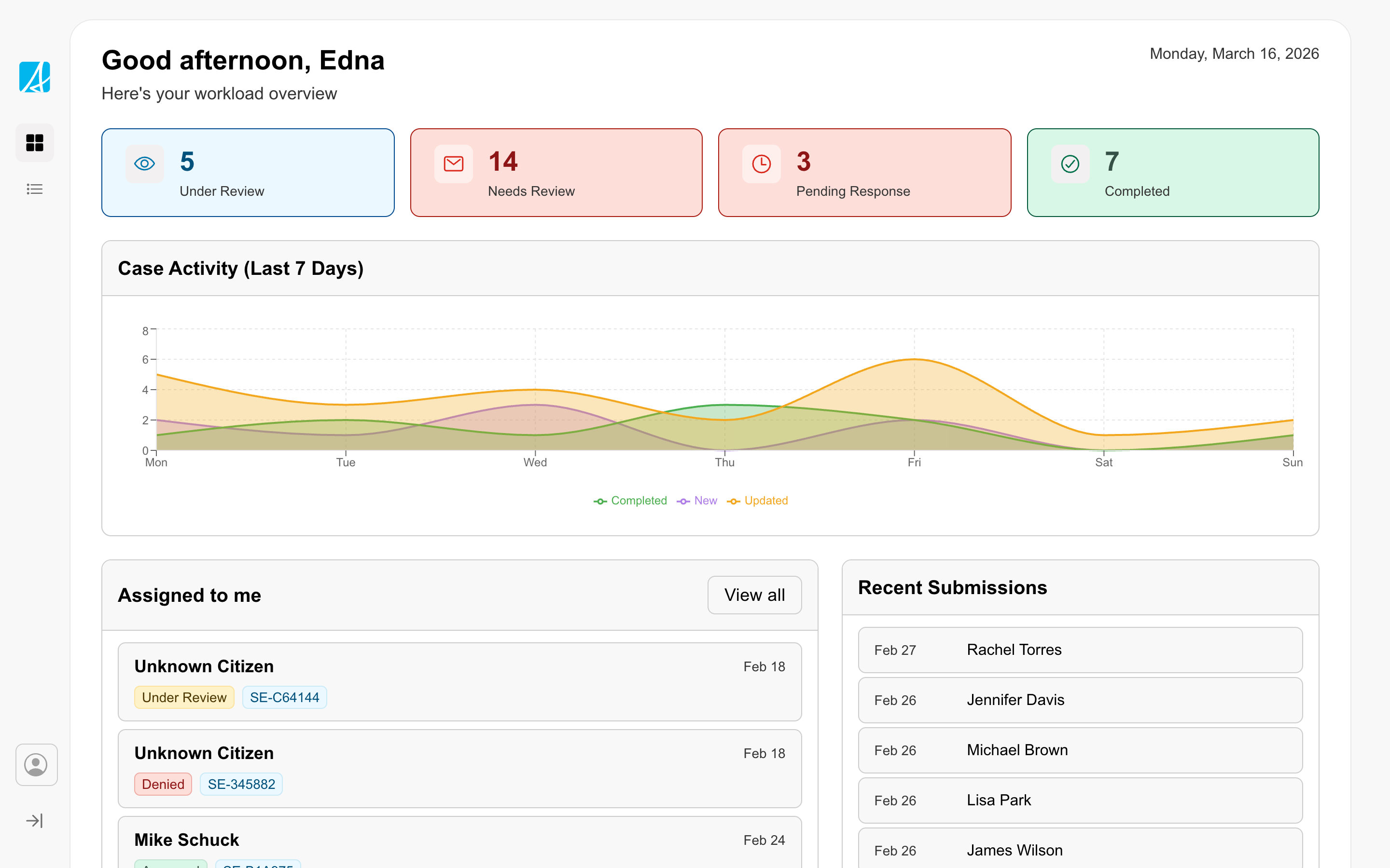
Show status on a card
Other
Types
Content
Screen Readers
Icon-only interactive elements must have an accessible label so screen reader users understand their purpose.
For IconButton: The ariaLabel prop is required.
// Good - describes the action
<GoabIconButton icon="trash" ariaLabel="Delete item" />

// Bad - no label for screen readers
<GoabIconButton icon="trash" />
For Badge with icon only: Provide ariaLabel when there’s no visible text.
<GoabBadge icon="warning" ariaLabel="Warning" type="important" />For Icon: Use ariaLabel when the icon conveys meaning, not just decoration.
The label should describe:
- What action happens (for buttons): “Delete”, “Edit”, “Close”
- What the icon represents (for informational icons): “Warning”, “Success”
For decorative icons: Set ariaHidden to true when nearby text or the parent control already communicates the same meaning. This prevents screen readers from announcing duplicate information.
<GoabIcon type="checkmark-circle" ariaHidden />
<span>Application saved</span>
Do not use ariaHidden to replace a missing accessible label. If the icon provides information that is not available elsewhere, use ariaLabel instead.