Defines how this option will be announced by screen readers.
compact
boolean
Reduces spacing for dense layouts.
description
string | React.ReactNode
Additional description text displayed below the label.
disabled
boolean
Disables this radio option. Also disabled if the parent RadioGroup is disabled.
error
boolean
Shows an error state on this radio option.
label
string
The display label for this radio option. Falls back to value if not provided.
maxWidth
string
Sets the maximum width of this radio item.
name
string
The name of the radio group. Inherited from the parent RadioGroup if not set.
revealAriaLabel
string
Text announced by screen readers when the reveal content is displayed.
value
string
The value of this radio option. Will be emitted when selected.
mt, mr, mb, ml
Spacing
Apply margin to the top, right, bottom, and/or left of the component.
ariaLabel
string
Defines how this option will be announced by screen readers.
compact
boolean
Enables compact layout for the radio item, reducing spacing for dense layouts.
description
string | TemplateRef<any>
Additional description text displayed below the label.
disabled
boolean
Disables this radio option. Also disabled if the parent RadioGroup is disabled.
error
boolean
Shows an error state on this radio option.
label
string
The display label for this radio option. Falls back to value if not provided.
maxWidth
string
Sets the maximum width of this radio item.
name
string
The name of the radio group. Inherited from the parent RadioGroup if not set.
revealAriaLabel
string
Text announced by screen readers when the reveal slot content is displayed.
testId
string
Sets the data-testid attribute for automated testing.
value
string
The value of this radio option. Will be emitted when selected.
mt, mr, mb, ml
Spacing
Apply margin to the top, right, bottom, and/or left of the component.
value
string
The value of this radio option. Will be emitted when selected.
arialabel
string
Defines how this option will be announced by screen readers.
description
string
Additional description text displayed below the label.
disabled
boolean true | false
Disables this radio option. Also disabled if the parent RadioGroup is disabled.
Defaults to false.
error
boolean true | false
Shows an error state on this radio option.
Defaults to false.
label
string
The display label for this radio option. Falls back to value if not provided.
maxwidth
string
Sets the maximum width of this radio item.
Defaults to none.
name
string
The name of the radio group. Inherited from the parent RadioGroup if not set.
revealarialabel
string
Text announced by screen readers when the reveal slot content is displayed.
mt, mr, mb, ml
Spacing
Apply margin to the top, right, bottom, and/or left of the component.
Radio Item Events
_radioItemChange
CustomEvent<{ value: string; label: string }>
Radio Item ReactNode
description
ReactNode
Additional description text displayed below the label.
reveal
ReactNode
Content revealed below the radio option when it is selected.
description
TemplateRef
Additional description text displayed below the label.
reveal
TemplateRef
Content revealed below the radio option when it is selected.
description
slot
Additional description text displayed below the label.
reveal
slot
Content revealed below the radio option when it is selected.
Examples
Add a record using a drawer
Add and edit lots of filters
Include descriptions for items in a checkbox list
Question page
More info
Reveal input based on a selection
Review and action
Set a max width on a long radio item
States
Submit
When you must disable a button or input:
Provide nearby text explaining what needs to happen first
Consider showing the element enabled with validation on submit instead
Use aria-describedby to link the disabled element to explanatory text
Don't
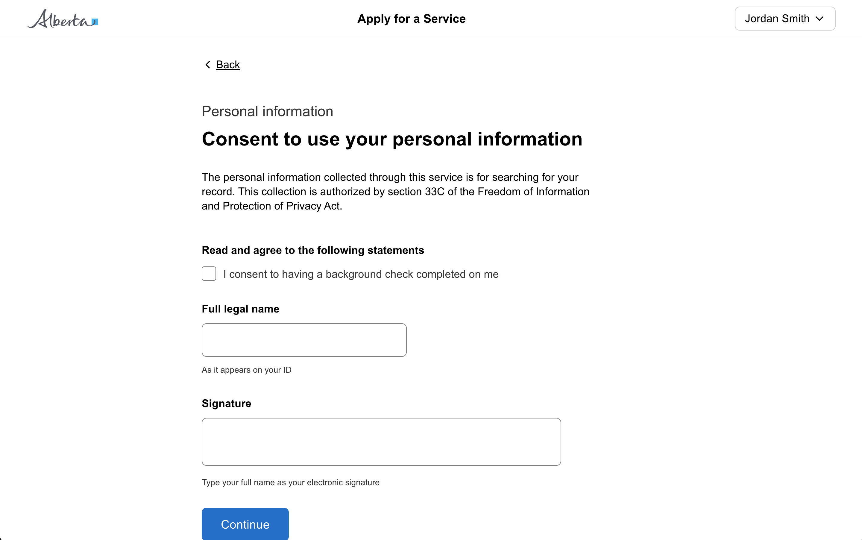
Don't disable buttons or inputs without explaining why. Disabled controls can be confusing and users may not understand why they can't interact with an element.
Other
The form item automatically associates the label with the input for screen readers, ensuring your form is accessible.
Do
Use a form item wrapper on all inputs to add a label, helper text, error message, and more.
Tip
Use the reveal slot to show additional content when a radio option is selected, like a follow-up question or input field.
Tip
Always use RadioGroup as the parent for sets of RadioItem children. Don't try to build radio button sets manually.
Content
Tip
Use the description prop to add context on radio options where the label alone isn't enough to explain the choice.
Don't
Don't include a period after a radio label.
Usage
Don't
Don't use radios when there are more than 7 options - use a dropdown instead.
Interaction
Don't
Don't nest multiple layers of conditionally revealed questions.
Don't
Don't preselect radio items - users might miss the question or submit the wrong answer.
Layout
Do
Consider horizontal listing when presenting 2-3 short options like Yes/No.
All GoA Design System components are built to meet WCAG 2.2 AA standards.
The following guidelines provide additional context for accessible implementation.
Screen Readers
Warning
When using the reveal slot, set revealAriaLabel so screen readers announce the newly visible content.