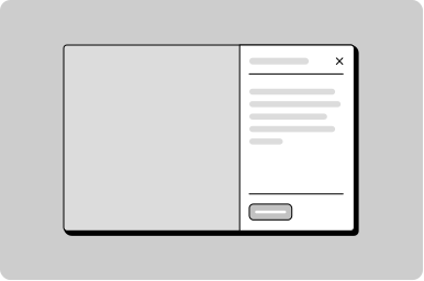
Push Drawer
A panel that pushes the main page content aside on desktop, falling back to an overlay drawer on smaller screens.
Props
heading
string | ReactNode
Sets the heading text or custom heading content.
open
boolean
Controls the open/closed state of the push drawer.
testId
string
Sets a data-testid attribute for automated testing.
width
string
Sets the width of the push drawer panel.
Defaults to
492px.
Events
onClose
() => void
Callback fired when the push drawer is closed.
ReactNode
actions
ReactNode
Content rendered in the actions slot, typically action buttons.
heading
ReactNode
Sets the heading text or custom heading content.
Filter a list using a push drawer
Other
Tip
The actions slot is optional. Include Save or Cancel buttons when the drawer content requires explicit confirmation. Omit them when changes apply immediately, like live filtering.
Don't
Don't use a push drawer for tasks that require the user's full attention. Use a regular drawer instead — it blocks interaction with the background and focuses the user on the task.
Tip
On screens narrower than 1024px, the push drawer automatically falls back to an overlay drawer. Design content that works well in both layouts.
Do
Use a push drawer when users need to reference or interact with page content while the panel is open, such as filtering a list, viewing record details, or adjusting settings.
See it used in context in the Workspace for case-action drawers that keep the user on the page while completing a focused task.