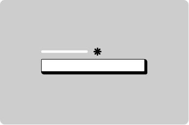
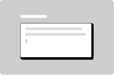
Input

A single-line field where users can input and edit text.

Props

name
string
Name of input value that is received in event detail payloads.
ariaLabel
string
Sets the aria-label used by assistive technologies.
autoCapitalize
GoabAutoCapitalize
Controls automatic capitalization behavior on supported mobile browsers.
autoComplete
string
Sets the autocomplete attribute for the input element.
debounce
number
Debounce delay in milliseconds before firing the change event. 0 means no debounce.
disabled
boolean
Sets the input disabled state.
error
boolean
Sets the error state styling.
focused
boolean
Sets focus on initial render or controlled updates.
id
string
Sets the id attribute of the input element.
leadingIcon
GoabIconType
Sets the icon shown before the value.
max
number | string
Maximum value. Supports any number, or ISO 8601 format for date/datetime types.
maxLength
number
Sets the maximum number of characters.
min
number | string
Minimum value. Supports any number, or ISO 8601 format for date/datetime types.
placeholder
string
Sets placeholder text when the input is empty.
readonly
boolean
Sets the readonly state.
size
GoabInputSize
Sets the input size.
Defaults to default.
step
number
How much a number or date value should change by.
Defaults to 1.
testId
string
Sets a data-testid attribute for automated testing.
textAlign
"left" | "right"
Sets text alignment.
Defaults to left.
trailingIcon
GoabIconType
Sets the icon shown after the value.
trailingIconAriaLabel
string
Sets the aria-label for an interactive trailing icon.
type
GoabInputType
Sets the type of the input field.
Defaults to text.
value
string
Bound to the current value of the input field.
variant
"goa" | "bare"
Sets the visual style variant.
Defaults to goa.
width
string
Sets the width of the input field.
mt, mr, mb, ml
Spacing
Apply margin to the top, right, bottom, and/or left of the component.
ariaLabel
string
Defines how the input will be translated for the screen reader. If not specified it will fall back to the name.
ariaLabelledBy
string
The aria-labelledby attribute identifies the element (or elements) that labels the input.
autoCapitalize
GoabInputAutoCapitalize
Controls whether and how text input is automatically capitalized as it is entered/edited by the user. This only works on mobile devices.
autoComplete
string
Specifies the autocomplete attribute for the input field.
debounce
number
Debounce delay in milliseconds before firing the change event. 0 means no debounce.
disabled
boolean
Sets the disabled state for the control.
error
boolean
Sets the error state for the control.
focused
boolean
Sets the cursor focus to the input.
id
string
Sets the id attribute of the underlying web component.
leadingContent
string | TemplateRef<any>
Sets the leading content slot, accepting a string or template reference.
leadingIcon
GoabIconType
Icon shown to the left of the text.
max
string | number
A string value that supports any number, or an ISO 8601 format if using the date or datetime type.
maxLength
number
Sets the maximum number of characters (as UTF-16 code units) the user can enter into the input.
min
string | number
A string value that supports any number, or an ISO 8601 format if using the date or datetime type.
name
string
Name of input value that is received in the onChange event.
placeholder
string
Text displayed within the input when no value is set.
readonly
boolean
Makes the input readonly.
size
GoabInputSize
Sets the size of the input. 'compact' reduces height for dense layouts.
Defaults to default.
step
number
How much a number or date should change by.
testId
string
Sets the data-testid attribute for automated testing.
textAlign
"left" | "right"
Sets the text alignment within the input field.
Defaults to left.
trailingContent
string | TemplateRef<any>
Sets the trailing content slot, accepting a string or template reference.
trailingIcon
GoabIconType
Icon shown to the right of the text.
trailingIconAriaLabel
string
Aria label for the trailing icon. Use only when the trailing icon is interactive.
type
GoabInputType
Sets the type of the input field.
Defaults to text.
value
string
Sets the control value used by Angular forms and one-way binding.
variant
string
Sets the visual style variant. 'goa' for standard GoA styling, 'bare' for minimal styling.
width
string
Sets the width of the text input area.
mt, mr, mb, ml
Spacing
Apply margin to the top, right, bottom, and/or left of the component.
arialabel
string
Defines how the input will be translated for the screen reader. If not specified it will fall back to the name.
arialabelledby
string
The aria-labelledby attribute identifies the element (or elements) that labels the input.
autocapitalize
GoabInputAutoCapitalize on | off | none | sentences | words | characters
Controls whether and how text input is automatically capitalized as it is entered/edited by the user. This only works on mobile devices.
Defaults to off.
autocomplete
string
Specifies the autocomplete attribute for the input field.
debounce
number
Debounce delay in milliseconds before firing the change event. 0 means no debounce.
Defaults to 0.
disabled
boolean true | false
Disables this input. The input will not receive focus or events. Use [attr.disabled] with [formControl].
Defaults to false.
error
boolean true | false
Sets the input to an error state.
Defaults to false.
focused
boolean true | false
Sets the cursor focus to the input.
Defaults to false.
handletrailingiconclick
boolean true | false
Flag that will result in an icon button component being rendered instead of an icon.
Defaults to false.
id
string
Unique identifier for the input element. Used for label associations and accessibility.
leadingicon
GoabIconType
Icon shown to the left of the text.
max
string
A string value that supports any number, or an ISO 8601 format if using the date or datetime type.
maxlength
number
Defines the maximum number of characters (as UTF-16 code units) the user can enter into the input.
min
string
A string value that supports any number, or an ISO 8601 format if using the date or datetime type.
name
string
Name of input value that is received in the onChange event.
placeholder
string
Text displayed within the input when no value is set.
readonly
boolean true | false
Makes the input readonly.
Defaults to false.
size
"default" | "compact"
Sets the size of the input. 'compact' reduces height for dense layouts.
Defaults to default.
step
number
How much a number or date should change by.
Defaults to 1.
testid
string
Sets a data-testid attribute for automated testing.
textalign
GoabInputTextAlign left | right
Sets the text alignment within the input field.
Defaults to left.
trailingicon
GoabIconType
Icon shown to the right of the text.
trailingiconarialabel
string
Aria label for the trailing icon. Use only when the trailing icon is interactive.
type
GoabInputType text | number | password | email | date | datetime-local | month | range | search | tel | time | url | week
Sets the type of the input field.
Defaults to text.
value
string
Bound to value.
variant
"goa" | "bare"
Sets the visual style variant. 'goa' for standard GoA styling, 'bare' for minimal styling.
Defaults to goa.
version
"1" | "2"
Design system version for styling.
Defaults to 1.
width
string
Sets the width of the text input area.
Defaults to 30ch.
mt, mr, mb, ml
Spacing
Apply margin to the top, right, bottom, and/or left of the component.
Events

onBlur
(detail: GoabInputOnBlurDetail) => void
Callback fired when the input loses focus. Receives GoabInputOnBlurDetail.
onChange
(detail: GoabInputOnChangeDetail) => void
Callback fired when the input value changes. Receives GoabInputOnChangeDetail.
onFocus
(detail: GoabInputOnFocusDetail) => void
Callback fired when the input receives focus. Receives GoabInputOnFocusDetail.
onKeyPress
(detail: GoabInputOnKeyPressDetail) => void
Callback fired when a key is pressed in the input. Receives GoabInputOnKeyPressDetail.
onTrailingIconClick
() => void
Callback fired when the trailing icon is clicked.
onBlur
(event: GoabInputOnBlurDetail) => void
Emits when the input loses focus. Emits blur detail including the current value.
onChange
(event: GoabInputOnChangeDetail) => void
Emits when the input value changes. Emits change detail including the new value.
onFocus
(event: GoabInputOnFocusDetail) => void
Emits when the input receives focus. Emits focus detail including the current value.
onKeyPress
(event: GoabInputOnKeyPressDetail) => void
Emits when a key is pressed in the input. Emits key press detail including the value and key pressed.
onTrailingIconClick
() => void
Emits when the trailing icon is clicked.
_blur
CustomEvent<{ name: string; value: string }>
_change
CustomEvent<{ name: string; value: string }>
_focus
CustomEvent<{ name: string; value: string }>
_keyPress
CustomEvent<{ name: string; value: string; key: string }>
_trailingIconClick
CustomEvent

ReactNode

leadingContent
ReactNode
Sets content in the leading slot.
trailingContent
ReactNode
Sets content in the trailing slot.
leadingContent
TemplateRef
Sets content in the leading slot.
trailingContent
TemplateRef
Sets content in the trailing slot.
leadingContent
slot
Sets content in the leading slot.
trailingContent
slot
Sets content in the trailing slot.
Examples

Add a record using a drawer

Add another item in a modal

Ask a user for an address

Ask a user for an Indian registration number

Ask a user for direct deposit information

Ask a user for dollar amounts

Disabled button with a required field

Dynamically add an item to a dropdown list

Filter data in a table

Question page

Question page preview
More info

Reveal input based on a selection

Slotted error text in a form item

Slotted helper text in a form item

Type to create a new filter

States

Submit

When you must disable a button or input:

  • Provide nearby text explaining what needs to happen first
  • Consider showing the element enabled with validation on submit instead
  • Use aria-describedby to link the disabled element to explanatory text
Don't disable buttons or inputs without explaining why. Disabled controls can be confusing and users may not understand why they can't interact with an element.

Other

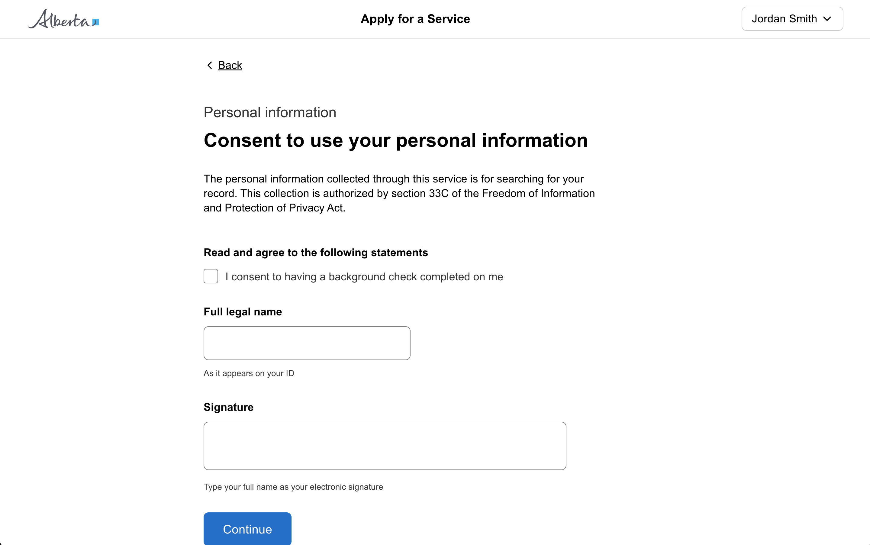
The form item automatically associates the label with the input for screen readers, ensuring your form is accessible.

Use a form item wrapper on all inputs to add a label, helper text, error message, and more.

Types

Use the appropriate input type for your context to give a better experience.
Use a text area to input content longer than a single line, such as descriptions, comments, or feedback.

Content

Placeholder text disappears when users start typing, leaving them without context for what the field is asking for.

Always use a visible label above or beside the input field. Placeholder text can provide an example of the expected format, but should never be the only indication of what information is needed.

Don't use placeholder text as a label

Sizing

Known input length: Use fixed-width inputs for content with a specific length, such as postal code (7 characters) or year (4 characters).

Unknown input length: If you don’t know how many characters the user will need (like their name), make your text input 100% of the container.

Size text inputs based on the expected content length to help users understand what information is needed.

Forms

Don't use a text area which is only one line high; instead, use text input if just one line is needed.

Capture text input from users in forms.

When to use

Use Input when you need users to enter:

  • Short text answers (names, email addresses)
  • Numbers (phone numbers, quantities)
  • Dates and times
  • Search queries

When not to use

Don’t use Input when:

  • Users need to enter multiple lines of text (use Textarea)
  • Users need to select from predefined options (use Dropdown or Radio)
  • The input requires complex formatting (consider specialized components)

Types

Input supports multiple HTML input types:

  • text - General text entry (default)
  • email - Email addresses with validation
  • password - Masked password entry
  • number - Numeric values with stepper
  • date - Date picker
  • tel - Phone numbers
  • search - Search with clear button

States

  • Default - Normal interactive state
  • Focused - When the input has keyboard focus
  • Error - When validation fails
  • Disabled - When input is not available
  • Read-only - When showing value without editing
All GoA Design System components are built to meet WCAG 2.2 AA standards. The following guidelines provide additional context for accessible implementation.

No accessibility-specific guidelines have been documented for this component yet.

View old component docs