Grid

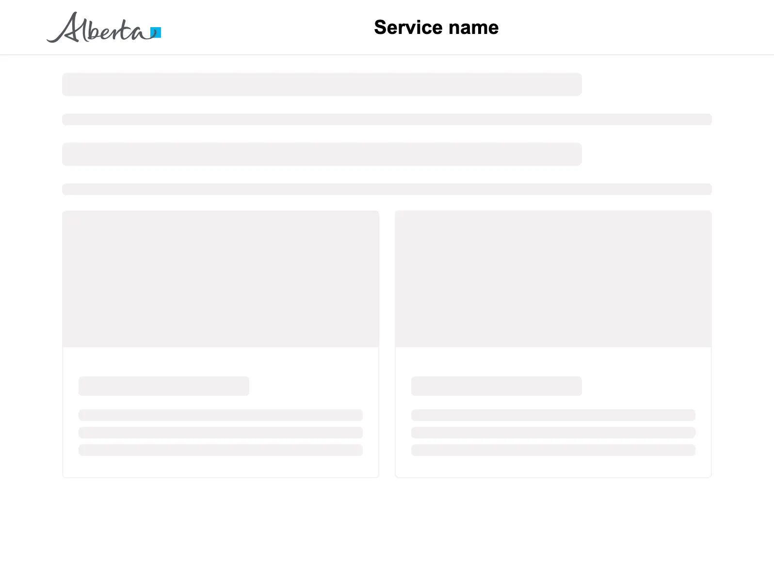
Arrange a number of components into a responsive grid pattern.

Props

minChildWidth
string
Minimum width of the child elements.
gap
Spacing
Gap between child items.
Defaults to m.
testId
string
Sets a data-testid attribute for automated testing.
mt, mr, mb, ml
Spacing
Apply margin to the top, right, bottom, and/or left of the component.
minChildWidth
string
Minimum width of the child elements.
gap
Spacing
Gap between child items.
testId
string
Sets the data-testid attribute for automated testing.
mt, mr, mb, ml
Spacing
Apply margin to the top, right, bottom, and/or left of the component.
minchildwidth
string
Minimum width of the child elements
gap
Spacing
Gap between child items.
Defaults to m.
testid
string
Sets a data-testid attribute for automated testing.
mt, mr, mb, ml
Spacing
Apply margin to the top, right, bottom, and/or left of the component.
Examples

Card grid

Review and action

Other

Header section

Main content area

Footer section

Don't use a container for general page layout. Containers are for visual emphasis and grouping content.

Sizing

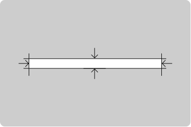
minChildWidth is required on Grid. Set it based on the content's minimum readable width so items wrap properly.
All GoA Design System components are built to meet WCAG 2.2 AA standards. The following guidelines provide additional context for accessible implementation.

No accessibility-specific guidelines have been documented for this component yet.

View old component docs