Filter chip

Allow the user to enter information, filter content, and make selections.

Props

ariaLabel
string
Accessible content used to label the filter chip controls.
error
boolean
Shows an error state.
iconTheme
GoabFilterChipTheme
Theme style of the leading icon.
Defaults to outline.
leadingIcon
GoabIconType
Icon displayed at the start of the chip.
secondaryText
string
Secondary text displayed in a smaller size before the main content.
testId
string
Sets a data-testid attribute for automated testing.
mt, mr, mb, ml
Spacing
Apply margin to the top, right, bottom, and/or left of the component.
ariaLabel
string
Accessible content used to label the filter chip controls.
content
string | TemplateRef<unknown>
Content displayed in the chip. Accepts a string or template for custom content.
deletable
boolean
Marks the chip as deletable.
error
boolean
Shows an error state.
iconTheme
GoabChipTheme
Sets the icon theme style for the filter chip.
leadingIcon
GoabIconType | null
Icon displayed at the start of the chip.
secondaryText
string
Secondary text displayed in a smaller size before the main content.
testId
string
Sets the data-testid attribute for automated testing.
mt, mr, mb, ml
Spacing
Apply margin to the top, right, bottom, and/or left of the component.
content
string
Content displayed in the chip. Use the content slot for custom HTML.
arialabel
string
Accessible content used to label the filter chip controls.
error
boolean true | false
Shows an error state.
Defaults to false.
leadingicon
GoabIconType
Icon displayed at the start of the chip.
secondarytext
string
Secondary text displayed in a smaller size before the main content.
testid
string
Sets a data-testid attribute for automated testing.
version
"1" | "2"
Design system version for styling.
Defaults to 1.
mt, mr, mb, ml
Spacing
Apply margin to the top, right, bottom, and/or left of the component.

Events

onClick
() => void
Callback fired when the filter chip is clicked to remove it.
onClick
() => void
Emits when the filter chip delete button is clicked.
_click
CustomEvent

ReactNode

content
ReactNode
Content displayed in the chip. Accepts a string or ReactNode for custom content.
content
TemplateRef
Content displayed in the chip. Accepts a string or ngTemplate for custom content.
content
slot
Content displayed in the chip. Accepts a string or ReactNode for custom content.
Examples

Add a filter chip

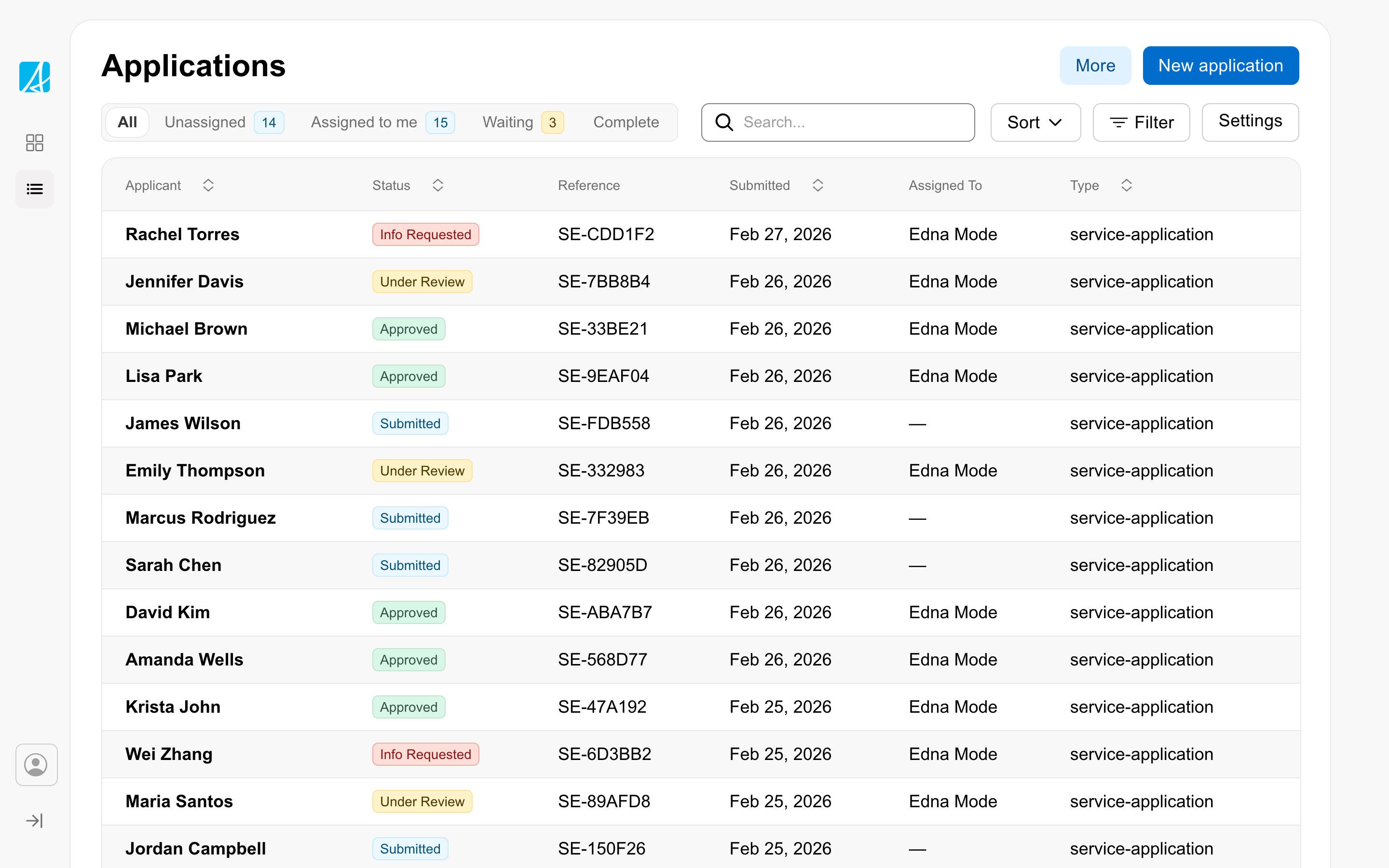
Filter data in a table

Remove a filter

Type to create a new filter

Types

FilterChip is for removable filters that users can dismiss. For static labels or status indicators, use Badge instead.
All GoA Design System components are built to meet WCAG 2.2 AA standards. The following guidelines provide additional context for accessible implementation.

No accessibility-specific guidelines have been documented for this component yet.

View old component docs