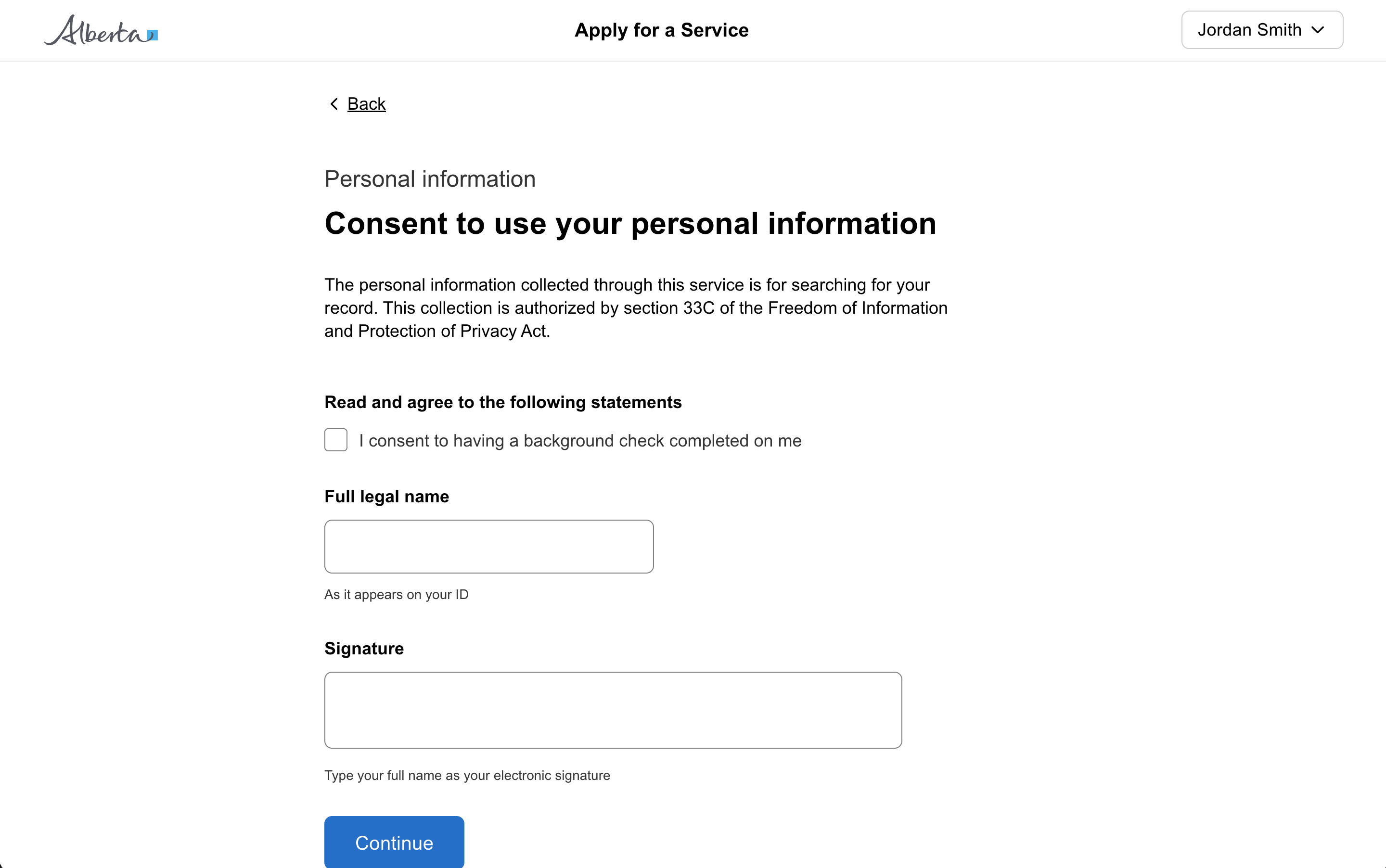
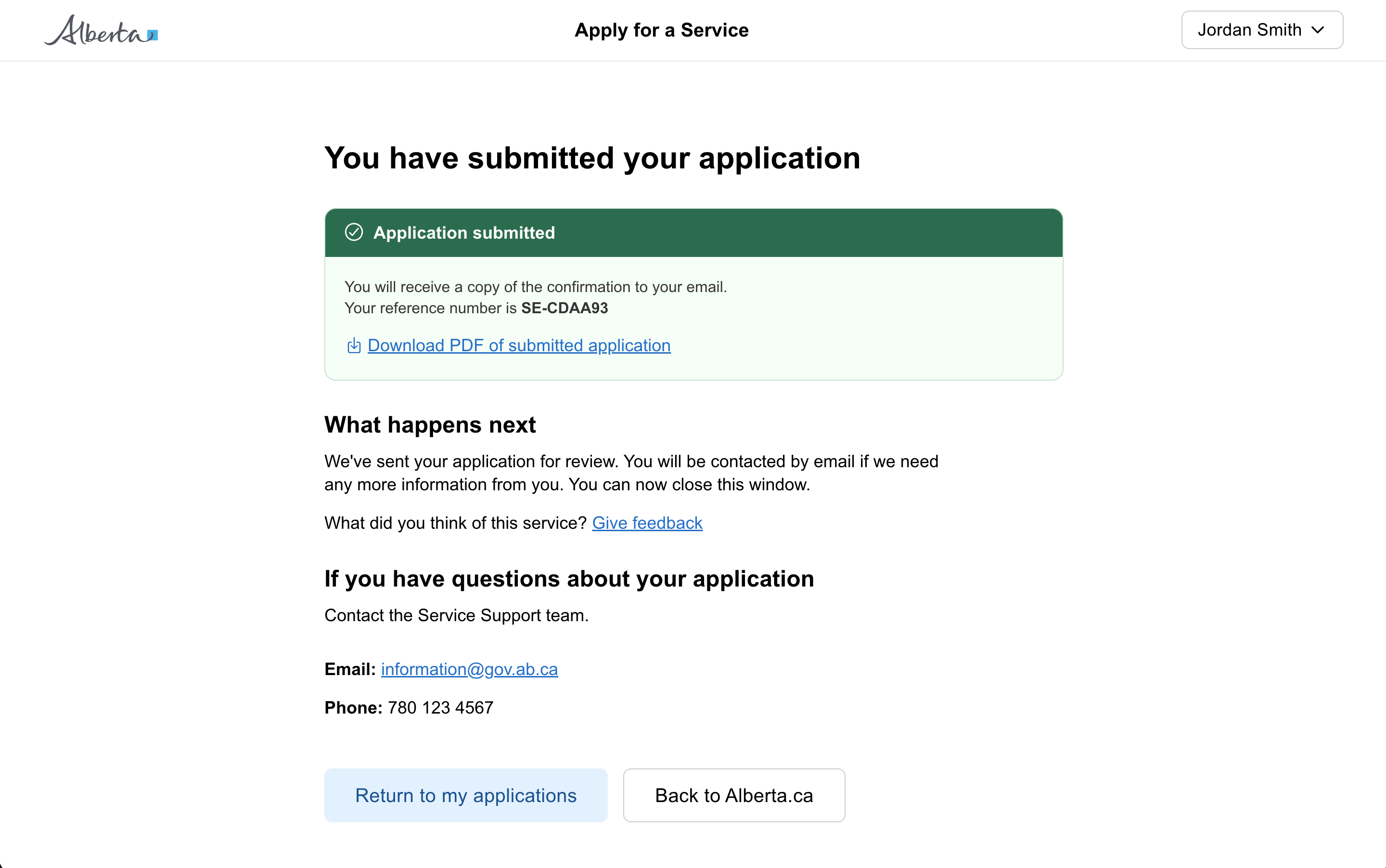
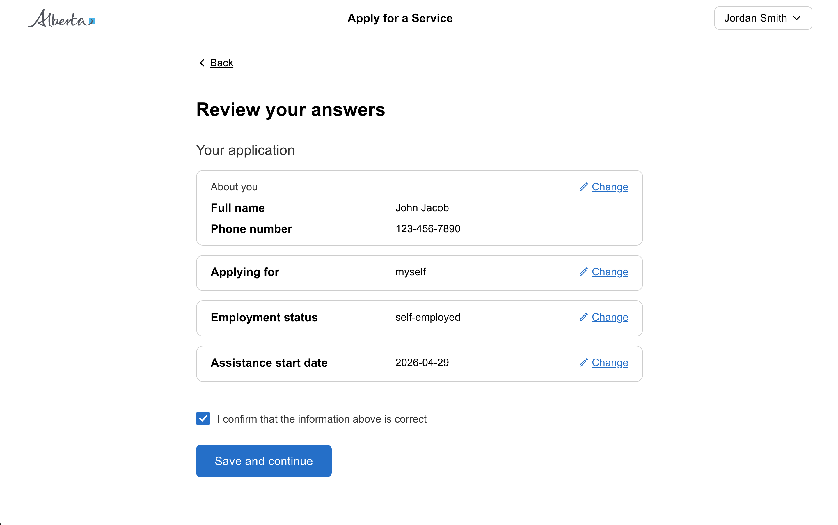
Display multiple related actions stacked or in a horizontal row to help with arrangement and spacing.
Props
alignment
GoabButtonGroupAlignment
Positions the button group in the page layout.
gap
GoabButtonGroupGap
Sets the spacing between buttons in the button group.
Defaults to relaxed.
testId
string
Sets a data-testid attribute for automated testing.
mt, mr, mb, ml
Spacing
Apply margin to the top, right, bottom, and/or left of the component.
alignment
GoabButtonGroupAlignment
Positions the button group in the page layout.
gap
GoabButtonGroupGap
Sets the spacing between buttons in the button group.
testId
string
Sets the data-testid attribute for automated testing.
mt, mr, mb, ml
Spacing
Apply margin to the top, right, bottom, and/or left of the component.
alignment
GoabButtonGroupButtonAlignment start | end | center
Positions the button group in the page layout.
Defaults to start.
gap
GoabButtonGroupGap relaxed | compact
Sets the spacing between buttons in the button group.
Defaults to relaxed.
testid
string
Sets a data-testid attribute for automated testing.
mt, mr, mb, ml
Spacing
Apply margin to the top, right, bottom, and/or left of the component.
Examples
Add a record using a drawer
Add and edit lots of filters
Add another item in a modal
Ask a user for an address
Button with Icon
When using icons in buttons, the button text provides the accessible name.
The icon is decorative and should be hidden from screen readers with aria-hidden.
Use Block for general layout and spacing. Use ButtonGroup for semantically related action buttons.
Sizing
SaveCancel
Don't
Don't use different button sizes in the same area to emphasize hierarchy.
CancelSave
Don't
Don't stack standard and full width buttons.
SaveCancel
Do
Use full width buttons on mobile.
Tip
Match gap to button size. Use 'relaxed' gap with normal-sized buttons and 'compact' gap with compact buttons.
Positioning
SubmitEditSaveCopyDraft
Don't
Don't group more than 3 actions together. Consider using an overflow menu for additional options.
SubmitCancel
Do
Use a button group when putting multiple buttons together.
Tip
Use 'end' alignment for modal action buttons so they sit at the bottom right, following the natural reading flow.
Types
Button types
Primary - If there is only one button on a page, it should be a primary button. For citizen facing applications, generally there should only be one primary button on a page.
Secondary - Use secondary buttons for less important actions on a page. Often paired with a primary action as a secondary action.
Tertiary - Use tertiary buttons for links that should function like a button, such as “edit” or “cancel” in applications. It’s okay to use more than one tertiary button on a page.
SaveCancel
Do
Use a primary button for main actions and a secondary button for less important actions.
All GoA Design System components are built to meet WCAG 2.2 AA standards.
The following guidelines provide additional context for accessible implementation.
No accessibility-specific guidelines have been documented for this component yet.