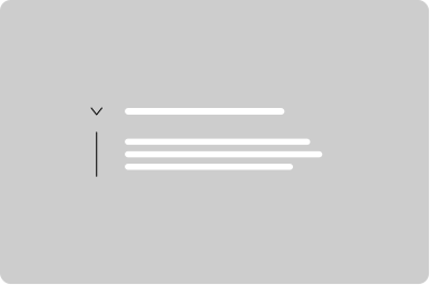
Accordion
Let users show and hide sections of related content on a page.
Props
heading
string
Sets the heading text.
headingSize
GoabAccordionHeadingSize
Sets the heading size of the accordion container heading.
Defaults to
small.
headingType
GoabAccordionHeadingType
Sets the accordion style variant.
Defaults to
normal.
iconPosition
GoabAccordionIconPosition
Sets the position of the expand/collapse icon.
Defaults to
left.
maxWidth
string
Sets the maximum width of the accordion.
Defaults to
none.
open
boolean
Sets the state of the accordion container open or closed.
secondaryText
string
Sets secondary text displayed alongside the heading.
testId
string
Sets a data-testid attribute for automated testing.
mt, mr, mb, ml
Spacing
Apply margin to the top, right, bottom, and/or left of the component.
Events
onChange
(open: boolean) => void
Callback fired when the accordion is opened or closed. Receives the new open state as a boolean.
ReactNode
actions
ReactNode
Sets content rendered in the accordion heading, right-aligned before the expand/collapse icon.
headingContent
ReactNode
Sets content rendered within the accordion heading, alongside the heading text.
Positioning
Enter your full legal name as it appears on your government-issued ID.
Do
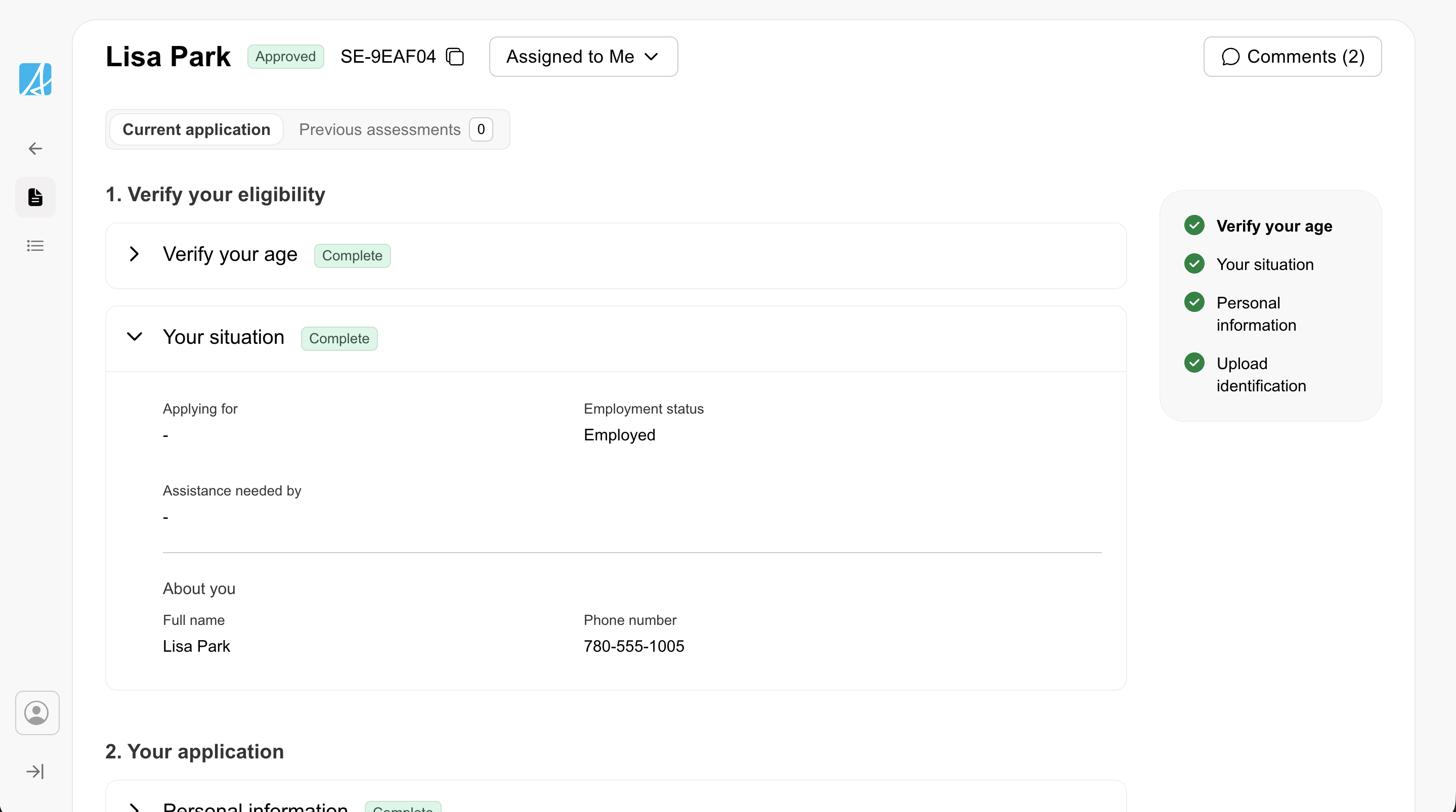
Ensure accordion content is left-aligned with the heading, leaving white space on the left side of the container.
Other
Don't
Don't hide key functionality in collapsed accordions. If content is critical to the workflow, it should be visible when the page loads.
Content
Lorem ipsum dolor sit amet consectetur. Felis mauris in interdum congue amet curabitur diam enim. Sem nec ut sed tristique mauris nibh ac.
Don't
Don't exceed 75 characters in line length within expanded accordion content.
Content here
Do
Use secondaryText for contextual information in accordions