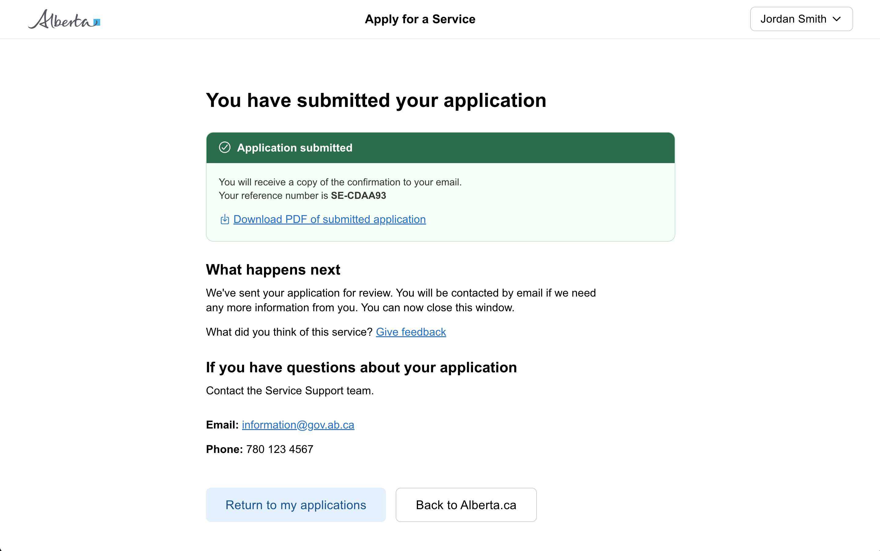
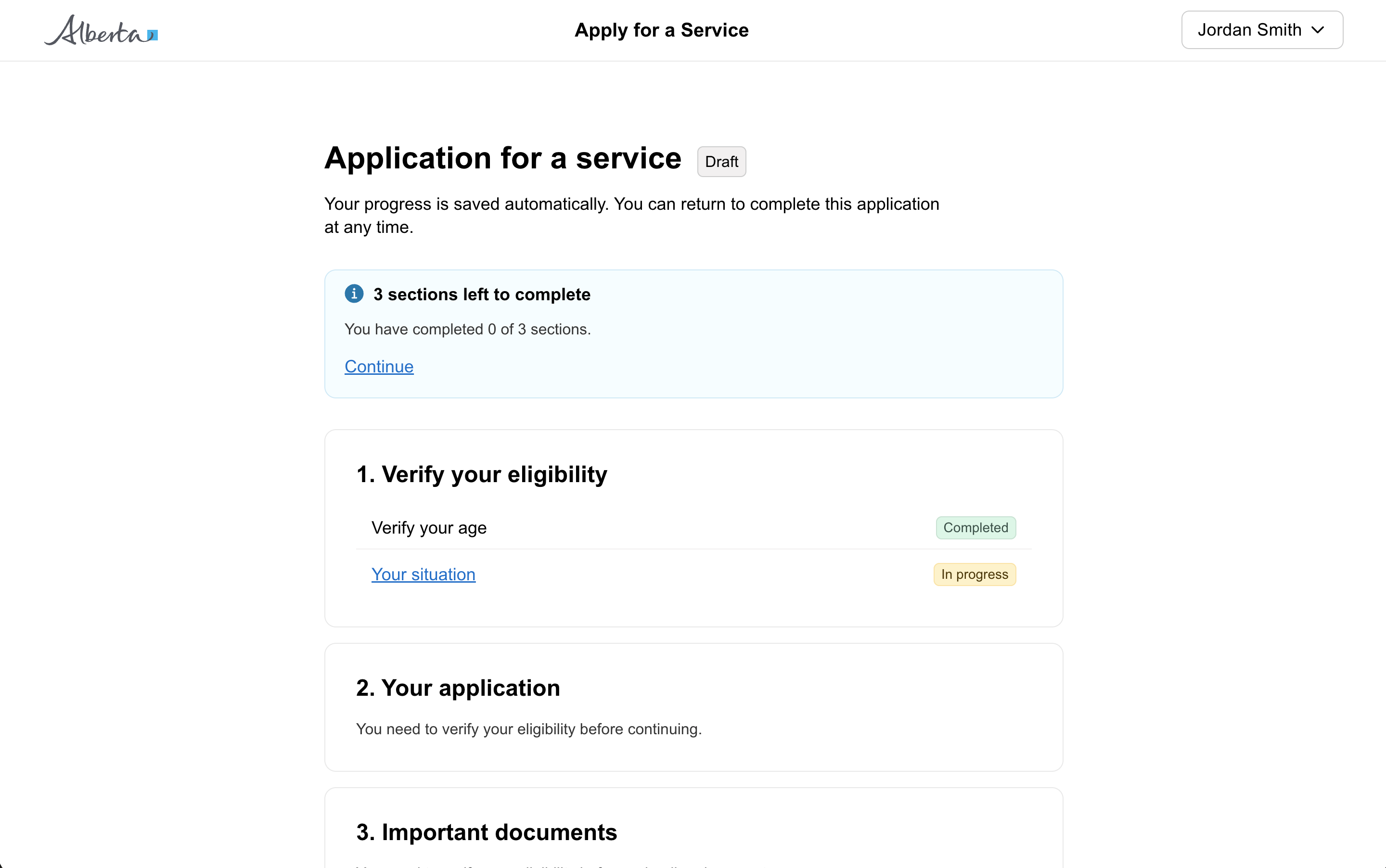
Callout

Communicate important information through a strong visual emphasis.

Props

ariaLive
GoabCalloutAriaLive
Indicates how assistive technology should handle updates to the live region.
Defaults to off.
emphasis
GoabCalloutEmphasis
Sets the visual prominence. 'high' for full background, 'medium' for subtle, 'low' for minimal.
Defaults to medium.
heading
string
Callout heading text.
iconTheme
GoabCalloutIconTheme
Sets the icon theme. 'outline' for stroked icons, 'filled' for solid icons.
Defaults to outline.
maxWidth
string
Sets the maximum width of the callout.
size
GoabCalloutSize
Sets the size of the callout. 'medium' has reduced padding and type size for compact areas.
Defaults to large.
testId
string
Sets a data-testid attribute for automated testing.
type
GoabCalloutType
Sets the context and colour of the callout.
Defaults to information.
mt, mr, mb, ml
Spacing
Apply margin to the top, right, bottom, and/or left of the component.
ariaLive
GoabCalloutAriaLive
Indicates how assistive technology should handle updates to the live region.
Defaults to off.
emphasis
GoabCalloutEmphasis
Sets the visual prominence. 'high' for full background, 'medium' for subtle, 'low' for minimal.
Defaults to medium.
heading
string
Callout heading text.
iconTheme
GoabCalloutIconTheme
Sets the icon theme. 'outline' for stroked icons, 'filled' for solid icons.
Defaults to outline.
maxWidth
string
Sets the maximum width of the callout.
size
GoabCalloutSize
Sets the size of the callout. 'medium' has reduced padding and type size for compact areas.
Defaults to large.
testId
string
Sets the data-testid attribute for automated testing.
type
GoabCalloutType
Define the context and colour of the callout.
Defaults to information.
mt, mr, mb, ml
Spacing
Apply margin to the top, right, bottom, and/or left of the component.
type
GoabCalloutType emergency | important | information | event | success
Define the context and colour of the callout.
arialive
GoabCalloutAriaLiveType off | assertive | polite
Indicates how assistive technology should handle updates to the live region.
Defaults to off.
emphasis
GoabCalloutEmphasisType high | medium | low
Sets the visual prominence. 'high' for full background, 'medium' for subtle, 'low' for minimal.
Defaults to medium.
heading
string
Callout heading text.
icontheme
IconTheme
Sets the icon theme. 'outline' for stroked icons, 'filled' for solid icons.
Defaults to outline.
maxwidth
string
Sets the maximum width of the callout.
Defaults to none.
size
GoabCalloutSize medium | large
Sets the size of the callout. 'medium' has reduced padding and type size for compact areas.
Defaults to large.
testid
string
Sets a data-testid attribute for automated testing.
version
GoabCalloutVersionType 1 | 2
Design system version for styling.
Defaults to 1.
mt, mr, mb, ml
Spacing
Apply margin to the top, right, bottom, and/or left of the component.
Examples

Sizing

Provincial Family Resource Networks deliver high quality prevention and early intervention services.

Use full width callouts with a maximum width of 700px.

This callout uses the medium size for mobile viewports.

Use the medium callout on mobile to save space.

Content

Networks deliver high quality prevention and early intervention services. Find a network in your area.

Use inline links when additional information exists on another page.

Employment standards set out the rights and obligations of employers and employees in Alberta. This includes the minimum standards that employers must provide. In this section, find out about Alberta’s basic employment standards, what to do if you think they are not being followed, and educational materials.

Don't include too much content. Callouts should communicate one important piece of information.

Submit your application by March 31, 2024 to be considered.

Keep callouts focused on one key message

Other

Changes to employment standards rules are in effect.

Don't allow callouts to be dismissed.

The username you entered did not match our records.
Don't use callouts for form or field validation. Use error messages instead.
All GoA Design System components are built to meet WCAG 2.2 AA standards. The following guidelines provide additional context for accessible implementation.

Screen Readers

Use ariaLive='polite' for status updates. Use 'assertive' for urgent messages that should interrupt the user immediately.
View old component docs