Workspace
The workspace is a pattern for productivity-focused services that service delivery staff use as a daily tool to review information, manage records, and complete tasks. The design prioritizes efficiency and accuracy. The reference example is a starting point to adapt to your service's context, not a rigid template.
Page types
Common pages seen in workspace products that you can combine and adapt to fit the work your service supports.
All of the page examples are built using the workspace layout component. It is a responsive shell with a side menu, sticky page header and footer, and an optional push drawer. On small screens, the side menu collapses into a hamburger menu.
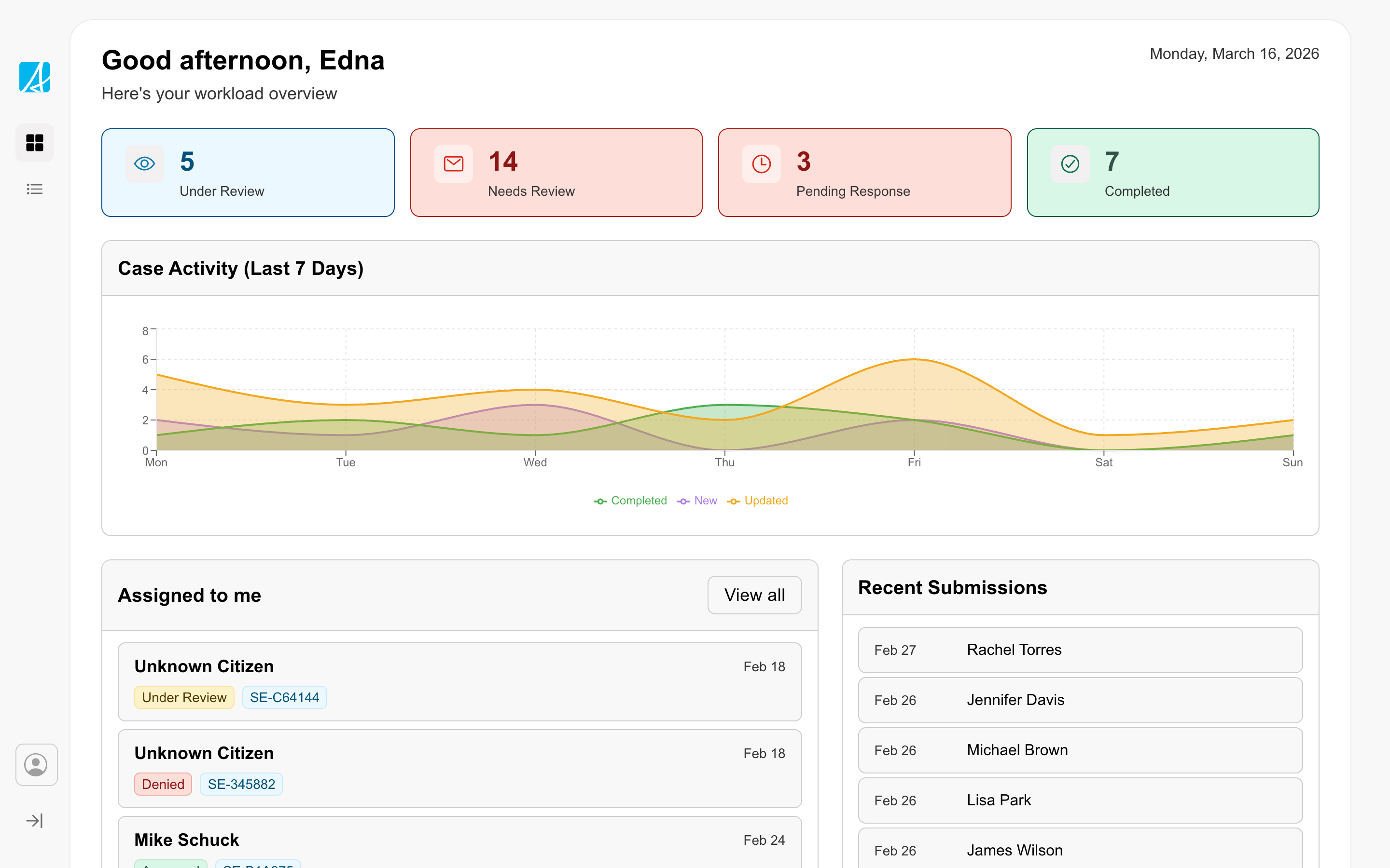
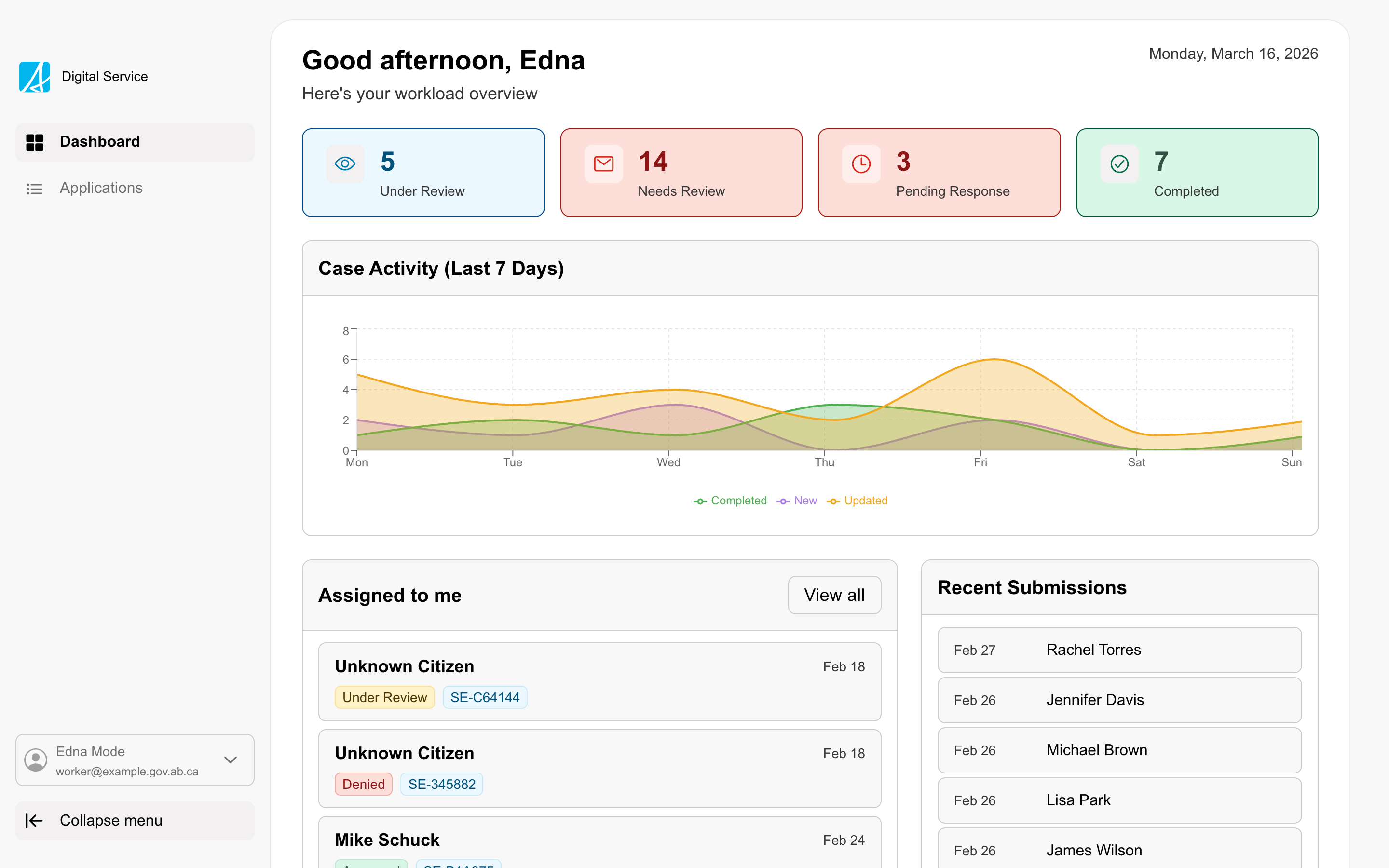
Dashboard
The landing view of a workspace, showing staff their counts, trends, and assigned work.
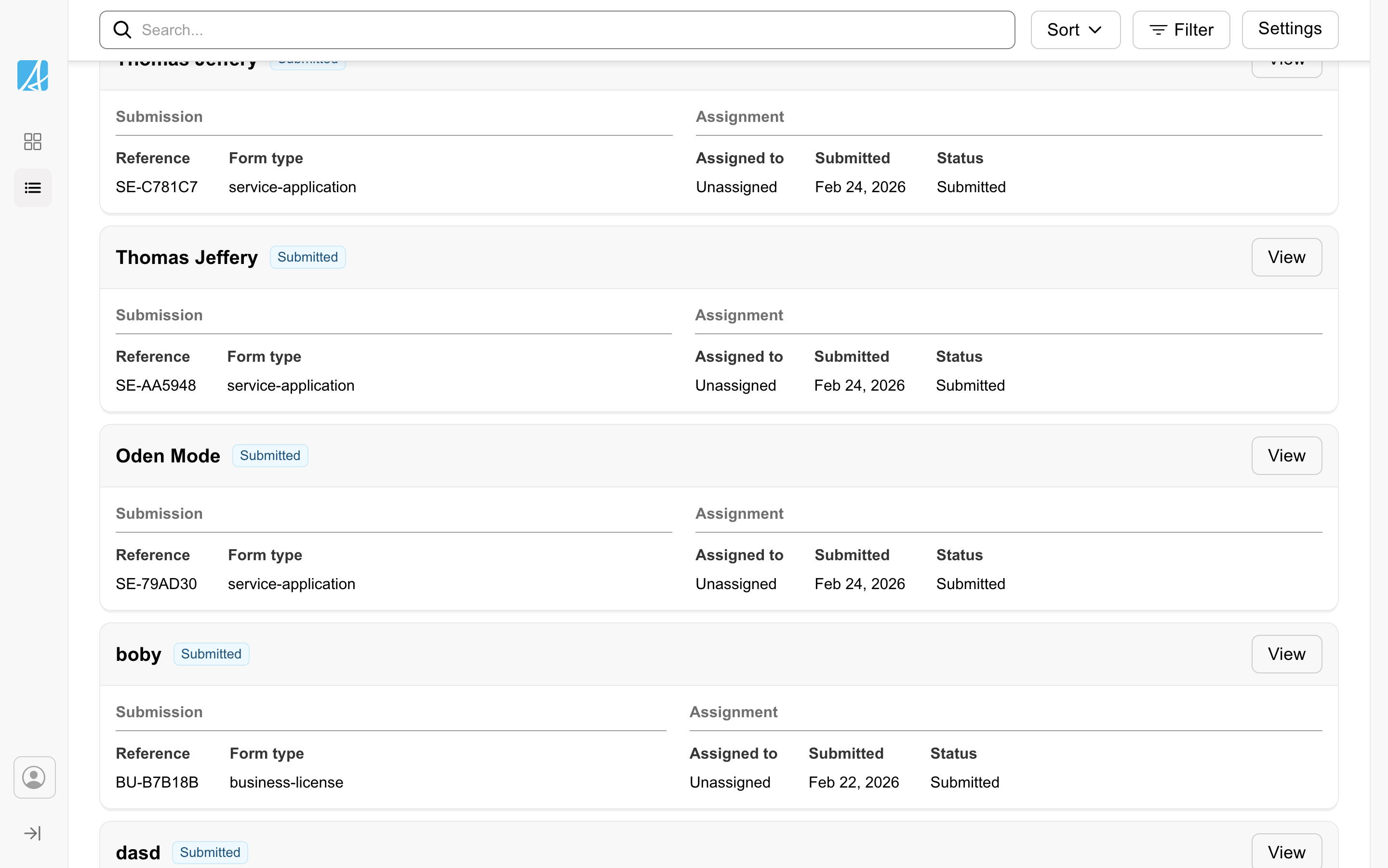
Index page
The page where staff scan and pick records to work on, with filters, search, and tabs.
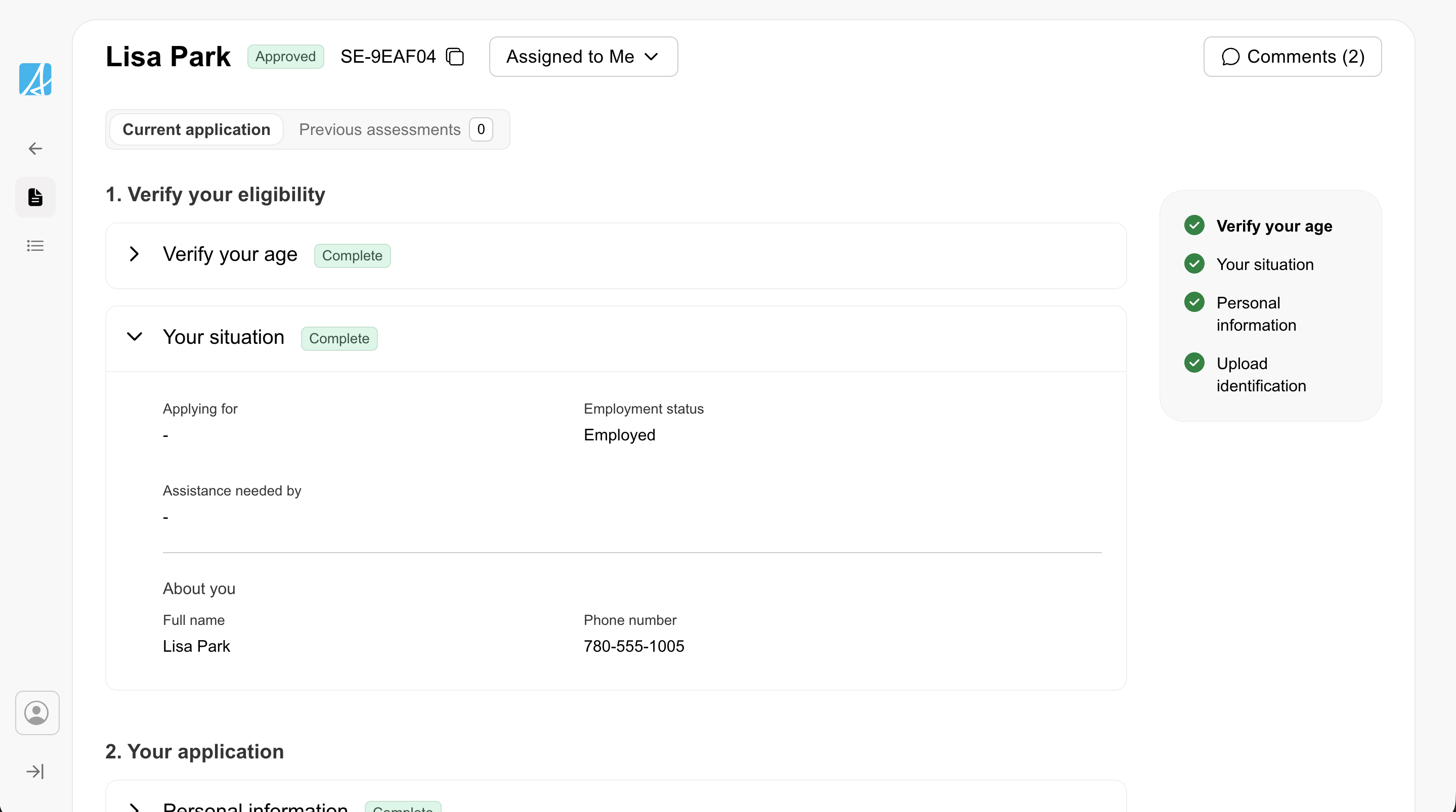
Case detail
A single-record view for reviewing and acting on one case.
Interaction patterns
Common interaction patterns that show up across multiple workspace pages.
Data views
Workers need different ways to view, scan, and act on records depending on the task. Choose the data view that best supports the task.
- Table view: Dense, scannable rows with sortable columns. Best for users who need to compare fields across many records at once.
- Card view: Each record as a card showing key details grouped into sections. Useful when records have more complex data that doesn’t fit neatly into columns.
- Expandable list view: Compact rows that expand inline to reveal detail. A middle ground between the density of a table and the richness of cards.
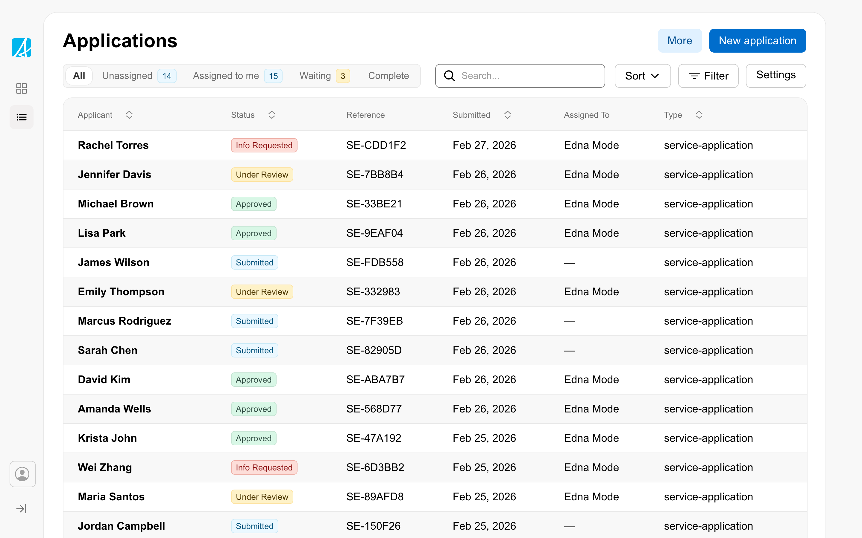
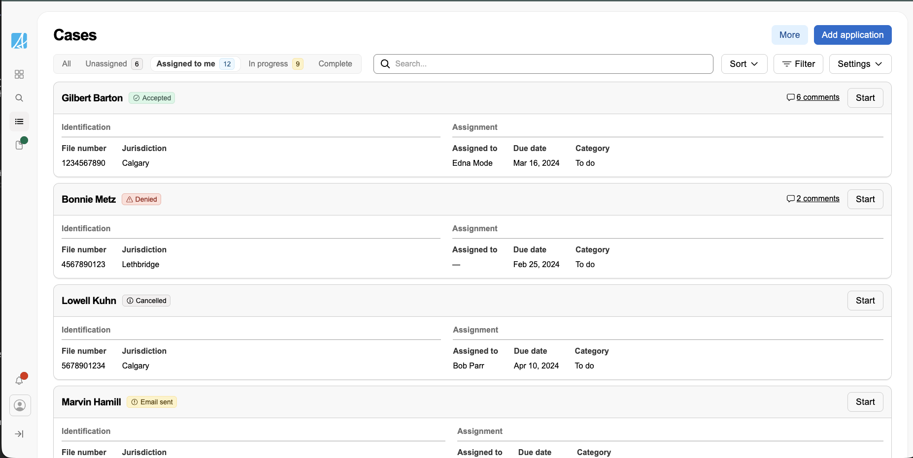
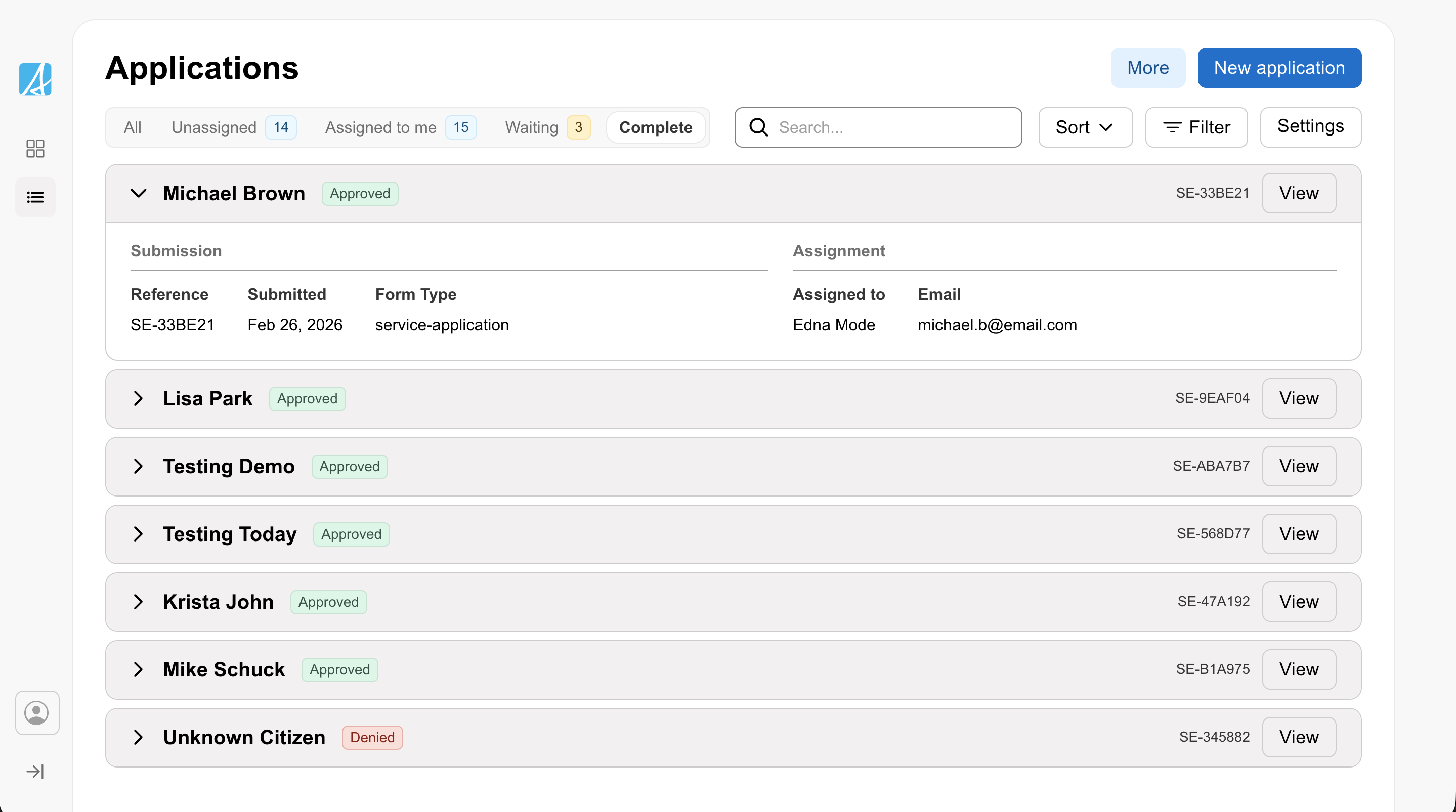
Any view can be combined with grouping (for example, group by priority or status) to organize records into collapsible sections. Users can also search, filter by status using tabs, sort with multi-level sorting, and manage active filters with filter chips.
Sidebar navigation
Use the work side menu as the primary navigation for a workspace. The workspace layout provides this navigation, including the collapse to a hamburger on mobile.
Keep top-level navigation focused on the main areas of work. When a user opens a record or case, switch to contextual navigation that supports that task. This puts the user into a focused mode with relevant navigation items (like sections of an application, comments, reminders) and a back link to return to the main view. The sidebar can adapt to what the user is doing, it doesn’t have to show everything at once.
Main workspace navigation
Secondary contextual navigation
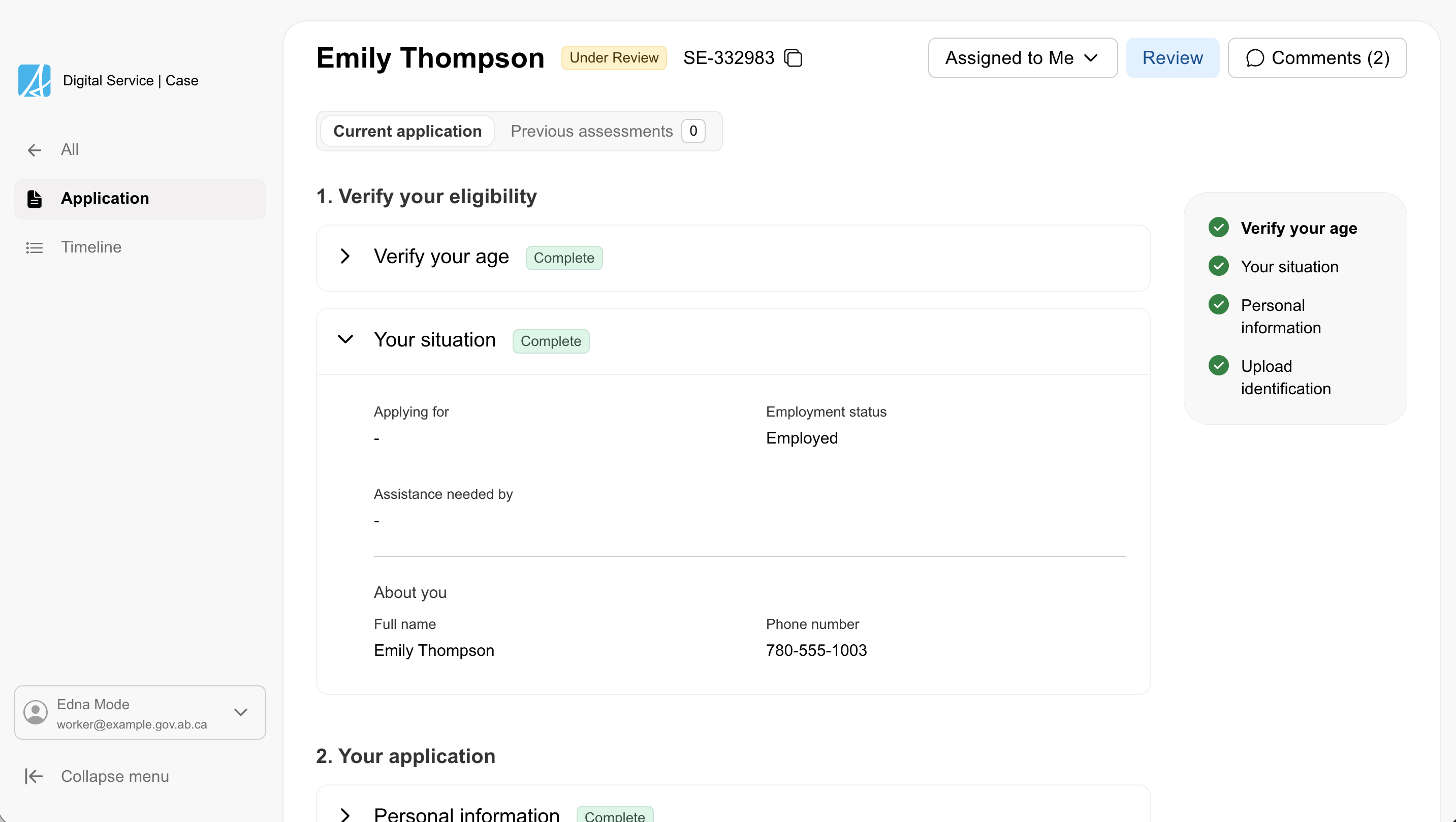
Sticky action bar
A scroll-aware header that pins to the top of the content area as the user scrolls. Use it to keep the most important tools visible. The workspace layout provides this as its sticky page header.
Set the content for each page based on the task:
- On a cases list page, keep tools such as search and key actions visible.
- On a detail page, keep the case name and key actions visible.
Do not pin everything. Keep only the information and actions people need to continue their work without losing context.
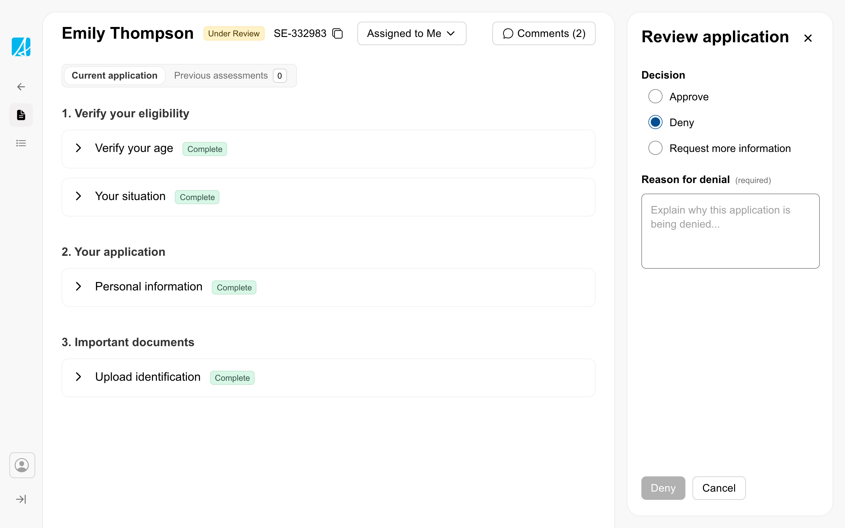
Push drawer
Use a push drawer for focused work that should happen without leaving the current page. The workspace layout hosts this as a push drawer that narrows the main card rather than overlaying it.
This works well for actions such as:
- approving or denying a record
- requesting more information
- completing a short decision form
- reviewing supporting details while taking action
Use it when users need to keep the main record in view while completing the task.
Components built for workspace
Workspace patterns are supported by component features designed for denser, more productive interfaces:
- Compact inputs: Every input component now has a
compactvariant that reduces height and spacing. This lets you build tighter forms and toolbars without sacrificing usability. - Compact badges and notifications: Badges and notification banners also have compact sizing to fit within dense data views and action bars.
- Badge variants: Badges now include
strongandsubtleemphasis options, giving you control over visual weight depending on context. - Data grid: The data grid works with the table component to support accessible, keyboard-navigable data views. Use them together when the user needs to move through records efficiently without relying on a mouse.
- Segmented tabs: A new tab variant that works as a segmented toggle for switching between views or modes within a workspace, rather than navigating between pages.
- Enhanced filter chips: Filter chips now support secondary text and secondary icons, making them more useful for richer filtering in workspace data views.
Keyboard-accessible data views
Workspace data views use the data grid to make table and card layouts fully keyboard navigable. Users can use arrow keys to move between cells and rows, making it possible to scan and act on records without a mouse. This is especially important in workspace contexts where staff are processing high volumes of cases and keyboard navigation is significantly faster than clicking. For assistive technology users, screen readers announce cell content and position as the user navigates.
When to use
Use the workspace when your service needs to support regular, task-based work, such as:
- Reviewing and processing submissions
- Managing case files, applications, or requests
- Moving between dashboards, lists, and detail views
- Taking actions such as approve, deny, assign, or request more information
When not to use
- Public facing applications or forms. Use the public form pattern instead.
- Content-only pages that do not involve case management.
- Simple internal tools that do not need structured case processing.
Get started
Use one of the workspace templates as a starting point for your service. Each template includes the sidebar navigation, dashboard, data views, and case detail patterns described above.