Workspace Layout
A full-page layout for workspace-style applications that wraps your content responsively.
Anatomy
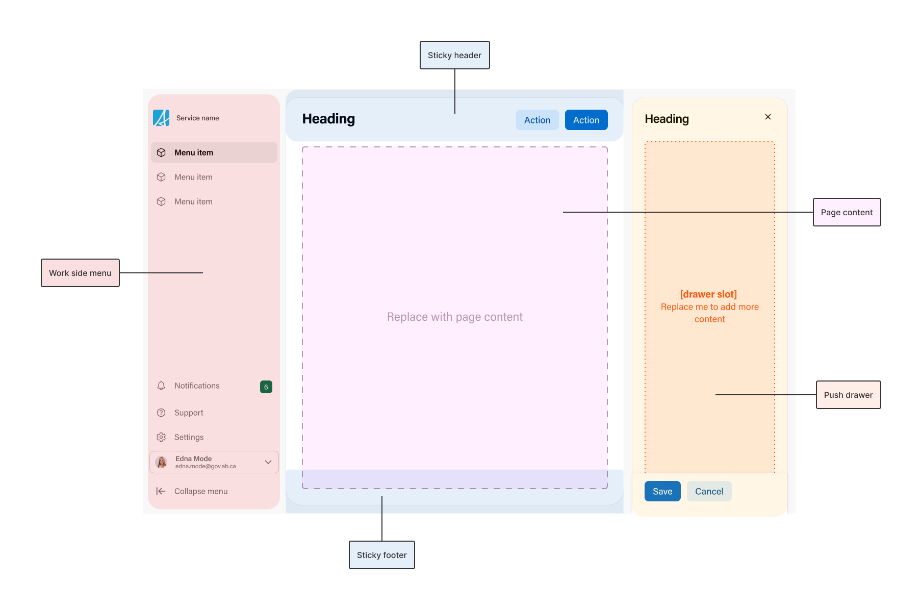
Work side menu
The main navigation for the workspace, built with a work side menu. It stays in place while the content scrolls. On narrow screens it hides and opens from the mobile hamburger menu.
Sticky header
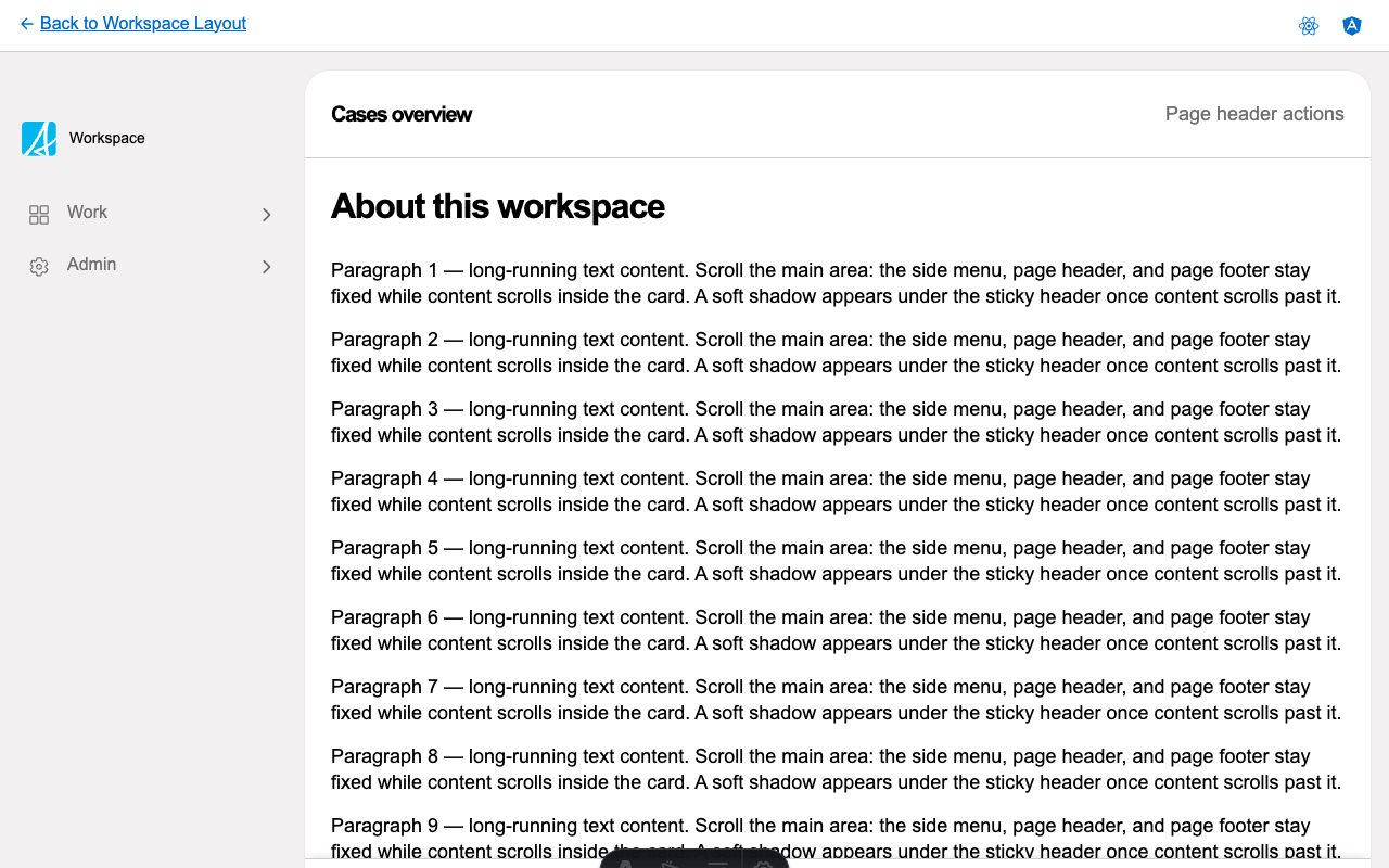
A header pinned to the top while the content scrolls. Use it for the page title, key actions, or a toolbar. A soft shadow appears under it once content scrolls past, so people can tell there is more above. It can also collapse as people scroll down, see scroll state.
Page content
Your page content. The layout wraps it in a scrollable card and handles the spacing, so the header and footer stay in place while this area scrolls.
Sticky footer
A footer pinned to the bottom while the content scrolls. Use it for a summary or actions that should stay reachable, such as a running count of selected items.
Push drawer
An optional drawer that opens beside the page content instead of over it. Unlike a modal drawer, it narrows the content rather than covering it, so users can still interact with the main page content while the drawer is open.
Mobile hamburger menu
At narrow screen widths the side menu hides to save space, and the layout adds a hamburger button that opens it. This comes with the layout, you do not wire it up yourself.
Scroll state
The layout keeps track of how far the content has scrolled (at the top, somewhere in the middle, or at the bottom) and lets you read that to respond. A common use is collapsing a tall header into a compact one as people scroll down, showing a “back to top” button, or recording an analytics event when someone reaches the bottom of a long list.
Considerations
- Use the workspace layout for workspace-style applications such as case management tools, internal dashboards, or back-office apps, where pages share a side menu and people scroll through long content while header and footer actions stay in reach.
- The layout fills the viewport (100vh). Host it directly inside the router outlet, not inside another scrolling container.
- The push drawer opens beside the main content and leaves the side menu in place, which suits a drawer that is contextual to the current page.
- If you start from one of the React or Angular examples, the base functionality (sticky header and footer, scroll state, push drawer, and the mobile hamburger menu) comes wired up for you.