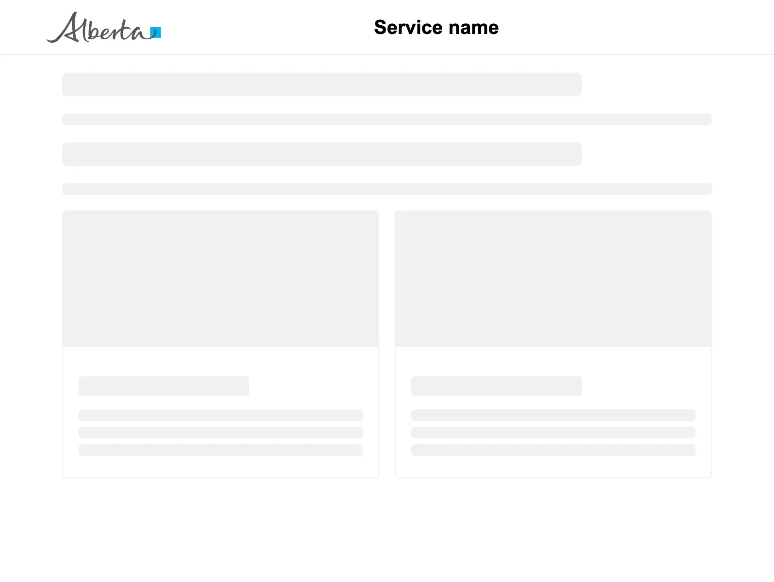
Skeleton loader
Provide visual feedback to users while loading a content heavy page or page element.
Props
type
GoabSkeletonType
Sets the skeleton shape to represent your content.
lineCount
number
Used within components that contain multiple lines. Currently only used in card skeleton type.
Defaults to
3.
maxWidth
string
Sets the maximum width. Currently only used in card skeleton type.
Defaults to
300px.
size
GoabSkeletonSize
Size can affect either the height, width or both for different skeleton types.
Defaults to
1.
testId
string
Sets a data-testid attribute for automated testing.
mt, mr, mb, ml
Spacing
Apply margin to the top, right, bottom, and/or left of the component.
Basic page layout
<GoabOneColumnLayout>
<section slot="header">
<GoabAppHeader url="/" heading="Service name">
<a href="/login">Sign in</a>
</GoabAppHeader>
</section>
<GoabPageBlock width="704px">
<p>
<GoabSkeleton type="header" size="4" />
<GoabSkeleton type="text" size="1" />
</p>
<p>
<GoabSkeleton type="header" size="4" />
<GoabSkeleton type="text" size="1" />
</p>
<GoabGrid minChildWidth="30ch">
<GoabSkeleton type="card" size="2" />
</GoabGrid>
</GoabPageBlock>
<section slot="footer">
<GoabAppFooter />
</section>
</GoabOneColumnLayout><goab-column-layout>
<section slot="header">
<goab-app-header url="/" heading="Service name">
<a href="/login">Sign in</a>
</goab-app-header>
</section>
<goab-page-block width="704px">
<p>
<goab-skeleton type="header" size="4"></goab-skeleton>
<goab-skeleton type="text" size="1"></goab-skeleton>
</p>
<p>
<goab-skeleton type="header" size="4"></goab-skeleton>
<goab-skeleton type="text" size="1"></goab-skeleton>
</p>
<goab-grid minChildWidth="30ch">
<goab-skeleton type="card" size="2"></goab-skeleton>
</goab-grid>
</goab-page-block>
<section slot="footer">
<goab-app-footer></goab-app-footer>
</section>
</goab-column-layout><goa-one-column-layout>
<section slot="header">
<goa-app-header version="2" url="/" heading="Service name">
<a href="/login">Sign in</a>
</goa-app-header>
</section>
<goa-page-block width="704px">
<p>
<goa-skeleton type="header" size="4"></goa-skeleton>
<goa-skeleton type="text" size="1"></goa-skeleton>
</p>
<p>
<goa-skeleton type="header" size="4"></goa-skeleton>
<goa-skeleton type="text" size="1"></goa-skeleton>
</p>
<goa-grid min-child-width="30ch">
<goa-skeleton type="card" size="2"></goa-skeleton>
</goa-grid>
</goa-page-block>
<section slot="footer">
<goa-app-footer version="2"></goa-app-footer>
</section>
</goa-one-column-layout>Other
Use CircularProgress for page-level or blocking operations. Use Skeleton for content placeholders while loading.
Do
Choose the right loading indicator for your context.
Types
Tip
Pick the loading indicator that matches the context. Use CircularProgress with the inline variant for a section of the page that's loading. Use the fullscreen variant when the whole page is loading and the user can't do anything else yet. Use Skeleton when part of the page can show while the rest loads, so users see structure right away instead of an empty space.
Tip
Match the skeleton type to your actual content shape. Accurate shapes reduce perceived load time and prevent layout shifts.
States
Warning
Show an error state if loading takes too long. Don't leave skeletons showing indefinitely without feedback.